Berlin October 2011
I went on a trip to Berlin with my fellow Art and Photography students on the 11th-15th October 2011. I found Berlin to be an incredible city, overflowing with interesting architecture and abundant history. I learnt so much when I was there and saw many inspiring exhibitions, which helped me to think deeper about my own dissertation and how to develop my ideas further.
Manual Photographs from Berlin
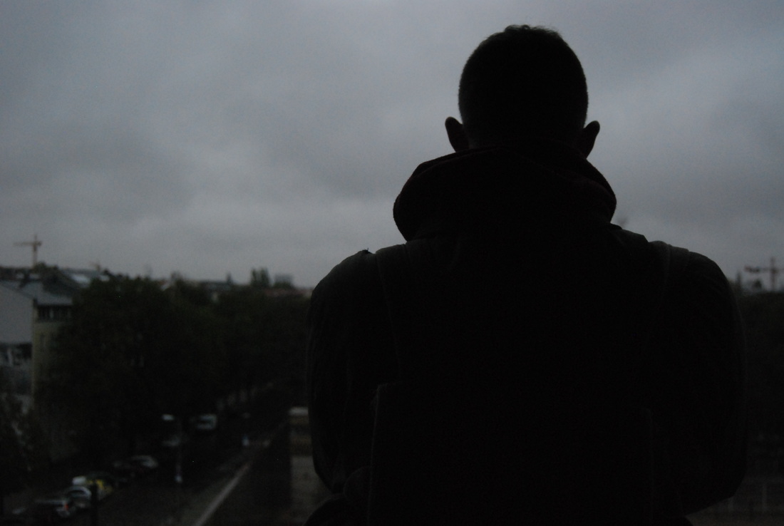
I took a manual camera with me to Berlin as well as my digital SLR, because I think that a manual camera delivers particular quality that an SLR doesn't. I brought both around with me when exploring Berlin and below are the pictures that developed.
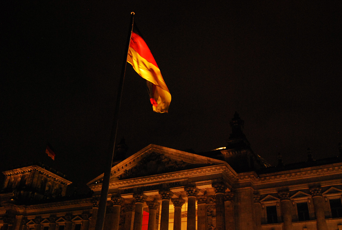
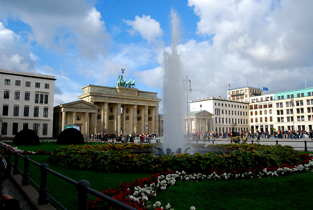
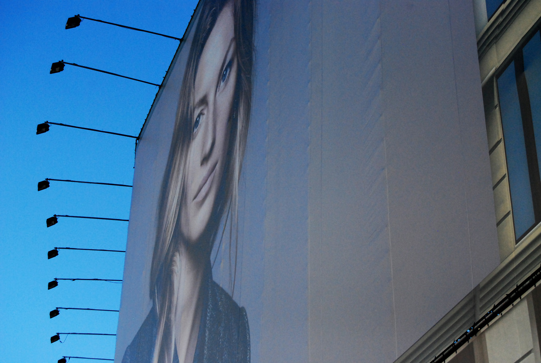
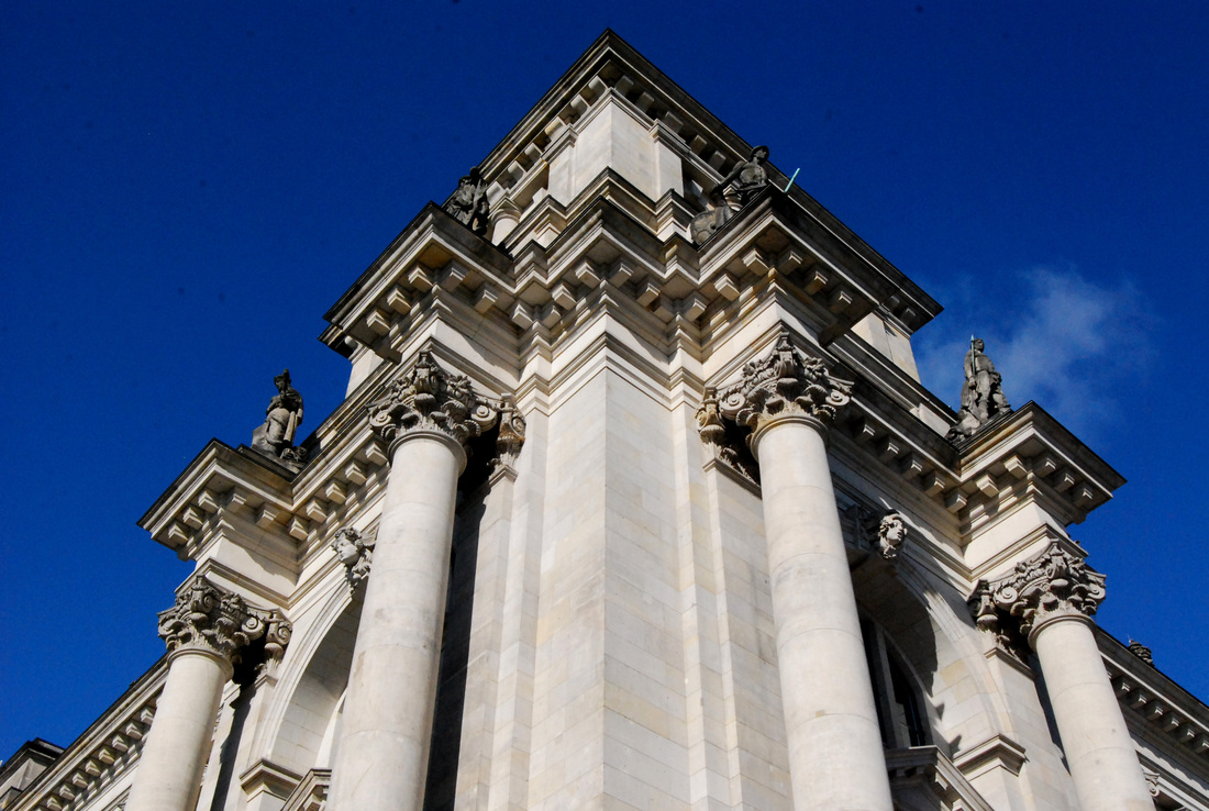
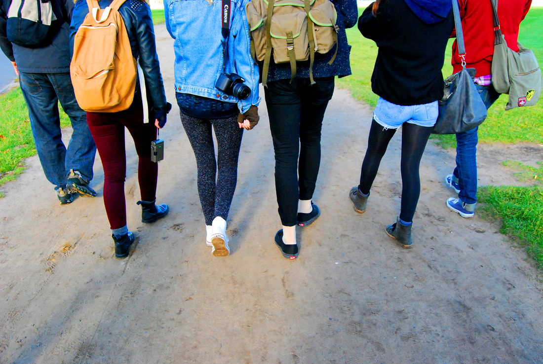
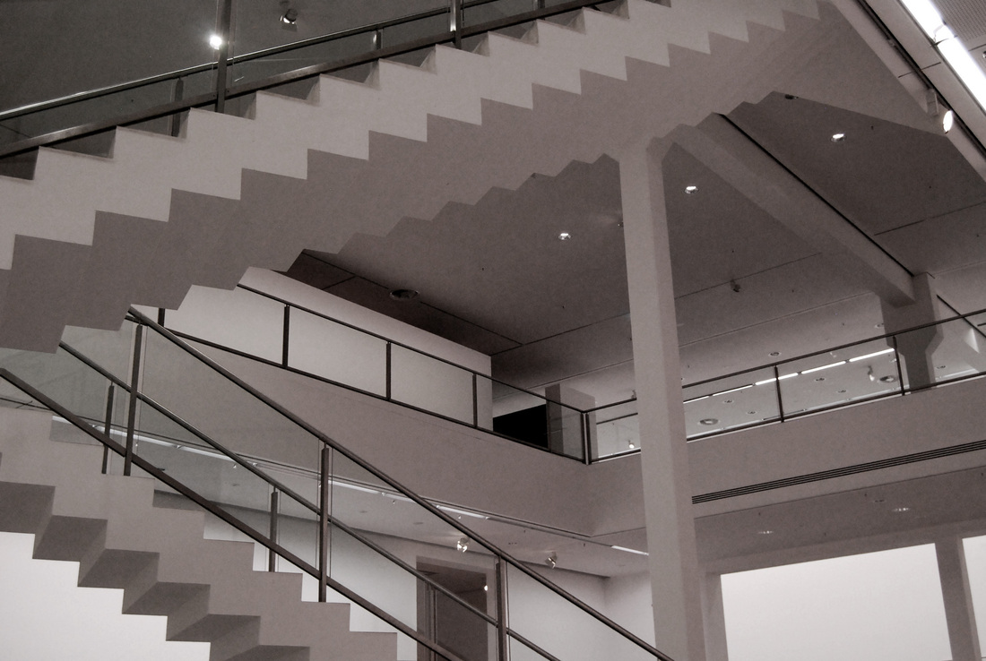
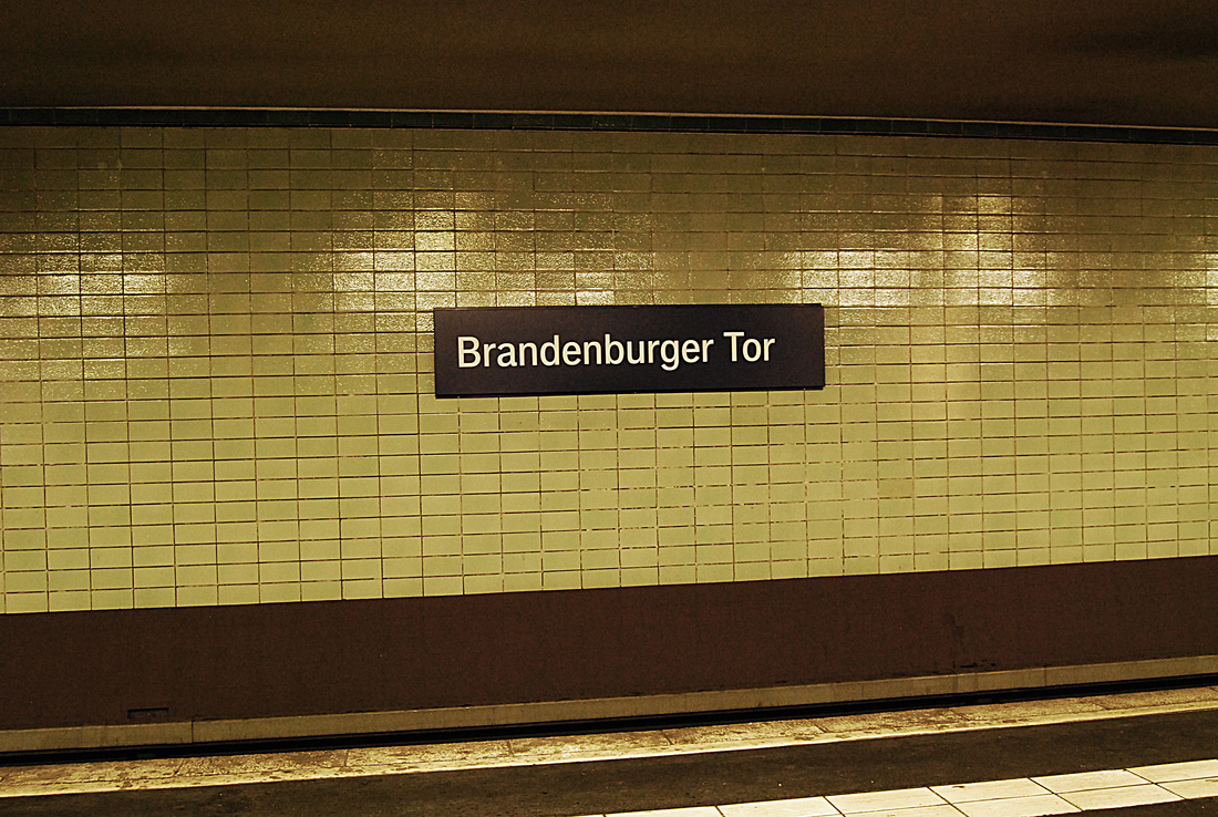
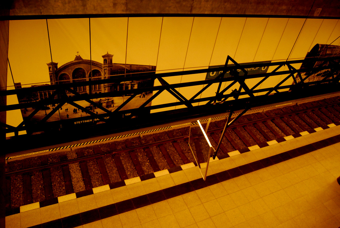
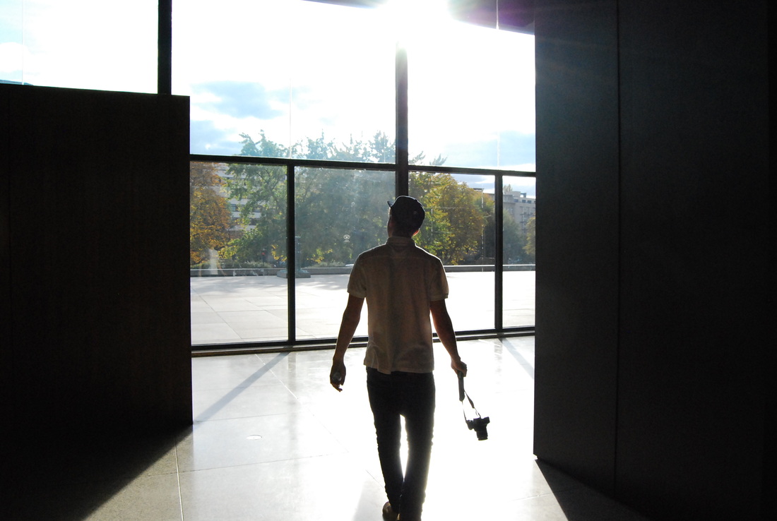
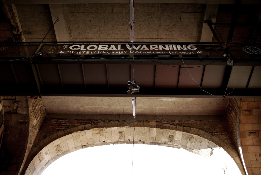
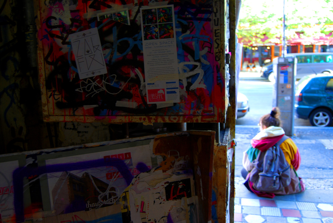
General Berlin Photographs
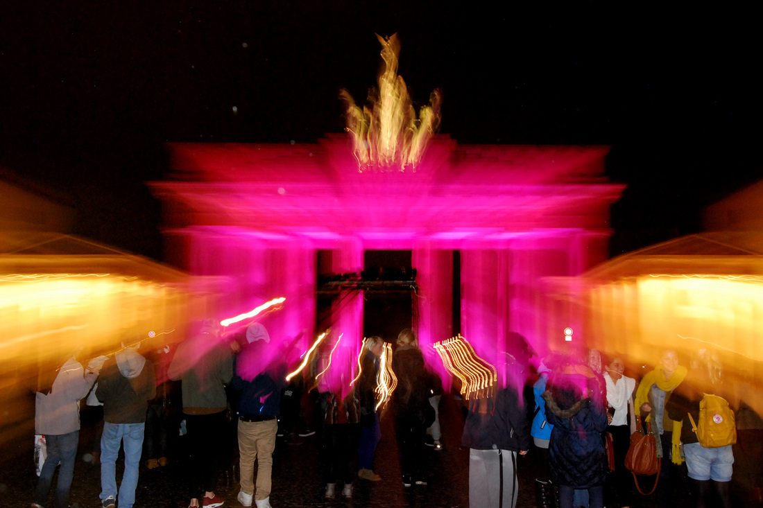
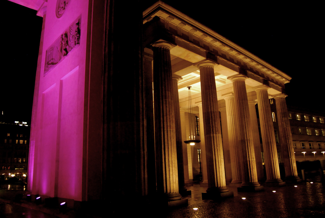
Below are some photographs that I took from all around Berlin; some of the sights and interesting things that I saw.
What went well - I experimented widely with these images, playing with shutter speed and aperture to capture the image as best as possible. I also think that my range of angles are an interesting contrast to one another within a set.
Even better if - In some places, the images can appear a little underexposed, and perhaps I should have let more light in to create an even image. I could have also done this in Photoshop. When taking photographs of the Brandenburg Gate it was very dark and it would have been very beneficial to have the use of a tripod when capturing these images, so more light could have been let in without blurring.
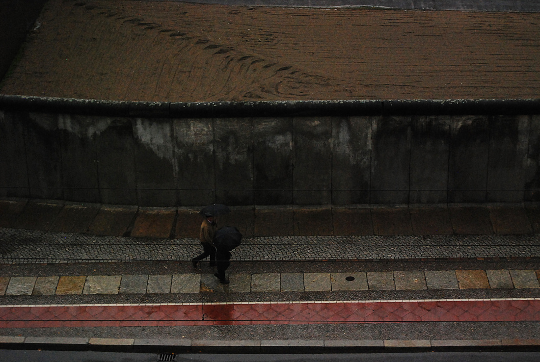
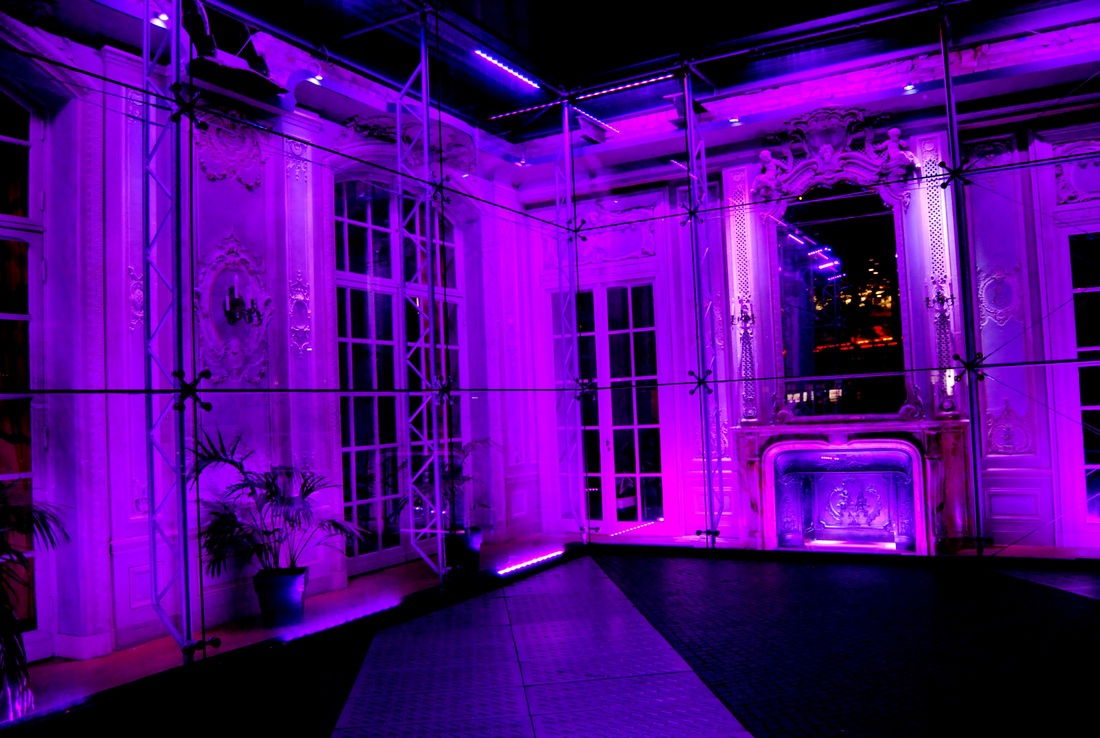
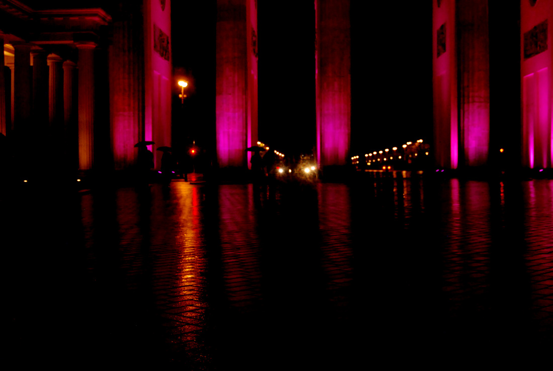
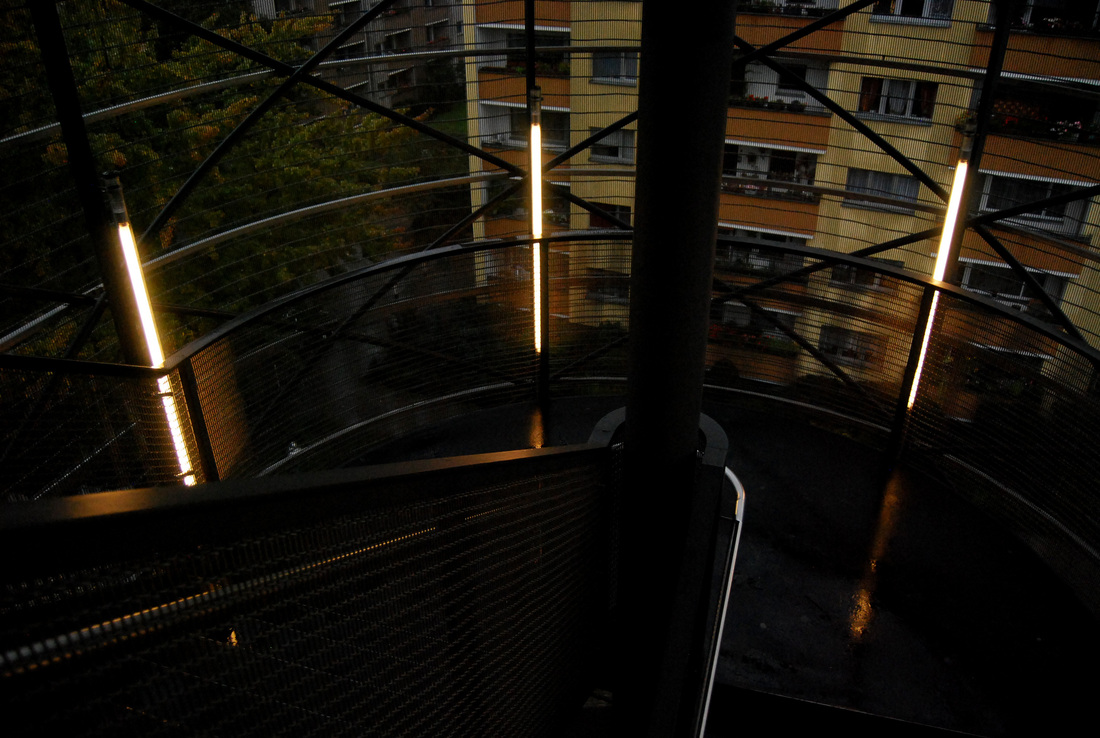
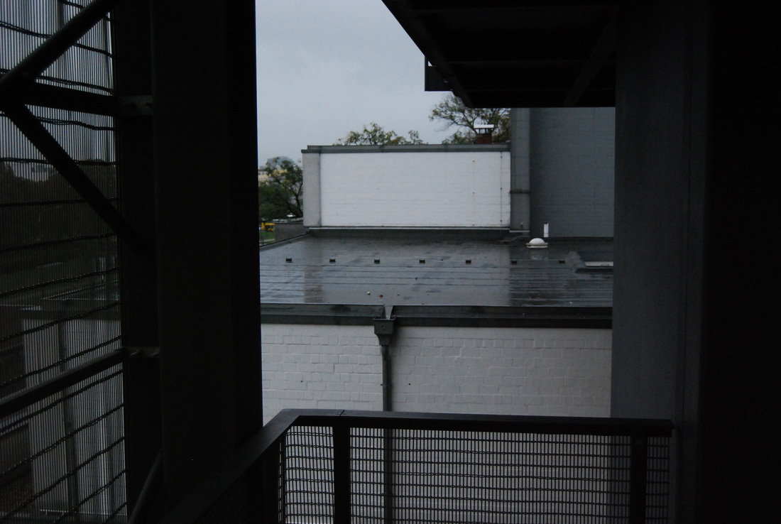
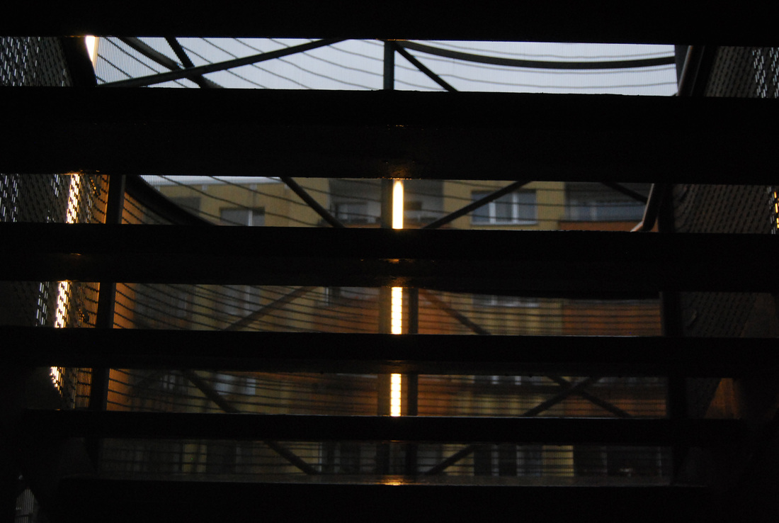
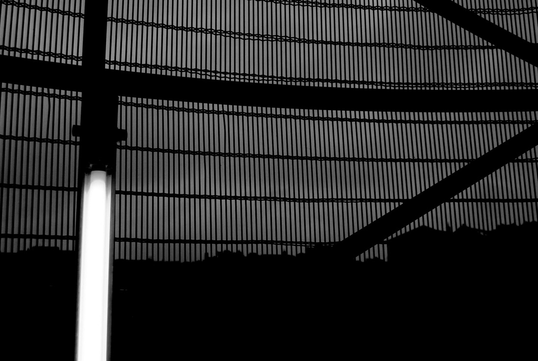
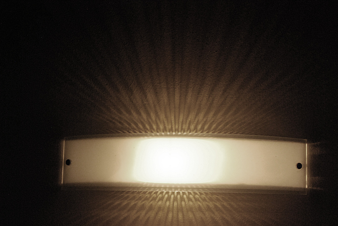
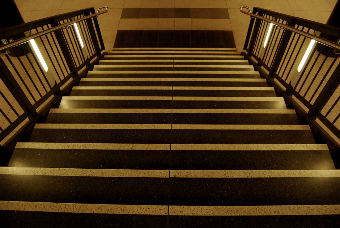
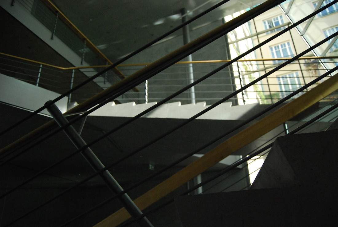
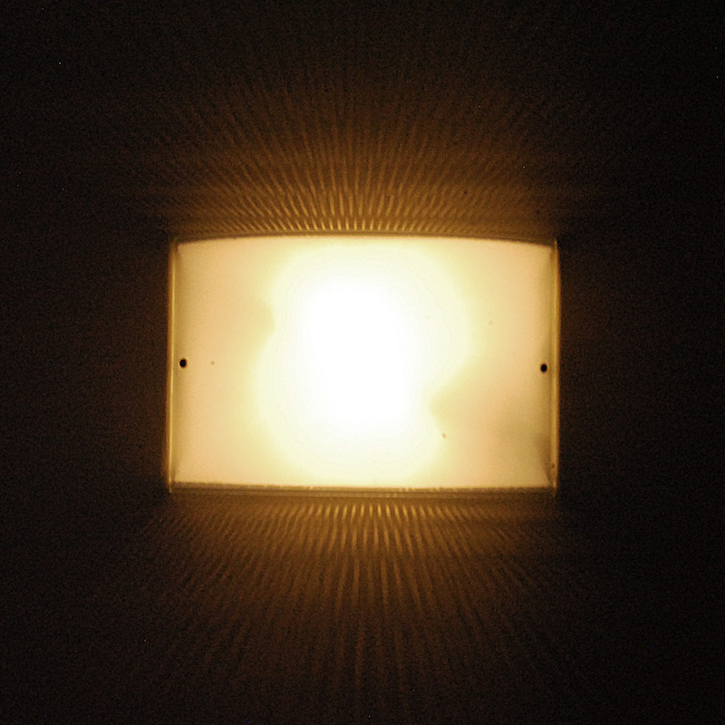
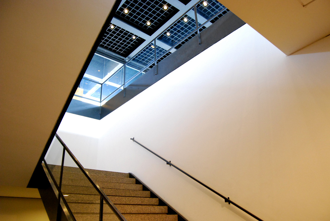
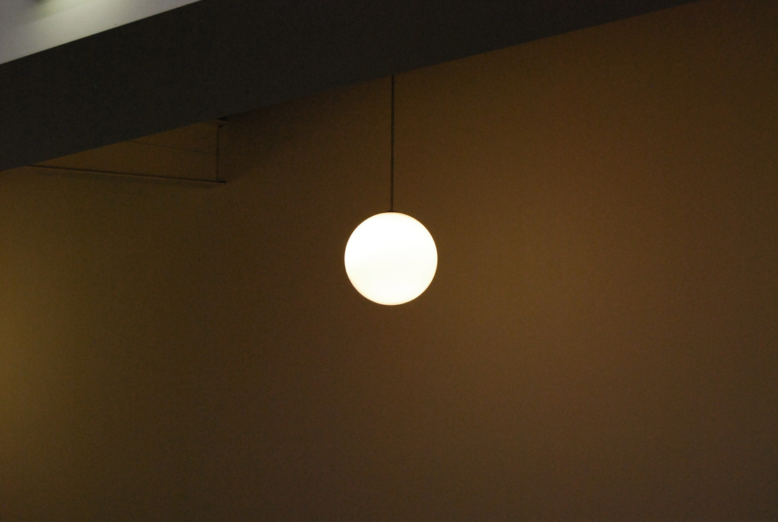
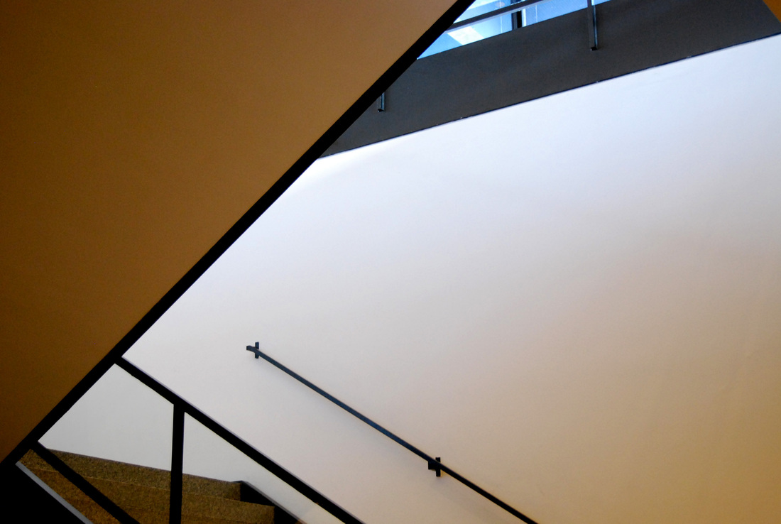
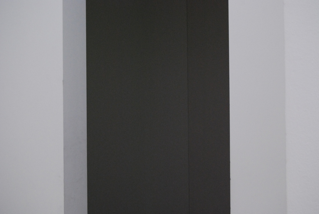
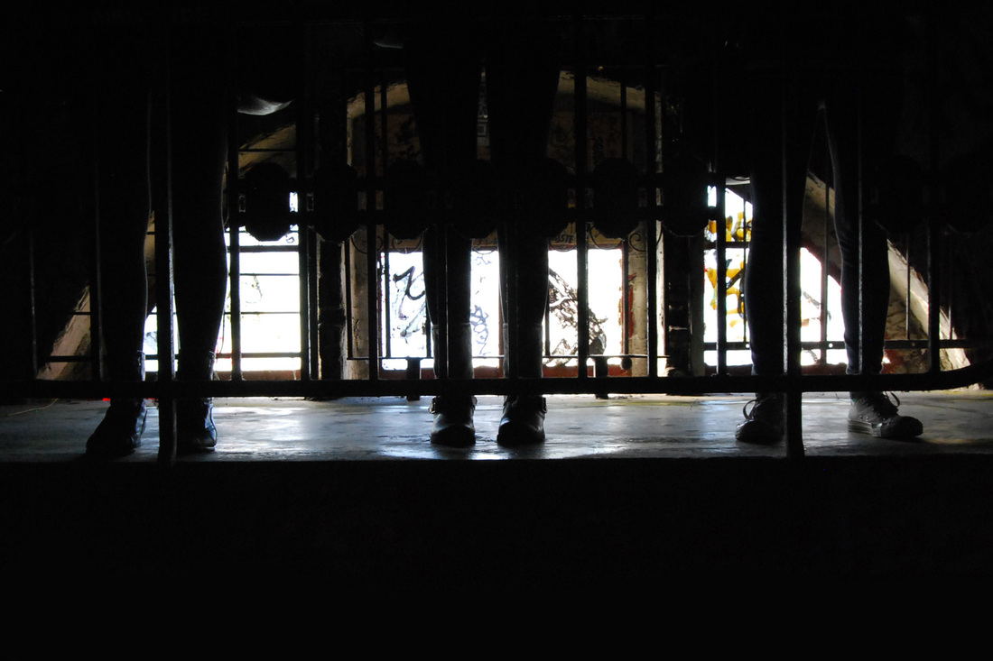
Collection - 'Lines'
When I was photographing around Berlin, I found that my images had similar themes throughout them, and so I have entitled this particular collection 'Lines' because of the straight angles and shapes that they hold. These images we taken in various places, including a couple in the room that I was staying and a few from the exhibitions that I visited.
What went well - I think that these photographs work well together as a collection, although they are all very different. The strong blacks and muted yellows and greens pull together a
Even better if - Again, I would have benefitted from the aid of a tripod because many of the images I was taking were in dark conditions. The quality of the images is also not as high as I would like, and I will have to put this down to the settings on my camera, which were reduced because I wanted to create space for as many images as possible. For my final images as part of my personal study, I will increase the settings to make sure that the images are the best resolution they can be.
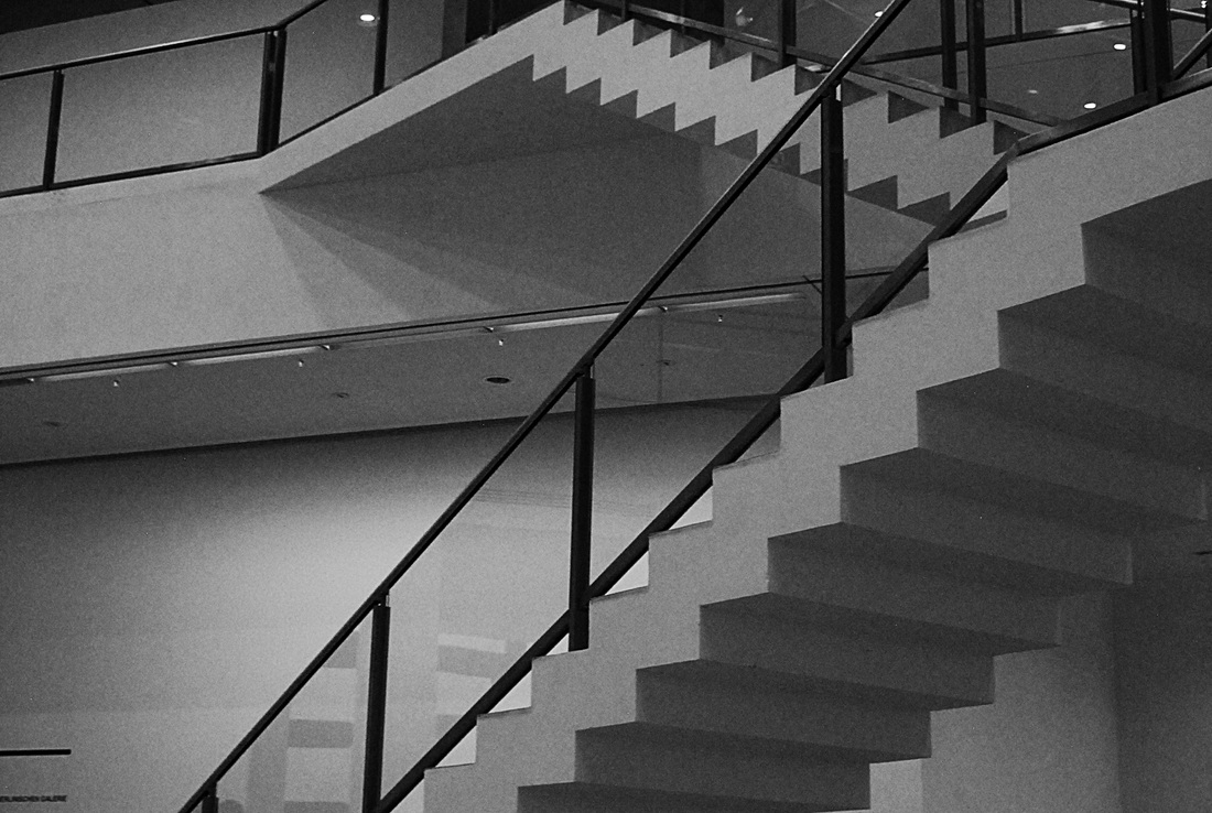
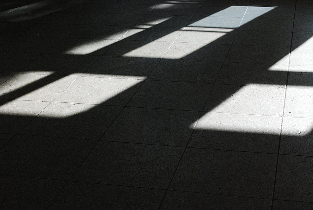
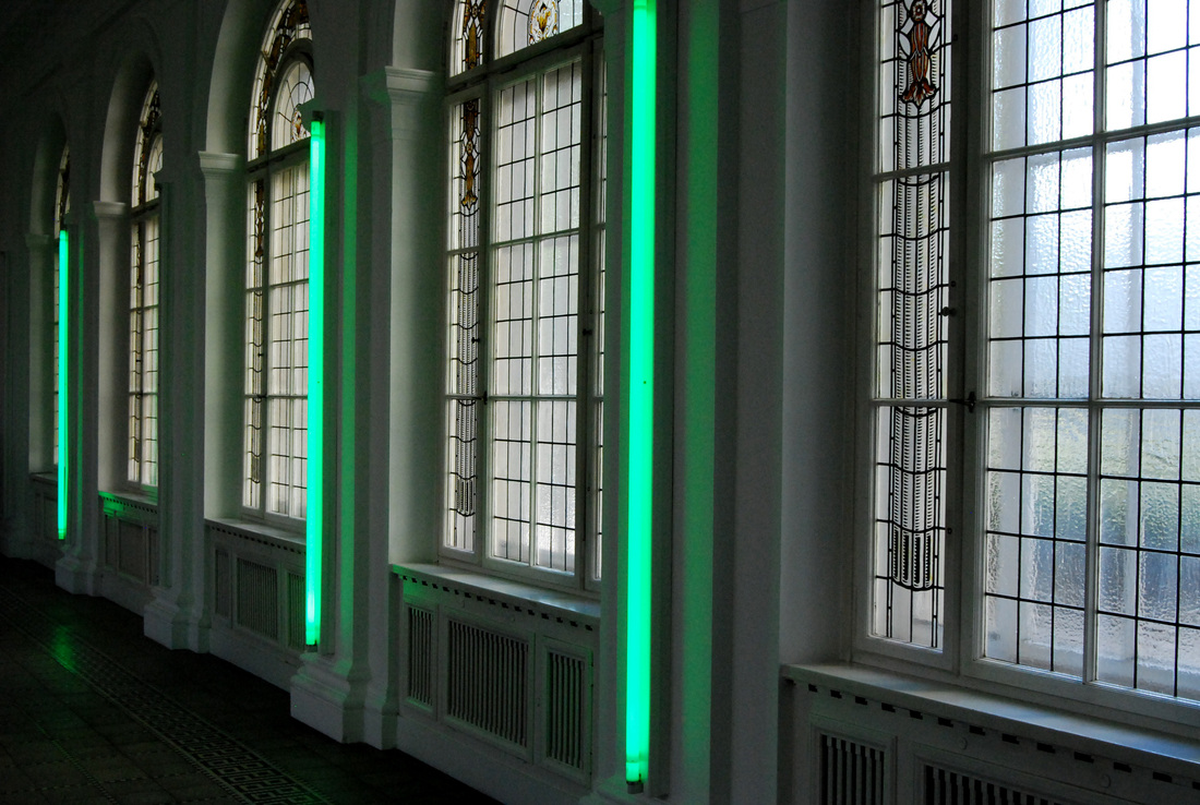
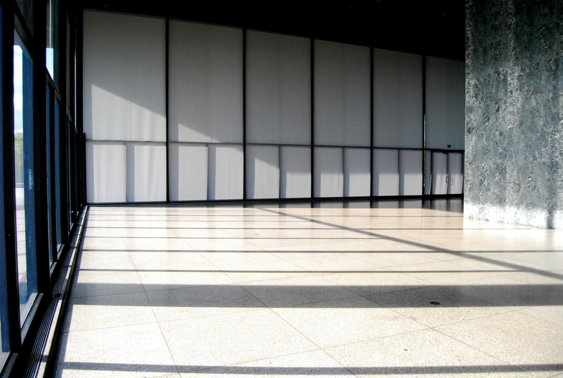
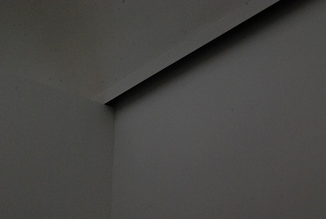
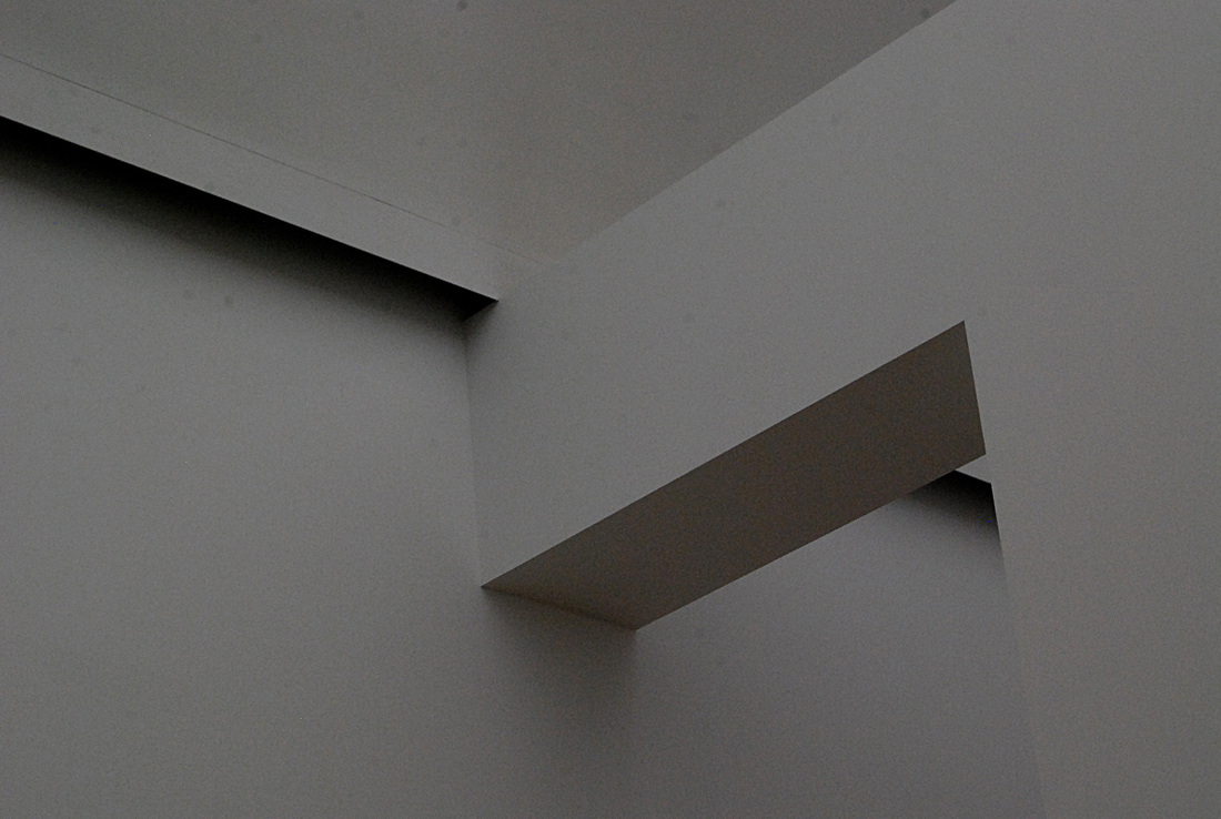
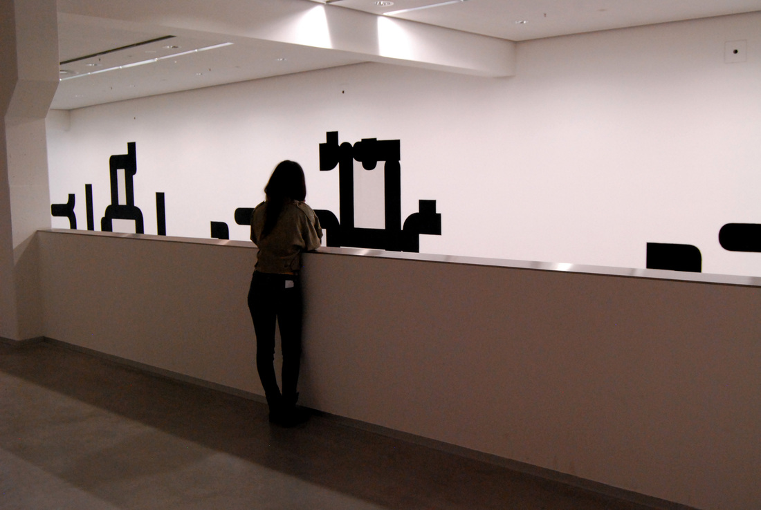
Collection - 'Negative Space'
One particular exhibition in the 'SMB Gallery' was held in a beautiful large white room. As I was walking around the exhibition I started to notice the corners and ceiling of the room and realised that I could collect a set of 'Negative Space' observations. I think that the edges of the walls making shadows on one another makes for a beautiful image.
What went well - I really like these images as a collection. The flatness of the colour in the images work very well together and I like how the straight lines lead on well from one another.
Even better if - The images look a little under-exposed in places and it would have been good if I had taken more of the same image on different settings, and then I would have had more choice of which images to include in the collection.
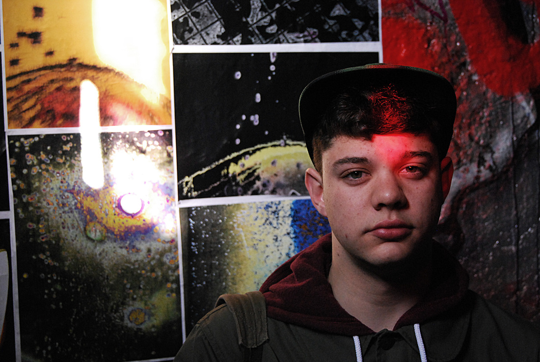
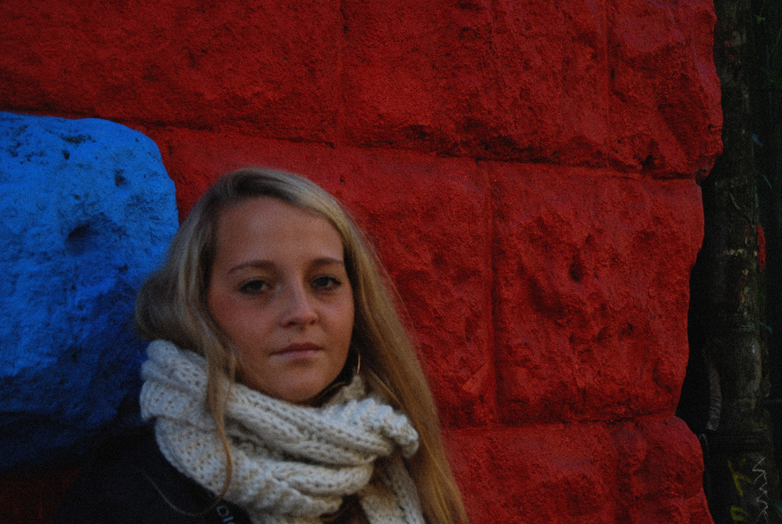
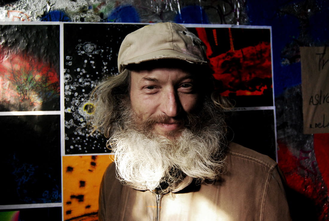
Portraits
The practical study as part of my dissertation is named 'The Study of a Lone Figure' and would be categorised as portraiture. When in Berlin, I was consistently experimenting with portraiture shots as I knew that these would give me inspiration for my own area of study. In Berlin there were many opportunities for interesting portrait backgrounds, and it pushed me to consider other locations for my own subject to be photographed against. It inspired me to explore London a bit more when taking my next set of observations.
What went well - I like the variety in the images, and how many of them were taken against a busy and colourful background. The patterns in the images work well against the shape of the subject. I also like how light has been utilised in these images, and how it often creates more of an idea of the person's identity.
Even better if - Some of the portraits could have been slightly more abstract, for example, body parts or clothing. Some could have even been showing the absence of the subject in the photograph; an empty bed or a full suitcase etc.

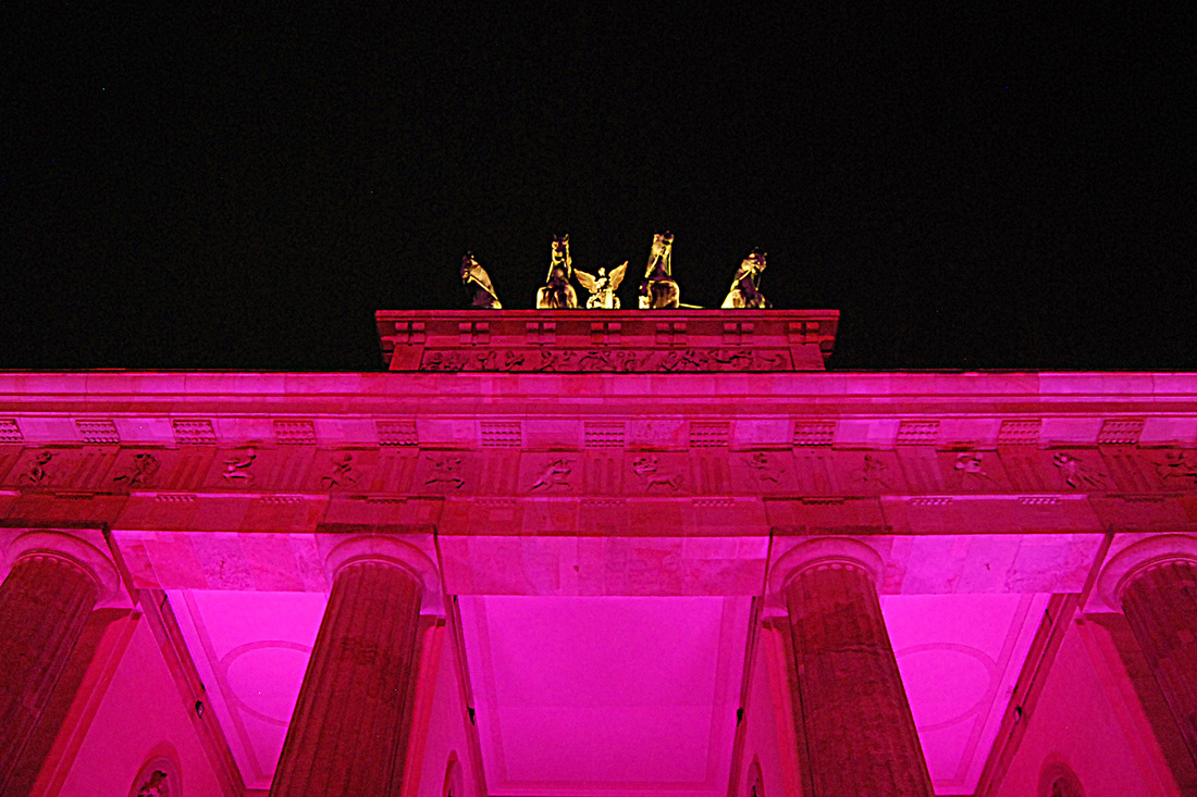
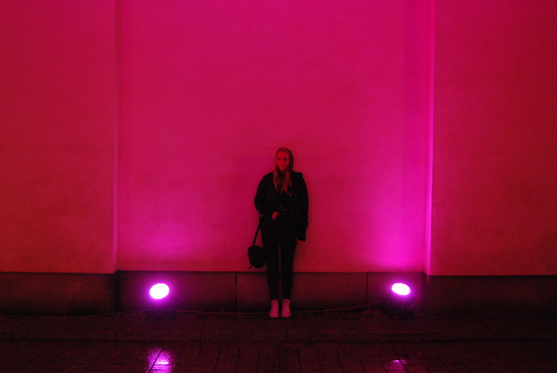
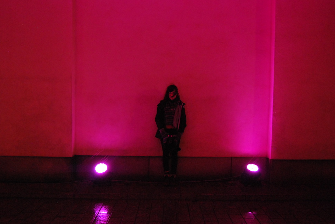
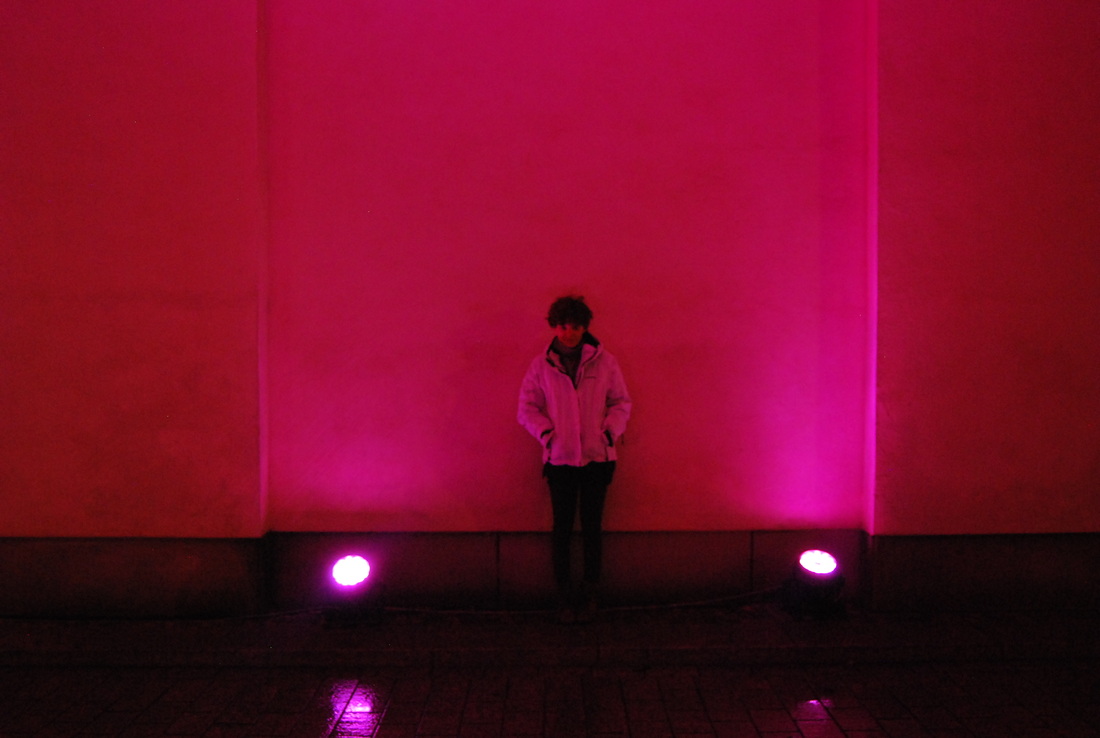
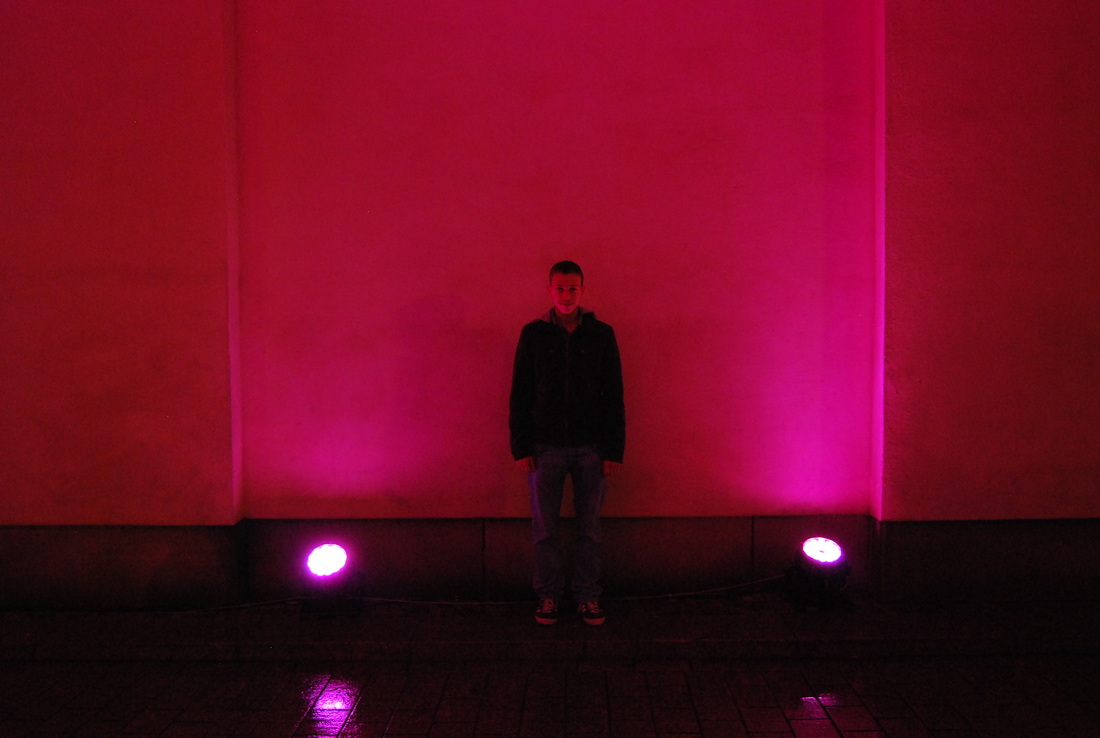
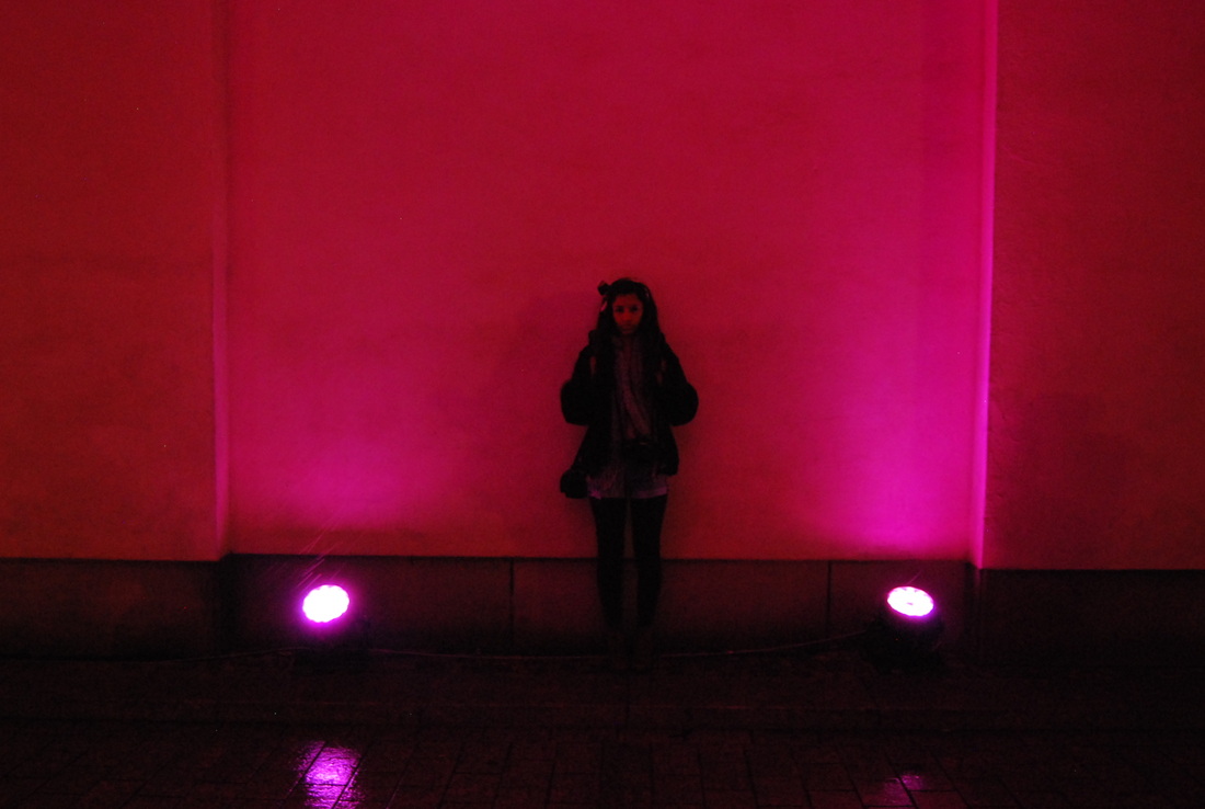
Portraits Collection - 'Soft-lighting Portraits'
In my dissertation I will be exploring how some photographers use one technique to capture the identity of their subject. So, whilst in Berlin, I took opportunities to take collections of identical photographs containing different subjects. These images were taken under the arch which was lit up with a soft pink light.
What went well - The similarity in the photographs is good, which is what I was aiming for - an almost identical set of photographs with the differing feature being the subject.
Even better if - The images are slightly under-exposed, and although I was attempting a dark image, in places there is too much black, and in this situation I would have benefitted with the use of a tripod to steady the camera and let more light in without blurring. It would have also been interesting to experiment with a long exposure and then movement of the model. But I would have also needed to use a tripod for this.
Portraits Collection - 'Busy-background Portraits'
I took these separate images in 'The Swap' house and combined them in Photoshop to create one seamless image.
What went well - I wanted to experiment with the presentation of similar portraiture images. What worked well with this was the busy background matching up to form a relatively smooth photograph.
Even better if - The images are under-exposed and this means that detail in the image is not particularly present.
Portraits Collection - 'Low-angled Portraits'
These photographs were taken from a low position deep in the tunnels of the Berlin Memorial. The large blocks of cement tower above the subject creating skyscraper-effect shapes above. This gives the images an appearance of vulnerability.
What went well - I like the muted saturation in the images and the cool colours create a tying element between the images. I also think that the low position of the camera creates an interesting expression to capture on the subject's face.
Even better if - If taking these pictures again, I would have been more militant with the position of the model, as I think that is looks best when they are perfectly centred in the shot.
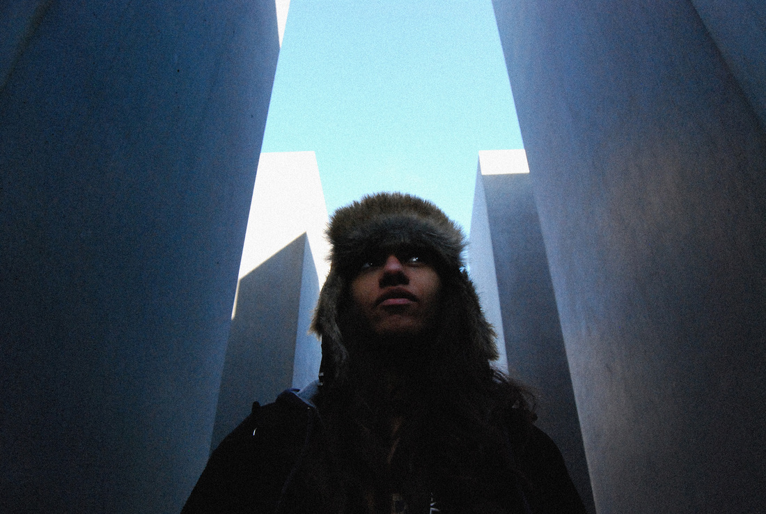
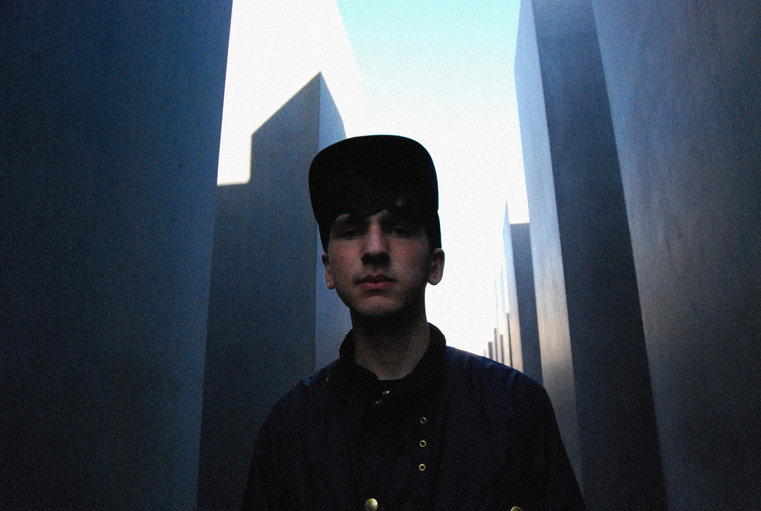
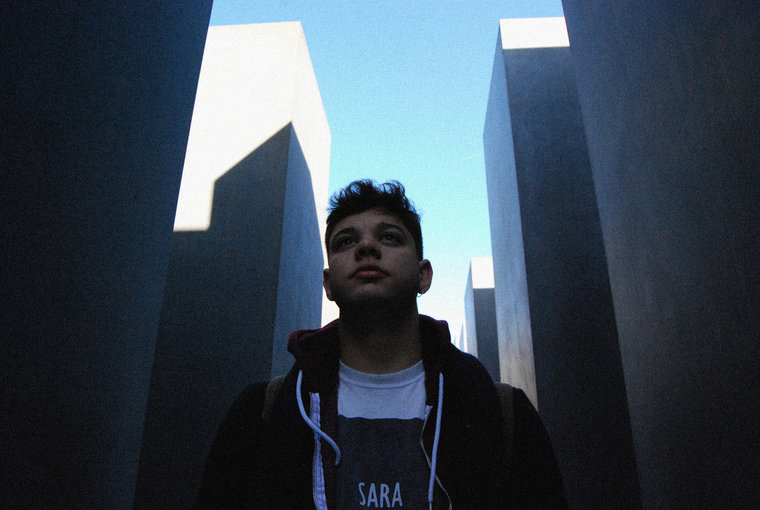
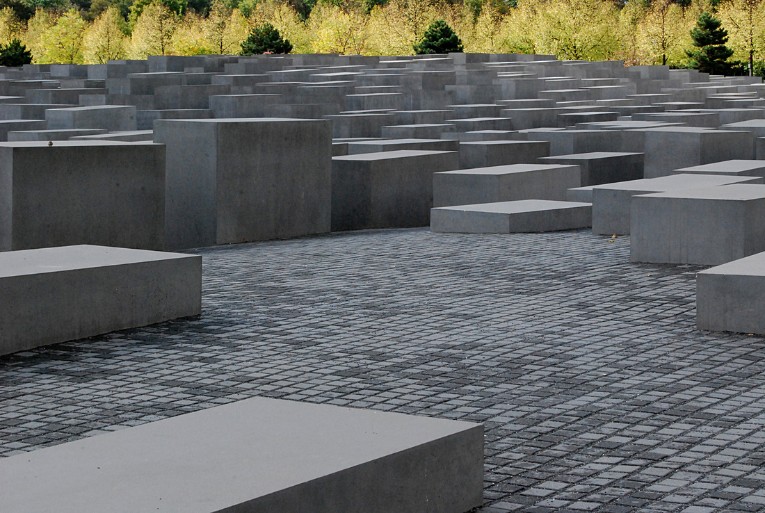
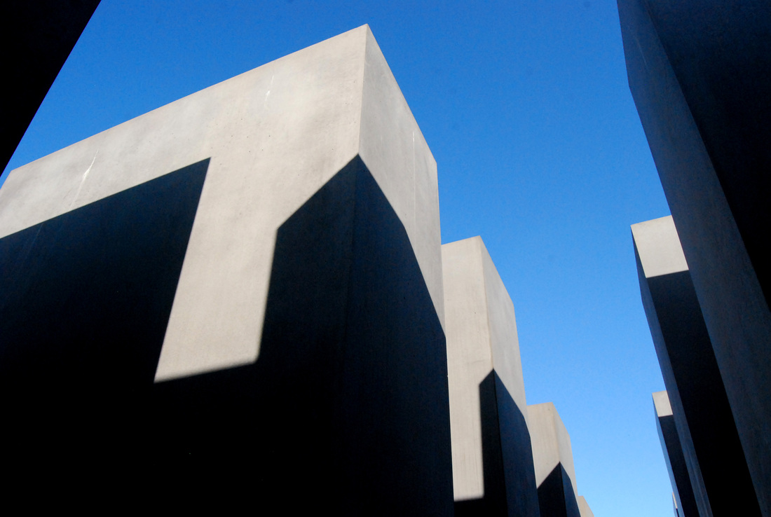
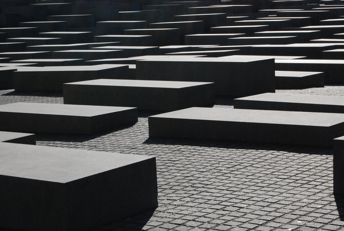
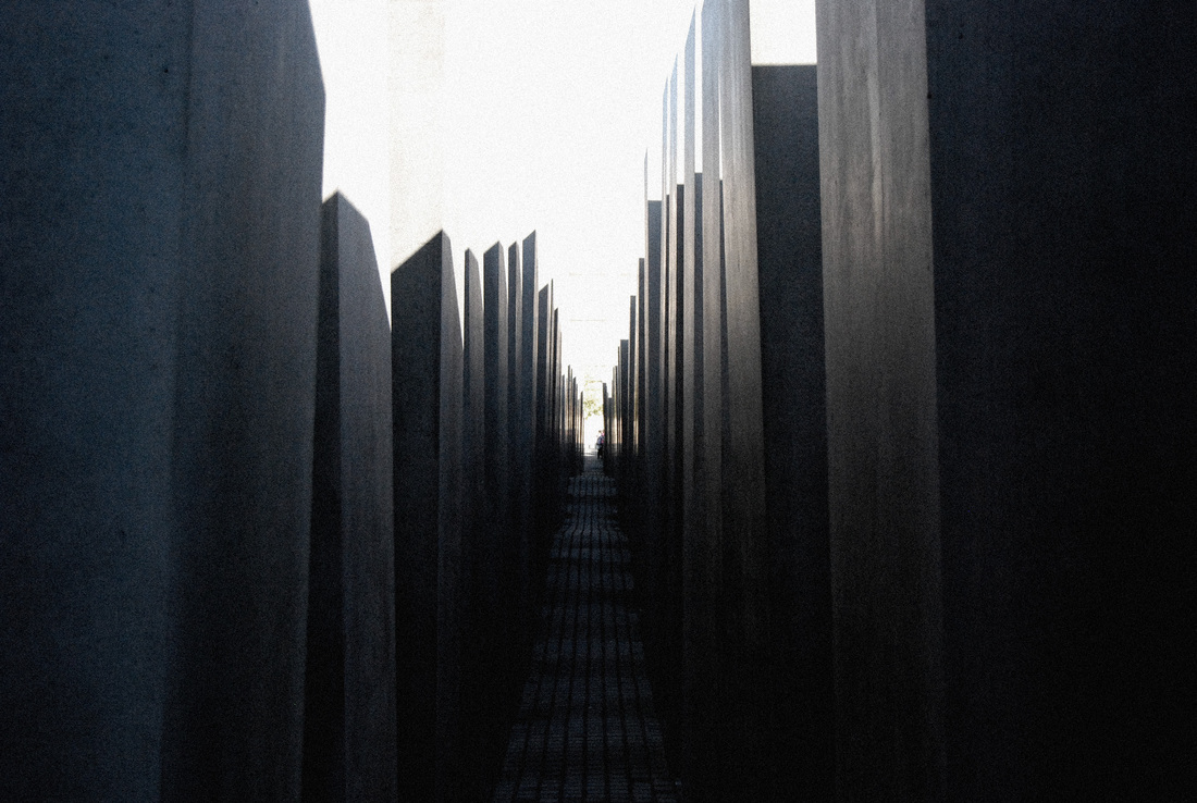
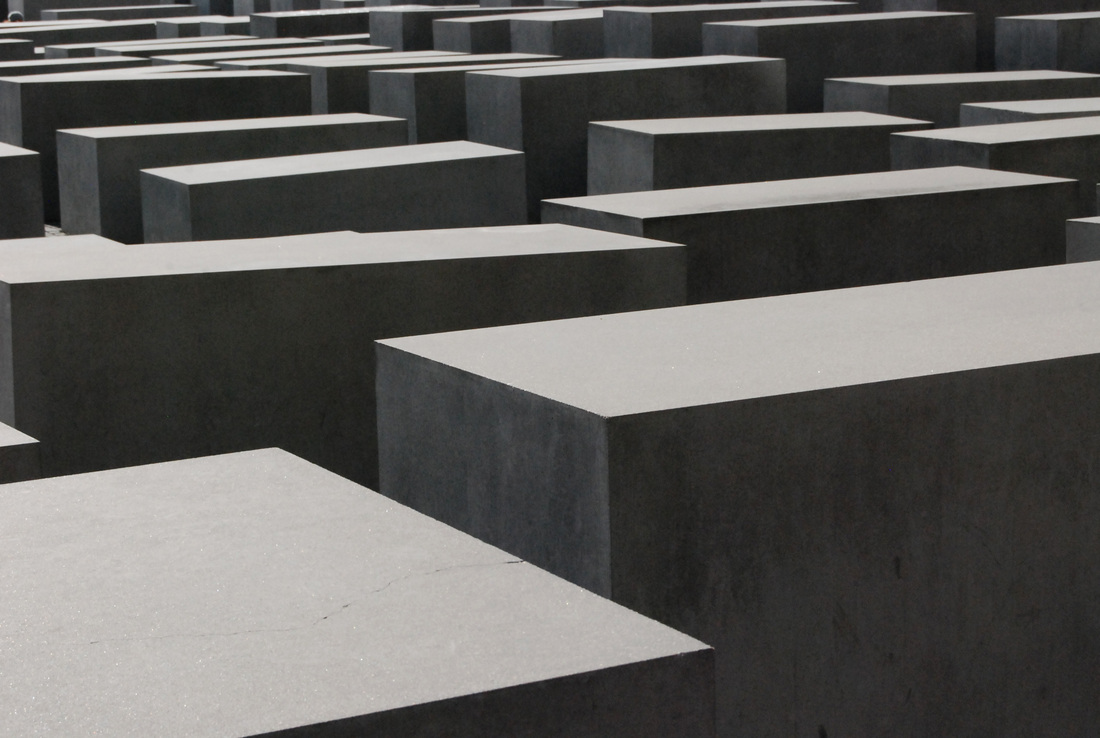
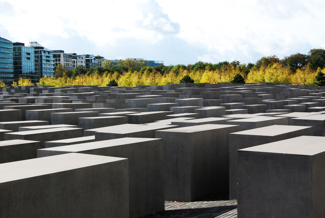
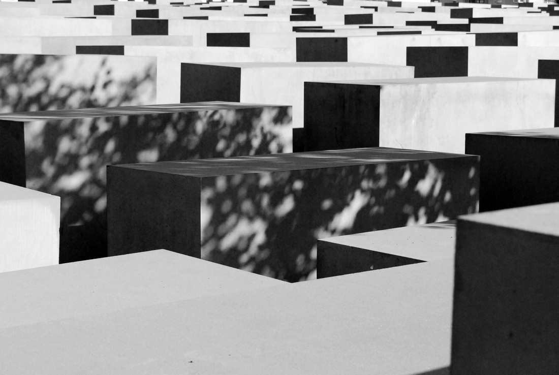
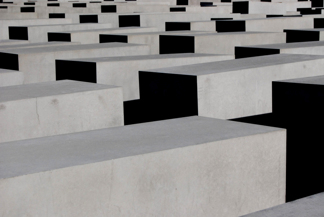
Berlin Memorial Photographs
The Berlin Memorial, or Holocaust Memorial, is a memorial in Berlin to the Jewish victims of the Holocaust. It is designed by architect Peter Eisenman and engineer Buro Happold. The site is 19,000 square metres, or 4.7 acres, and is covered with 2,711 concrete slabs arranged in a regimented grid pattern on a sloping field. The blocks vary in height from 0.2 to 4.8 metres. According to the project text created by Eisenman, the blocks are designed to produce an uneasy, confusing, atmosphere, and the whole sculpture aims to represent a supposedly ordered system that has lost touch with human reason.
I thought that the memorial was incredibly beautiful, and the size of it was astounding. You also got a completely different feel of it when standing on top of one of the outer blocks photographing it all from above, than you did opposed to standing deep within the tunnels where the blocks were towering intimidatingly over you.
What went well - The light was very good, as it was creating harsh shadows block to block. It was helpful to have the blocks there so that photographs could be shot from above. It was also good taking your camera into the tunnels where the shadows were harsher and the colours cooler.
Even better if - A problem that I encountered frequently when taking my images at the Berlin Memorial were people getting into my shots! On a sunny day, the memorial gets very busy so it is hard to get a human-free clean shot. However, perhaps I could have utilised the figures in my shots to create a different kind of photograph. If visiting again, I would take this contrasting approach.
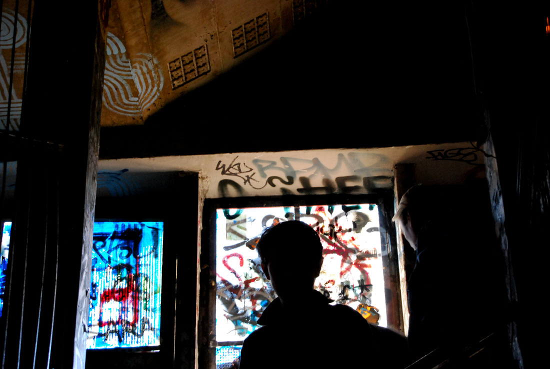
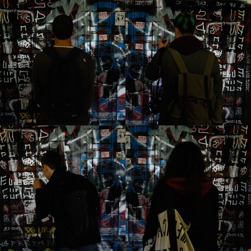
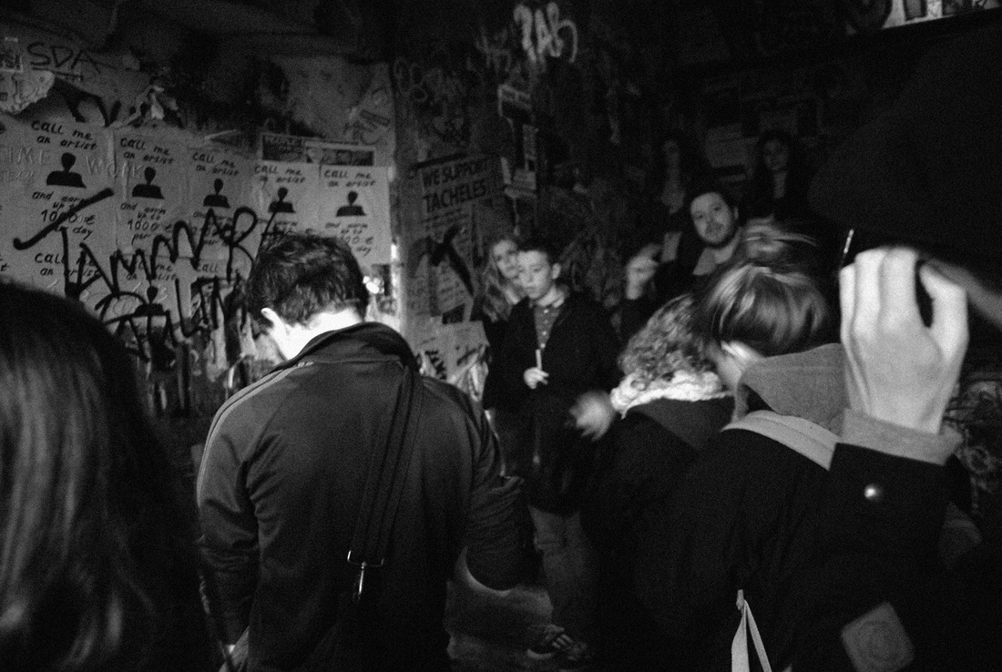
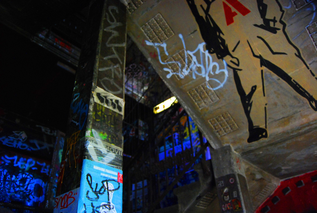
'The Swap'
We visited a house in Berlin named 'The Swap' which, whilst we were there, been currently taken over by artists who had covered the walls in images, posters, paint and graffiti. The house was spread over four or five floors and the art on the walls continued throughout the whole place. There was not one blank spot in the whole place. It was an incredible spectacle and so interesting to see the artistic choices that the artists had made. My favourite thing about the place was the darkness of it, and how the light streamed through the windows to create warm shapes on the busy walls.
What went well - I like some of the images that I took utilising the light that came through the holes in the walls and the empty window frames.
Even better if - I was not particularly pleased with my images from 'The Swap' because I don't think that I took enough. The light levels in the house were low so it was hard to capture good quality images. However, I did take some photographs using a manual camera, so I will see how those turn out when they are developed.
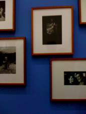
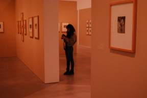
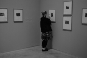
Exhibition Visit - Centre for Creative Photography
The Centre for Creative Photography was a beautiful old building, inside and out. The windows and floors were both intricately beautiful. It was here that I visited the Eugene Smith exhibition.
Eugene Smith
William Eugene Smith was born on December 20th, 1918, in Wichita Kansas. Smith was an American photojournalist best known for his refusal to compromise professional standards. He is also well known for his brutally vivid World War II photographs.
I was particularly excited to visit this exhibition, as my dream career is to be a photojournalist.
Smith's photographs are all black and white and were framed neatly across the various rooms contained within the exhibition.
I was particularly excited to visit this exhibition, as my dream career is to be a photojournalist.
Smith's photographs are all black and white and were framed neatly across the various rooms contained within the exhibition.
Each room contained a different set of Smith's photographs. My favourite room was entitled 'A Nurse Midwife', 1951. This set of images occured when Smith suggested an article to 'Life' magazine about midwives. Smith wished to show in these photographs how important the role of a nurse-midwife was. He also wanted to highlight the theme of racism and its destructive consequences. Smith accompanied one woman for six weeks. Every year this woman travelled more than 50,000 km.
The images were a variety, some in hospitals, some simply of children, but all equally beautiful. The contrast in the images was very high which suited them.
The images were a variety, some in hospitals, some simply of children, but all equally beautiful. The contrast in the images was very high which suited them.
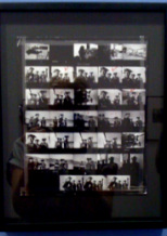
Contact Sheet for Spanish Village Essay 1948
In the Eugene Smith exhibition, I was particularly struck by this contact sheet displayed in a frame along with a magnifying glass so the audience are able to see each small image clearly. Some of the images had been marked with a red dot, which signalled that they were to be used. It was fascinating to see backstage of documentary photography. When seeing famous documentary photographs, most people assume that there had only been one shot and it was spontaneous, and yet seeing the proof that there is in fact whole reams of negatives dedicated to getting the perfect shot was very reassuring! It was an insight into Eugene Smith's creative mind to see what he considered a good photograph.
It gave me ideas about perhaps incorporating a contact sheet or negatives into 'The Study of a Lone Figure', as this is another type of image that would create texture into a final piece.
It gave me ideas about perhaps incorporating a contact sheet or negatives into 'The Study of a Lone Figure', as this is another type of image that would create texture into a final piece.
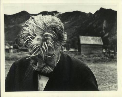
Albert Schweitzer
Aspen, Colorado, 1949
This particular image struck me as interesting because it related to portraiture and my own study. It seemed a very natural photograph as the movement appeared unaware. The man seemed to be in his own habitat and his emotion was clearly caught, without any necessary eye contact.
There was a room in the exhibition towards the end which contained drawings and sketches for the layouts of particular essays or articles that Smith was planning to write. There was a pencil drawing of the layout for 'Labrinthian Walk', 1957. Smith sketches ideas before he photographs and takes notes of his thoughts and what colours, outlines and shapes he is planning to capture. It was such valuable insight into the work of a photojournalist and all the preparation that needs to be achieved before photos are even taken or words written.
There was a room in the exhibition towards the end which contained drawings and sketches for the layouts of particular essays or articles that Smith was planning to write. There was a pencil drawing of the layout for 'Labrinthian Walk', 1957. Smith sketches ideas before he photographs and takes notes of his thoughts and what colours, outlines and shapes he is planning to capture. It was such valuable insight into the work of a photojournalist and all the preparation that needs to be achieved before photos are even taken or words written.
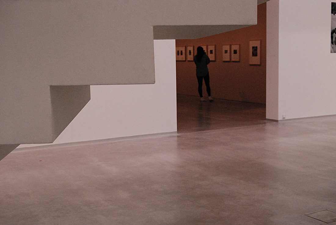
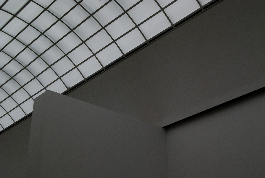
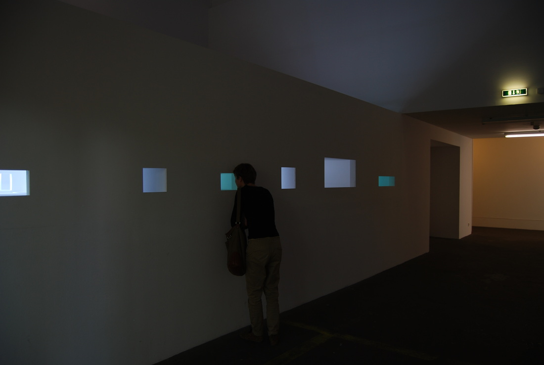
Exhibition Visit - SMB Gallery
The SMB was an extensive gallery, with rooms and corridors off to all sides. One particular room was in the East Wing of the gallery called Sammlung Mark. The artwork in the room was displayed on large white walls, pictured below. There was lots of opportunities to photograph negative space and there were interesting shapes and muted colours. The ceiling in this room acts as one huge window and so no artificial light is needed.
Sammlung Mark, East Wing
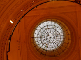
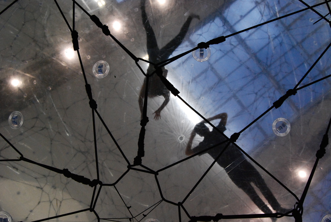
Tomas Saraceno - 'Cloud Cities'
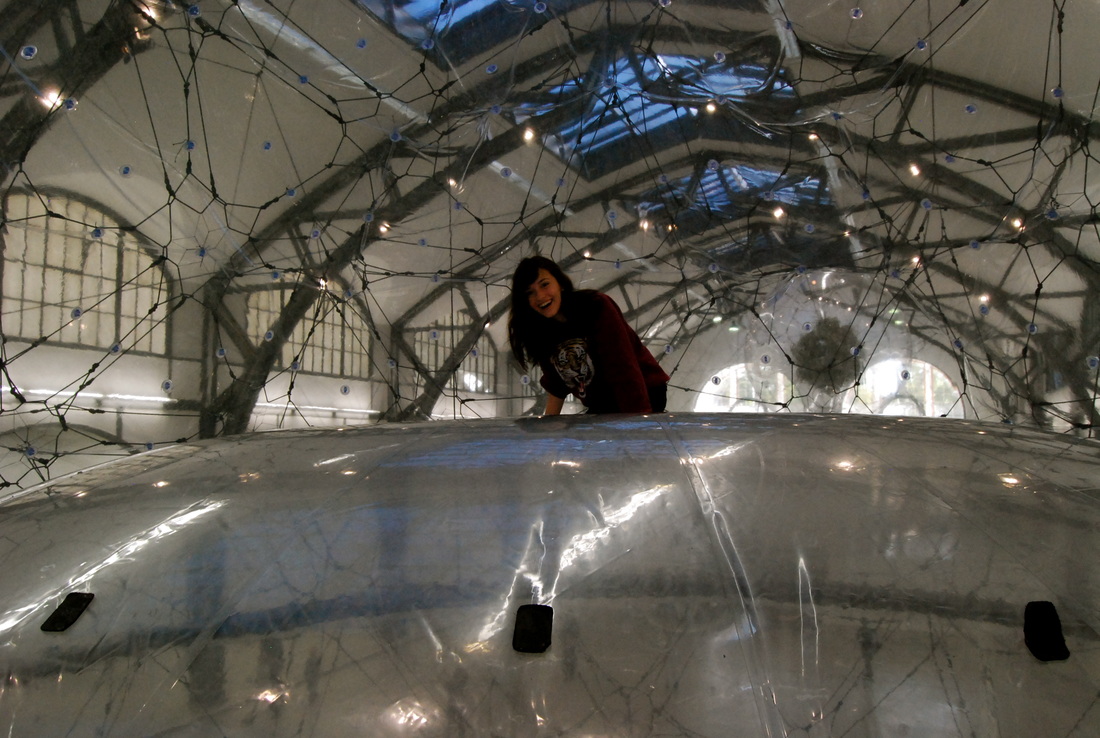
In the main room there was a giant round sculpture made out of plastic, surrounded by other small similar ones. They all contained a similar spider-web feel. It was possible to enter the largest one by climbing up a ladder. You had to kneel once inside and not make too large a movement. After entering, I went below the sculpture and took photographs of the silhouettes in the dome above.
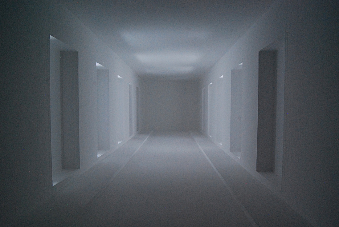
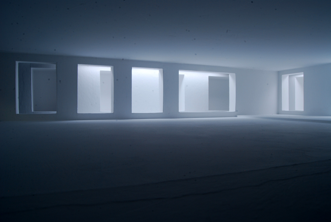
Jurgen Albrecht - 'Orte'
My favourite part of the exhibition came towards the end with Jurgen Albrecht's 'Orte'. In a dark room were squares cut into the walls and when you walked closer and peered inside, there appeared to be architectural white sculptures illuminated by a softly coloured light.
The mini rooms were beautiful because they confused the mind as to what size they were.
I adjusted my camera settings so that a large aperture captured as wide a depth of field as possible. I wanted to be able to have equal focus throughout the depth of the image. I also set my camera onto timer and a longer shutter speed so that my unsteady hand did not interrupt the clarity of the photographs.
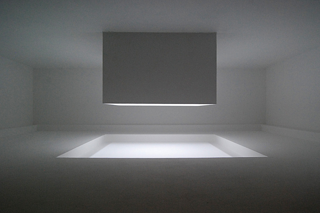
The image pictured above is my favourite as it seems the most eery out of the set. This image has not been desaturated and yet the absence of any colour in the image makes for something that appears monochrome. The hard lines and contrast of shades of grey make for a striking photograph.
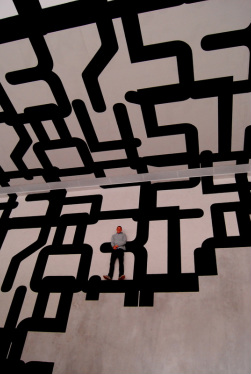
Exhibition Visit - Berlin's Museum of Modern Art
As you walked into the first room of the exhibition you were struck by the vastness of the patterned carpet, covering the floor and the walls. The thick black lines formed interesting shapes and it was a great photographic opportunity.
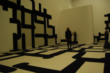
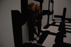
It made for a good photograph to ask people to lie down on the lines, their bodies shaping to the same as the black lines.
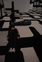
When on the upper level of the gallery, there was an opportunity to take photographs of a subject on the lower level patterned carpet. When framing the floor and the wall in the image, and asking the person to make it look as if they are standing on one of the black lines, it seems as if an optical illusion is created.

Freidrich Seidenstucker - Photography 1925-1958
Friedrich Seidenstucker never left home without a camera. Day by day he walked the streets of the young metropolis Berlin in constant search of unspectacular images that were typical of the times. His principe themes were the everyday life of people in the city and the leisure hours they spent at the zoo. His most successful years as a street and zoo photographer were between 1928 and 1937. His pictures appeared in the major German magazines.
Seidenstucker's depiction of everyday life dispenses with pathos, quite unlike the avant-garde art of the 1920s. As a poet of the ordinary he turned his attention to unassuming little occurrences, frequently pinpointing their bizarre and humorous aspects. His protagonists, both animal and human, are heroes in an imperfect world.
Seidenstucker's depiction of everyday life dispenses with pathos, quite unlike the avant-garde art of the 1920s. As a poet of the ordinary he turned his attention to unassuming little occurrences, frequently pinpointing their bizarre and humorous aspects. His protagonists, both animal and human, are heroes in an imperfect world.
Exhibition Visit - Berlin's National Portrait Gallery
Berlin's National Portrait Gallery is parallel to our own in London, but I thought the building was far more beautiful. Structurally, it made for great photographs, and inside there were many opportunities to take images of negative space.
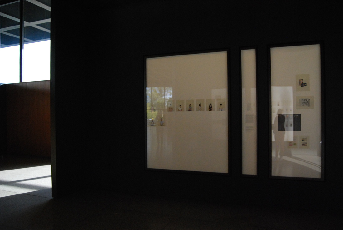
Taryn Simon - 'A Living Man Declared Dead and Other Chapters'
A Living Man Declared Dead and Other Chapters was produced over a four year period (2008-2001), during which the artist, Taryn Simon, travelled around the world researching and recording bloodlines and their related stories. In each of the eighteen 'chapters' that make up the work, the external forces of territory, power, circumstance or religion collide with the internal forces of psychological and physical inheritance. The subjects documented by Simon include feuding families in Brazil, victims of genocide in Bosnia, the body double of Saddam Hussein's son Uday, and the living dead in India. Her collection is at once cohesive and arbitrary, mapping the relationships among chance, blood, and other components of fate.
Each work in A Living Man Declared Dead was comprised of three segments. On the left of each chapter were one or more large portrait panels systematically, ordering a number of individuals directly related by blood. The sequence of portraits was structured to include the living ascendants and descendants of a single individual. The portraits were followed by a central text panel in which the artist constructs narratives and collects details. On the right were Simon's 'footnote images' representing fragmented pieces of the established narratives and providing photographic images. It was with this side panel that I was interested. The images were laid out in a Wolfgang-Tillmans style presentation, similar to how I would like to lay out my final images in 'The Study of a Lone Figure'.
Each work in A Living Man Declared Dead was comprised of three segments. On the left of each chapter were one or more large portrait panels systematically, ordering a number of individuals directly related by blood. The sequence of portraits was structured to include the living ascendants and descendants of a single individual. The portraits were followed by a central text panel in which the artist constructs narratives and collects details. On the right were Simon's 'footnote images' representing fragmented pieces of the established narratives and providing photographic images. It was with this side panel that I was interested. The images were laid out in a Wolfgang-Tillmans style presentation, similar to how I would like to lay out my final images in 'The Study of a Lone Figure'.
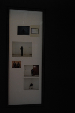
Taryn Simon's 'Footnote Images'
There were empty photographs which represented living members of a bloodline who could not be photographed. The reasons for these absences were included in the text panels and included imprisonment, military service, dengue fever and women not granted permission to be photographed for religious and social reasons. I thought that these photos which were left blank benefitted the composition and kept things regimented.
Simon's presentation explores the struggle to determine codes and patterns embedded in the narratives she documented, making them recognisable as variations or archetypal episodes from the present, past and future. The background colour on the photographs was a pastel green colour and created depth in the photograph that a white background would have struggled to do.
I thought that this exhibition linked to my dissertation because it was showing relationships through the medium of photography, and yet it was able to do this through one particular type of shot, because the images were accompanied by words and other 'footnote images'. The photographs showed the collected identity of a family through one type of shot. I may include Simon in my dissertation to argue from the side 'it is possible to show identity through one type of photograph'. Yet is it possible to do this without text or other images to accompany it? I wil explore these ideas also.
A Living Man Declared Dead and Other Chapters highlights the space between text and image, absence and presence, and order and disorder. I thought it was extraordinary.
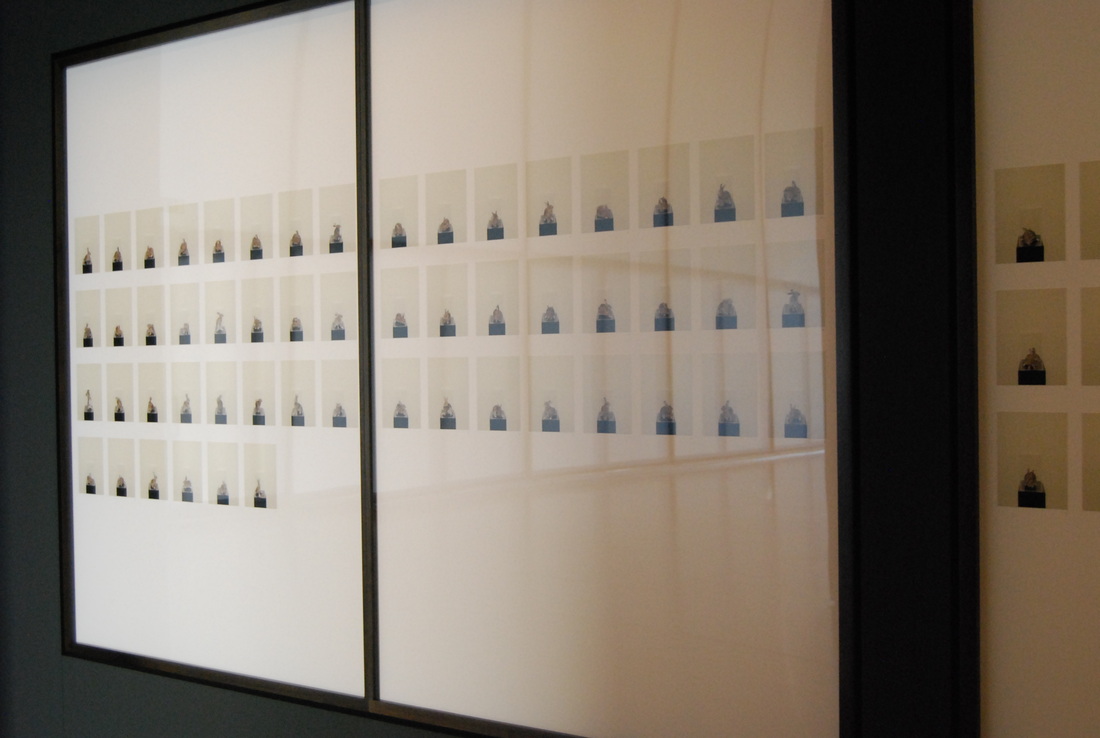
'VI Rabbits'
An example of one of the exhibits:'Twenty-four European rabbits were introduced to Australia in 1859 for hunting purposes on an estate in Victoria. Within 100 years the rabbit population exploded to half a billion. A single female rabbit can produce between 30 and 40 young a year.'
Exhibition Visit - Museum for Photography
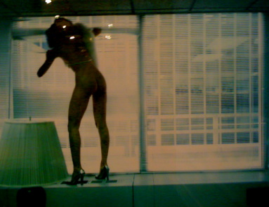
Helmut Newton - 'Polaroids'
Helmut Newton was born on October 31st, 1920. He was a German-Australian photographer. He has been described as a "prolific, widely imitated fashion photographer whose provocative, erotically charged black and white photos were mainstay of Vogue and other publications".
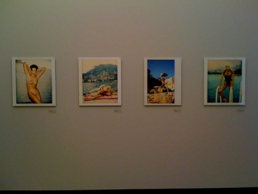
The figure in each of Newton's works was almost always a powerful Amazonian-like woman, and she was often androgynous. The shape of the bodies combined with the colours and backgrounds Newton creatively chose made for a stunning fashion image.
He used many techniques that I found interesting, and that pushed me to consider experimenting with them for my own personal study. For example, I saw more that one solarised print and there were also extreme close-up macro shots.
He used many techniques that I found interesting, and that pushed me to consider experimenting with them for my own personal study. For example, I saw more that one solarised print and there were also extreme close-up macro shots.
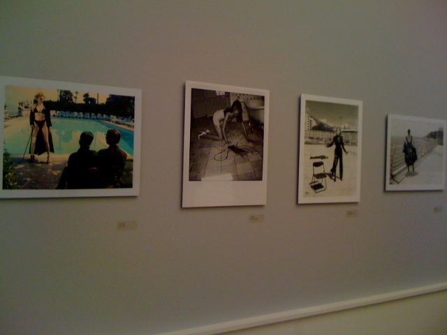
I found that many of these images linked to my own personal study as they were illustrating a lone figure. I also liked many of the prints that were square film-like stills such as Yves Saint Laurent, Paris 1987 and Brigitte Nielsen, Monte Carlo 1986.
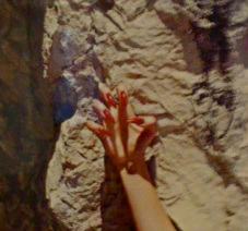
A particular photograph that stood out to me, because I believe it links with my own study was that pictured below, the hand with red nails from Italian Vogue, La Turbie 1994. It singled out this particular body part, and yet even without seeing this persons face, you feel their emotion, and a clear picture of them is conveyed. It shows strong identity and the red nails seem to signify power and anger.
Exhibition Visit - C/O Gallery
I would say that the C/O Gallery was probably my favourite, because there were many different great exhibitions happening in a concentrated space and each one left you completely moved.
"Since its founding in the year 2000, C/O Berlin has been presenting a lively cultural program of international stature. As an exhibition centre for photography, C/O Berlin presents the work of renowned artists, organises events, promotes talented young artists, and accompanies children on voyages of discovery through their visual culture. C/O Berlin is a private institution that distinguishes itself through modern entrepreneurial thinking and up-to-date cultural management. Intensive educational work and close cooperation with institutions worldwide make C/O Berlin unique locus of cultural exchange - one of a kind not only in Berlin, but in all of Germany."
"Since its founding in the year 2000, C/O Berlin has been presenting a lively cultural program of international stature. As an exhibition centre for photography, C/O Berlin presents the work of renowned artists, organises events, promotes talented young artists, and accompanies children on voyages of discovery through their visual culture. C/O Berlin is a private institution that distinguishes itself through modern entrepreneurial thinking and up-to-date cultural management. Intensive educational work and close cooperation with institutions worldwide make C/O Berlin unique locus of cultural exchange - one of a kind not only in Berlin, but in all of Germany."
Talents 25
Talents 25 was put together by Mirko and Melanie Martin.
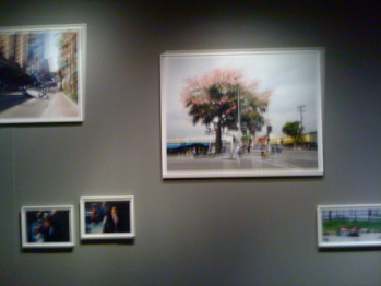
A wall in 'Talents 25'
My favourite part of this was the layout of the images. The were dotted along the wall, all different sizes and no order apparent. It reminded me of a Wolfgang-Tillmans exhibition and pushed me onto planning what my layout would look like. The tying element in each of the images was the same thick wooden frame, painted white. It inspired me onto experimenting with frames for my own final outcome.
Anja Niedringhaus - At War
We know her photographs even if we don't know her name. They have appeared on the covers of magazines and newspapers worldwide, defining our image of the wars and crises of our time. For the last 20 years, Anja Niedringhaus has been travelling to the theatres of war around the world - in Croatia, Serbia, Kosovo, Bosnia, Iraq, Afghanistan, Libya and Israel - photographing misery and suffering in vivid and unflinching detail. As one of the few woman working in this specialised branch of photography, she documents human tragedies and the deep scars left by violence. When send on assignment, Anja Niedringhaus does not photograph scenes at a distance, but places herself within them - who someone who herself is involved, immersed in the war.
I found Anja's work incredible, especially because this is something that really interests me, as my idea career would be a photojournalist. It was so inspiring to see a woman achieve this.
"What we remember of wars are the still images, not the films" Anja Niedringhaus
I found Anja's work incredible, especially because this is something that really interests me, as my idea career would be a photojournalist. It was so inspiring to see a woman achieve this.
"What we remember of wars are the still images, not the films" Anja Niedringhaus
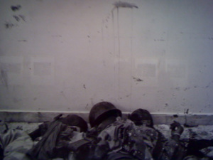
Bengasi, Libya March 2011 -
Dead Gaddafi soldiers lay in the morgue of Jalaa hospital, killed by rebels
The images were beautifully composed, and my favourite images are pictured above and below, where it is clearly seen that Anja has made use of the negative space in the photograph.
In the image above you are able to see the texture of the dirt on the wall contrasted with body shapes.
In the image above you are able to see the texture of the dirt on the wall contrasted with body shapes.
"I believe all journalists have the mission to inform as true and honest as possible" Anja Neidringhaus
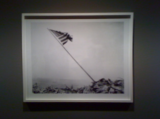
Images of Terror
The Images of Terror exhibition comprised of many different sections, spreading over more than one floor.
The images ranged from a masked man looking over a balcony o an airplace flying into a skyscraper. Hearing these descriptions, we immediately picture the scenes in our minds. We know exactly what events are meants. Pictures possess a tremendous power, and this is seen through the Images of Terror exhibition. Not only do they capture the decisive moment; they also influence public discourse, demanding reflection and response. Particularly after catastrophes nd traumatic events, the ubiquity of the images makes the events themselves seem more omnipresent, inescapable. Pictures of terror have an enormous, enduring power that holds the views in its thrall. They burn themselves deep into our collective memory, and this is exactly what this exhibition did to me.
Upstairs, along a corridor was the 9/11 exhibition. It consisted of hundreds of photographs hung in lines across the walls.
"Here is New York, a democracy of photographs."
It was shocking to see these images, because I had never seen any like them before. It was as if the papers only showed us the main event - the places, the smoke and the destruction. But these images seemed to be behind the scenes. It seemed in one particular photograph, that the person who was capturing the images of the crash suddenly turned round and snapped it's audience, who were in pieces. Another images was of a single leg on the pavement, and many of people standing on the balcony in their flat taking a picture against the burning sky.
September 11th is undoubtedly the most photographed event in the history of photojournalism. 95% of publications printed an image from 9/11 on their front page. Yet, despite the abundance, we still had the sensation of seeing the same thing over and over. And that was why it was so refreshing, and equally as shocking, to see images of this kind that I had never experienced before.
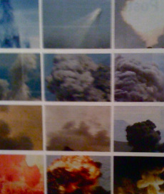
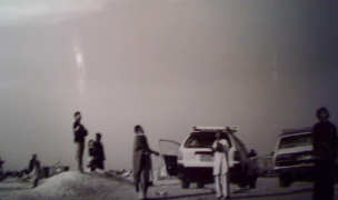
Images from the collection 'Smoke'
In another room were images collected like these ones. Some other titles were: 'cameras', 'police', 'flags', 'waste', 'xenophobia', 'urban', 'grief' and 'heat'. It was fascinating to see images collated in this way, and the way they were presented was beautiful.
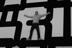
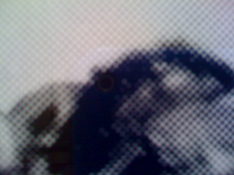
Above and below are the images of Michael Schirner. They are inkjet prints from the series 'BYEBYE'. What I found so great about these images was the way they were printed. As you stood close, the colour was made up of dots, as you can see below. In the colour prints, each colour, when stood far away, was made up of yellow, blue and red, only seen when stood close.
This is possible when you apply half-tone in Photoshop and you project the image with a patterned acetate.
This is possible when you apply half-tone in Photoshop and you project the image with a patterned acetate.
"Schirner uses digital photography in these images to negate every element in familiar images from the mass media that identifies their content. He robs the image of it's puncture."
