combinations and alliances
The exam theme we have been given is 'Combinations and Alliances'. The body of work presented here will be aimed at developing and realising ideas to create an outcome that displays the best of my potential.
visual collage
At the beginning of a project, it is always important to keep your mind open to many different ideas, and a good way of presenting this is through a visual collage, containing words, images and specific photographers who encapsulate your own ideas concerning the theme.
Below are two text-bases collages that I completed, using each theme work separately for inspiration.
Below are two text-bases collages that I completed, using each theme work separately for inspiration.
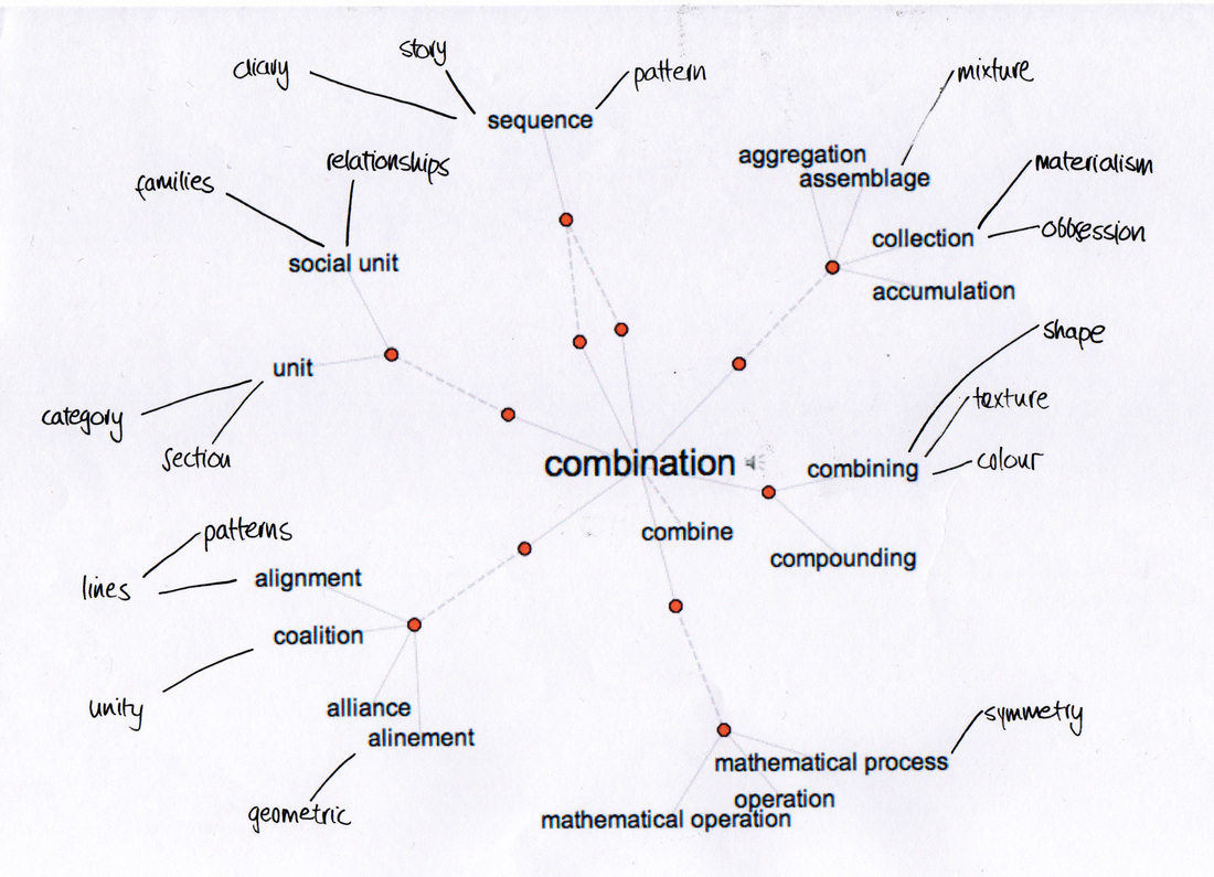
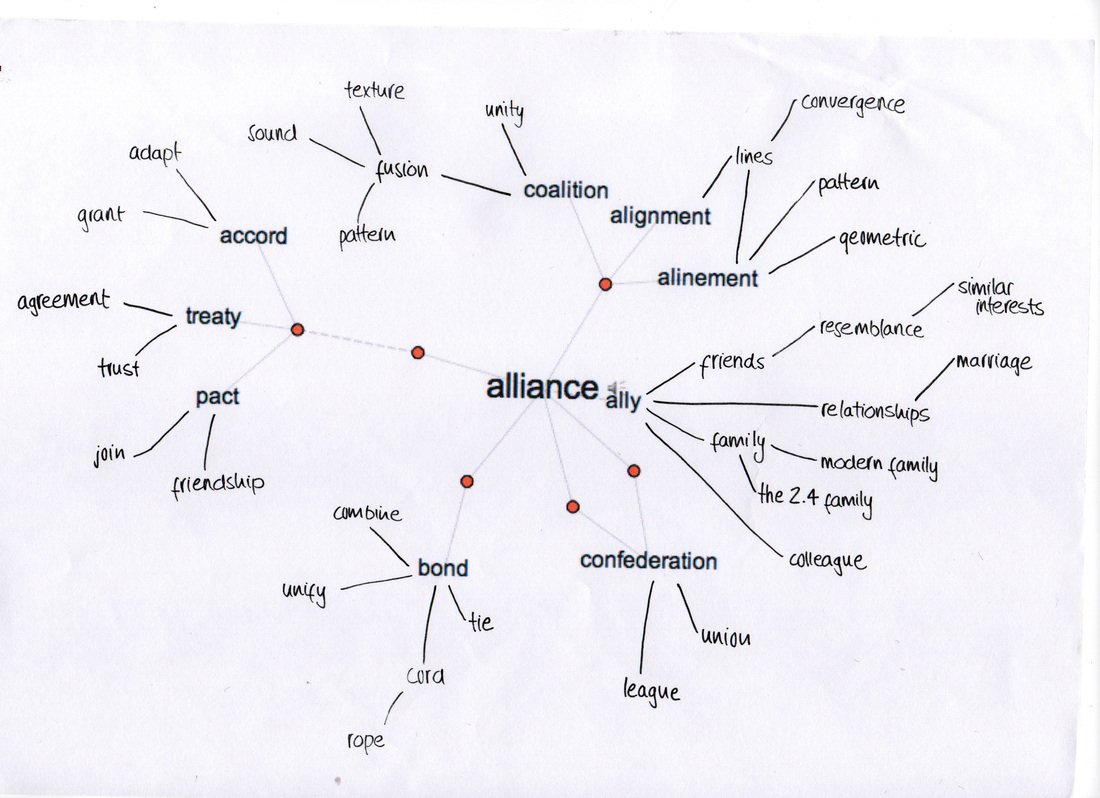
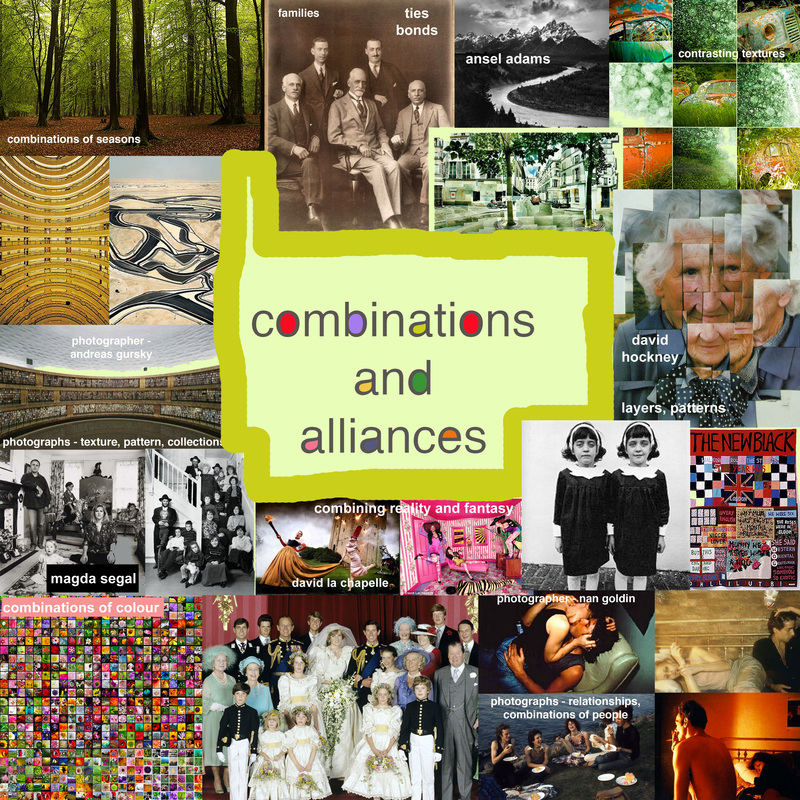
The next step was to begin including images to create a visual collage that would help to give me inspiration. Using photo gallery websites such as Flickr, I entered some of the words that I thought interesting regarding 'Combinations and Alliances' and used these images, and some photographers work, to create the visual collage below.
exhibition visit
The Saatchi Gallery - The Sunday Times Magazine 50th Anniversary
The Sunday Times was the first newspaper to launch its own colour magazine in 1962. The magazine turned innovative and fresh, capturing readers with its high quality of photojournalism and offering advertisers to showcase themselves within full colour pages. This exhibition showcased the work of many of the world's most famous photographers, including people such as David Bailey and Richard Avedon, as well as highlighting the massive contribution from writers such as Ian Fleming.
The Sunday Times was the first newspaper to launch its own colour magazine in 1962. The magazine turned innovative and fresh, capturing readers with its high quality of photojournalism and offering advertisers to showcase themselves within full colour pages. This exhibition showcased the work of many of the world's most famous photographers, including people such as David Bailey and Richard Avedon, as well as highlighting the massive contribution from writers such as Ian Fleming.
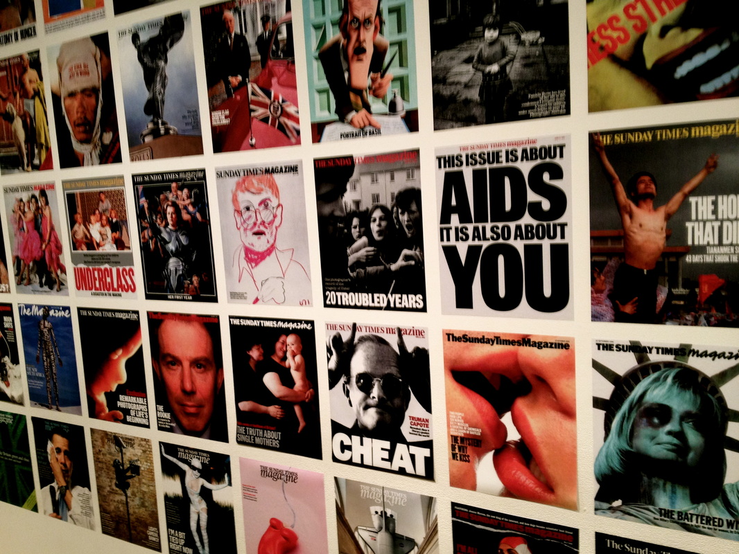
The exhibition itself found itself in two long white rooms on the upper floor of the Saatchi Gallery. Each photograph was presented on a black screen-like glass, rendering the quality and finish of the pictures regimented and beautiful. Each image was accompanied by a small sub-text, explaining why that image was so important in the magazine at the time. The photographed ranged from portraiture, to still life, to macro insect snapping, so was very beneficial for inspiring ideas.
There were particular images that caught my eye, whilst I was thinking about the theme 'Combinations and Alliances'. There were sequences of images, shown below, that seemed to capture the essence of a moment, through a series of images, almost like a story board.
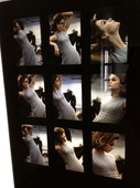
'Jean Shrimpton' by David Bailey, 1962
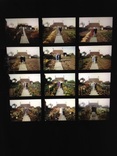
'English Country Garden' by Ken Griffiths, 1974
My favourite image of the whole exhibition is pictured above, named 'English Country Garden'. It depicts a year in the life of Mrs Sweetman's cottage garden in East Sussex. Each image illustrates the change in seasons. I thought it was a very striking image, as showed how the combination of colour (of the flowers), pattern (of the elderly couples' clothes) and lighting changed the atmosphere of each image, and aligned together, created a clear picture of the changing seasons, as if the image is alive with movement.
Images such as the two pictured above, gave me inspiration of how a sequence of photographs could remain within the realm of 'Combinations and Alliances', as moments are being combined on paper to create a vivacious sense of life.
Images such as the two pictured above, gave me inspiration of how a sequence of photographs could remain within the realm of 'Combinations and Alliances', as moments are being combined on paper to create a vivacious sense of life.
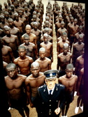
'Apartheid' by Abbas, 1978
Another image that inspired me was 'Apartheid', illustrated above. This striking image shows a white office, Colonel SJ Malan and his black recruits at the Hammanskraal police academy near Pretoria. What I liked about the image was the order and symmetry it held, each recruit having the same body stance and similar expression on their faces. An idea of regularity could be interpreted as being part of 'Combinations and Alliances', especially using the human body as the matching symbol, as each is an ally to the other.
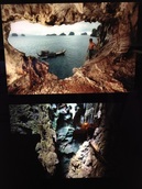
'Hunting Soup' by Eric Valli, 1990
Another image that caught my eye was 'Hunting Soup' by Eric Valli, illustrating a fishing boat passing the opening to a cave off the coast of southwest Thailand. Immediately, I observed the combination of different elements depicted; the air clashing with the still sea, which lapped onto the land of the caves. This clash of elements inspired me to perhaps pursue a similar theme in my personal study: the combination of elements and texture.
Exhibition visit
Pallant House gallery, Chichester - Various exhibitions
Whilst on a trip to Chichester during half term, I visited the local gallery, which was exhibiting many different things that I thought would be able to be used as inspiration for 'Combinations and Alliances'.
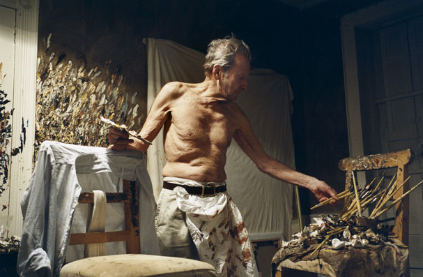
The first exhibition was by David Dawson, named 'Working with Lucian Freud', and displayed an extraordinary insight into the notoriously private world of the painter Lucian Freud through the eyes of his model and studio assistant David Dawson. the exhibition featured remarkable intimate photographs of the artist at work as well as his own rarely-seen paintings of the street outside his studio in Kensal Rise, placing them alongside drawings by Freud himself.
Whilst on a trip to Chichester during half term, I visited the local gallery, which was exhibiting many different things that I thought would be able to be used as inspiration for 'Combinations and Alliances'.
The first exhibition was by David Dawson, named 'Working with Lucian Freud', and displayed an extraordinary insight into the notoriously private world of the painter Lucian Freud through the eyes of his model and studio assistant David Dawson. the exhibition featured remarkable intimate photographs of the artist at work as well as his own rarely-seen paintings of the street outside his studio in Kensal Rise, placing them alongside drawings by Freud himself.
'Freud Working at Night' by David Dawson
Each image illustrated how Freud was so connected to his work, as if it was a true alliance. It gave ideas of photographing people working and completing tasks that they seem as if they are in their element with. The combination of the candid snaps and the deep, meaningful artwork that Freud was working on showed a double image that I thought was interesting.
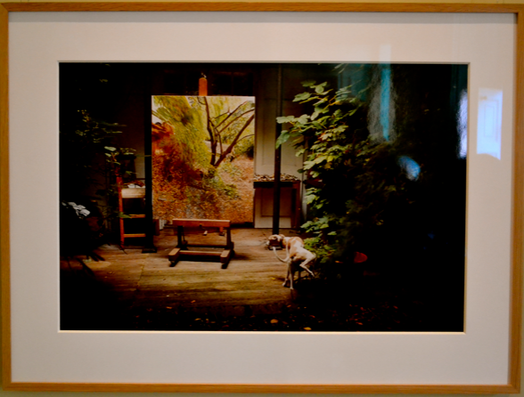
Whilst working, Freud combined elements of nature and earth into his habitat, as he believed this would help him further into imagining himself in the actual artwork.
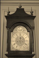
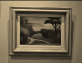
The resident exhibition at the Pallant House Gallery was spread through many rooms, and some specific pieces gave inspiration. Below are some of the images I saw and attached are a few key words that lead me to thinking about my own personal study.
The resident exhibition at the Pallant House Gallery was spread through many rooms, and some specific pieces gave inspiration. Below are some of the images I saw and attached are a few key words that lead me to thinking about my own personal study.
- Small things combined to form a much bigger thing
- The alignment of time and where it leads us in life
- Things 'working like clockwork'
- Structure
- Regimented
- The alignment of time and where it leads us in life
- Things 'working like clockwork'
- Structure
- Regimented
- Combination of seasons
- Elements
- Textures
- Colours
- Paths in life
- Different peaceful places for different people
- Elements
- Textures
- Colours
- Paths in life
- Different peaceful places for different people
- Order
- Structure
- Number
- Combination of colour
- Combinations of small things forming a bigger picture
- Structure
- Number
- Combination of colour
- Combinations of small things forming a bigger picture
personal response
Considering all of my research, visual collages and exhibition visits I set about to complete three begginning strands of response to the theme 'Combinations and Alliances'. At this early stage, it is important to keep a wide interpretation and to not focus solely on one idea, as other better ones could be close off as a result.
1
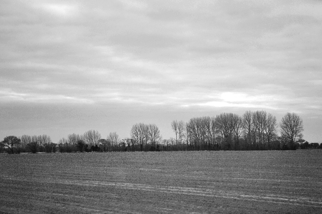
The combination of elements in a landscape.
My idea for this response came about when researching images for my visual collage, and exploring further into particular photographers work such as Ansel Adams, who captures beautiful combinations of the elements by capturing such things as powerful mountains against a bright sky. I thought about how the combination of elements work together to form a contrasting palette of colours, textures and shapes and then captured images of the countryside to convey this.


I then captured a short film to convey the theme of 'Combinations' even further, suggesting the combination of each single second of film to form an elongated landscape, which linked in with my earlier idea of small things combining to form something much more significant.
My short film showing the combination of elements in a landscape...
My attempt at an Ansel Adams landscape...
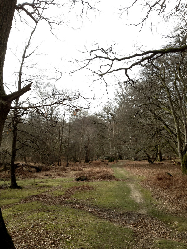
I then took another set of observations whilst walking in the woods in the New Forest, as I noticed such beautiful colours and shapes within the nature there. In these images I attempted to capture a combination of sky against earth, and the effect that these contrasting elements cause. I also thought that the images could suggest the theme 'alliance' and portrayed the alliance that nature has with itself, and the subtle intricacies which form something amazing.


What went well - In both sets of observations, I believe that the composition suits the image, and is supported by the editing that I chose to inflict - desaturation, heightened sharpness etc.
Even better if - I would have liked to have captured these images from different times of day, and shown how the landscape changes as the light and weather does, as this can show a combination of circumstances.
These observations gave me inspiration to try and capture an identical scene at different times of the day, and them combine the images.
2
The contrasting textures and patterns that appear in life.
The idea formed when looking at images by Andreas Gursky, who conveys pattern and order in his cluttered images. I wanted to try and take my own photographs which portrayed this idea of order through a combination of colours and patterns. This set of observations was taken in a Cathedral, as thought that the bright colours and heavily decorated windows and chandeliers would suggest this idea of combination well.


What went well - The setting was perfect to convey the idea that I had conceived, and the colours and patterns came up when photographing.
Even better if - The lighting in the cathedral was often low, and it would have benefitted the images to be taken with a tripod, to enable me to capture the highest detail and at the same time prevent blurring and under-exposure.
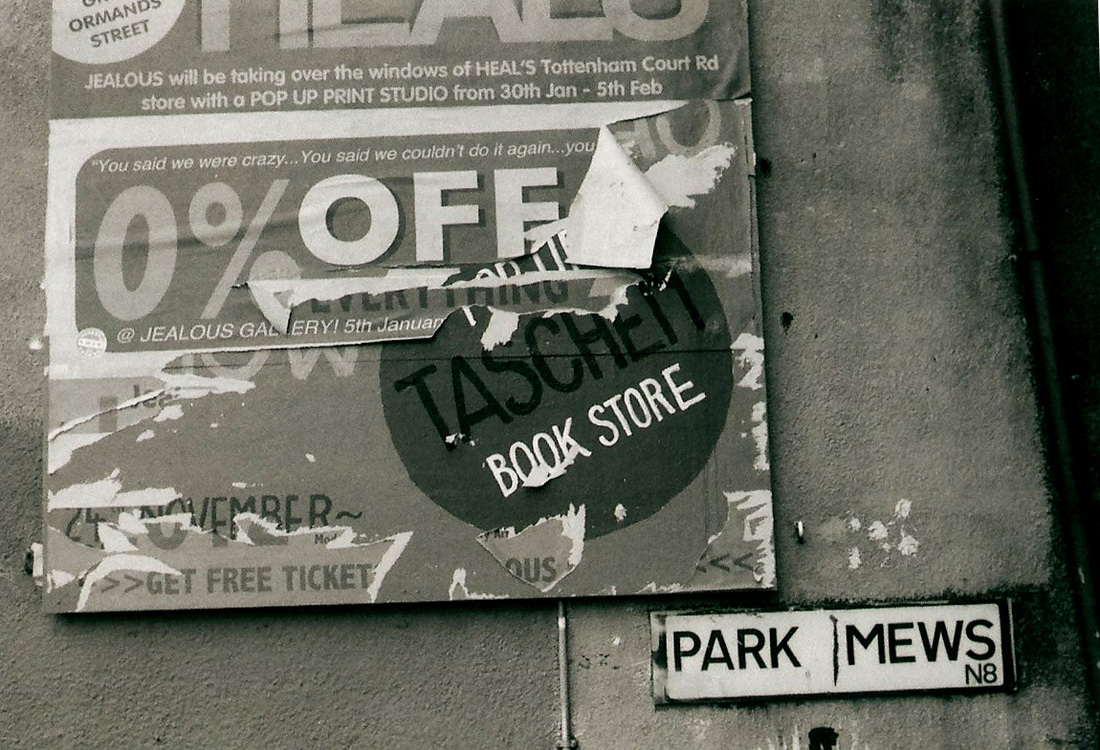
Below is another photograph I took on the manual camera of the contrasting patterns that are so heavily apparent in London. I like the image as has many different tones and the framing is slightly off-centre and works well with the idea of combinations of urban landscape.
Even better if - The lighting in the cathedral was often low, and it would have benefitted the images to be taken with a tripod, to enable me to capture the highest detail and at the same time prevent blurring and under-exposure.
Below is another photograph I took on the manual camera of the contrasting patterns that are so heavily apparent in London. I like the image as has many different tones and the framing is slightly off-centre and works well with the idea of combinations of urban landscape.
3
Combinations and alliances captured within a family portrait.
Through this idea, I wanted to explore combinations within a family portrait, such as the relationships between family members and also their pets. I wanted us to sit where we most felt as a family, which is in the front room on the sofa.


What went well - I like the background of the images, as this shows something about the family's identity, through photographs that present memories. My favourite photographs were those which were spontaneous, such as the communication between family member's and the pets!
Even better if - The lighting wasn't great, as I took the images late afternoon where the sun was rapidly fading. For this reason, I edited levels more than I wanted to, and this gave the images a slightly unfocussed unnatural feel.
Even better if - The lighting wasn't great, as I took the images late afternoon where the sun was rapidly fading. For this reason, I edited levels more than I wanted to, and this gave the images a slightly unfocussed unnatural feel.
inspiration
As I was looking through the photography books in class, I came across a book by Madga Segal called 'London at Home'. Hundreds of photographs were collected to create this book, each depicting a family in their personal environment, either in bedrooms or living rooms. Each image is highly interesting in its ability to convey identity of each family through simply their position, expression and the room that they have created to suit them. I found it interesting to look through the images and see what kind of families fit stereotypes, as each image was accompanied with a caption explaining the area they lived in and either their occupation, for example, 'Chelsea businesswoman' or 'Single mother', shown in the slideshow below. Although this book did seem to play up to stereotypes, it was fascinating to see each family, but I would take a different approach to by not accompanying them with stereotypical captions to make for a fairer image.
Class tasks
In class, we completed a number of tasks which would help us to gain wider knowledge and realise our own personal study based on 'Combinations and Alliances'. We rotated around four of the set tasks and completed our own work on them, each inspired by a photographer.
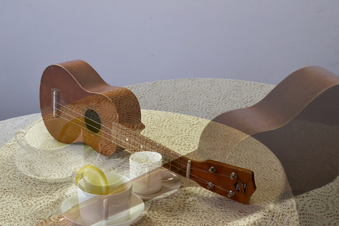
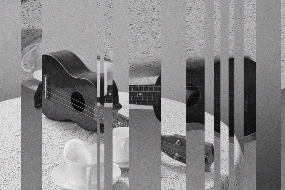
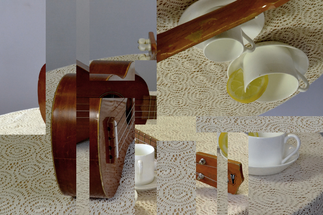
1 - Cubism
1 - Cubism
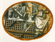
For this experiment, we had to compose a 'cafe scene' out of some of the objects provided, and capture this scene from as many angles as possible, and to then later later these images to provide a cubist-like creation, such as the Picasso seen above. For this, we used natural light and a reflector to gain the sharpest images possible.
For the image below, I layered two images and changed the opacity of one to create a translucent double layered effect that creates depth and texture, similar to Picasso's.
For the image below, I layered two images and changed the opacity of one to create a translucent double layered effect that creates depth and texture, similar to Picasso's.
In the image below, I converted both the chosen images to black and white, and added a filter of noise to produce an old, manual-camera-like effect. I then flipped one of the images, layered it on top of the other and took separate pieces out in strips.
In the image below I chose four of the 'cafe-scene' images, edited them to increase contrast and balance levels, and then layered them. I then proceeded to take out pieces of image to reveal the layer underneath. I did this until I felt I was happy with the image, and this was the outcome!
2 - Letinsky
Laura Letinsky presents objects juxtaposed in the domestic environment within the genre of still life. Crucial elements we had to think about when composing a Letinsky composition were minimal colour, natural lighting, folds and creases, imbalance and precarious objects.
As a supplement to the natural lighting in the room, the studio lights were used, to create higher contrast in colour and cleaner whites.
As a supplement to the natural lighting in the room, the studio lights were used, to create higher contrast in colour and cleaner whites.


What went well - I enjoyed composing the images and framing them. It was interesting to explore different angles to the photographs, and I did so with the help of a tripod.
Even better if - The quality of the photographs would be improved if I had set a 2-second timer on the camera, as then I would have been able to click the shutter, and step away without my hand moving the camera. The light could also have been heightened, as in some places the images appear under-exposed.
Even better if - The quality of the photographs would be improved if I had set a 2-second timer on the camera, as then I would have been able to click the shutter, and step away without my hand moving the camera. The light could also have been heightened, as in some places the images appear under-exposed.
3 - Fischli and Weiss
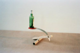
Fishchli and Weiss balance everyday objects in interesting positions to create a combination of colour, balance and texture. Below are some images in which I attempted to create a similar effect. I positioned the objects on windowsills, as this was the best form of natural light that I could find.


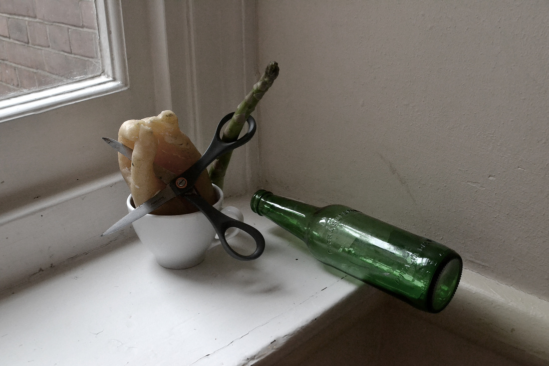
What went well - I edited the images to reduce colour, and I think this suited them well, as made them more similar to the original images. In the first two images, I tried to keep the composition very simple, and I think that this made for the best images.
Even better if - The background of the images could have been improved to become more similar to the original images, although then light would have been restricted. Perhaps more interesting composition could have been created if there was a greater range of objects (and if I had better balancing skills!)
Even better if - The background of the images could have been improved to become more similar to the original images, although then light would have been restricted. Perhaps more interesting composition could have been created if there was a greater range of objects (and if I had better balancing skills!)
4 - Blossfeldt
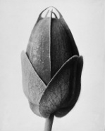
Karl Blossfeldt was a German photographer, teacher, sculptor and also artist who worked in Berlin. We took inspiration from his extreme close-up photographs of plants and living things and attempted to create our own. As can be seen, our objects were slightly less beautiful than Blossfeldt's, but were still very interesting to photograph! We used the rostra to photography the vegetables and below are the photographs that I took...


What went well - The lighting was sufficient to produce enough detail in the images. The black and white effect also suits the images very well, and I did this by editing the green levels when choosing the black and white option on Photoshop. I also increased contrast to make the object stand out against the background.
Even better if - Perhaps I could have taken some of the images from different angles, as they are all from relatively the same positioning. I could have also extended my observations and grouped objects together.
class experiments
In class, we carried out four experiments that fit well with the theme of 'Combinations and Alliances', as each combined different chemicals and elements to form brand new reactions. The experiments are listed below with the images of the reactions.
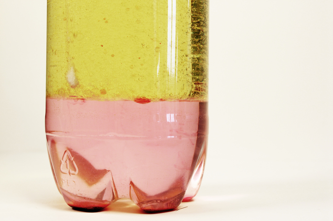
Experiment 1 - 'Lava Bottle'
In this experiment, we had to fill a water bottle about three-quarters full with vegetable oil, then fill the rest with water. We then added about ten drops of food colouring, which glided through the vegetable oil to the water at the bottom, and turned it a darkish pink colour. We then divided an Alka-Seltzer tablet into eight pieces and dropped a couple into the mixture. The combination of the tablet and the oil started bubbling like lava, and pink bubbles began to rise to the surface. Below are the images that I captured of this experiment...
In this experiment, we had to fill a water bottle about three-quarters full with vegetable oil, then fill the rest with water. We then added about ten drops of food colouring, which glided through the vegetable oil to the water at the bottom, and turned it a darkish pink colour. We then divided an Alka-Seltzer tablet into eight pieces and dropped a couple into the mixture. The combination of the tablet and the oil started bubbling like lava, and pink bubbles began to rise to the surface. Below are the images that I captured of this experiment...
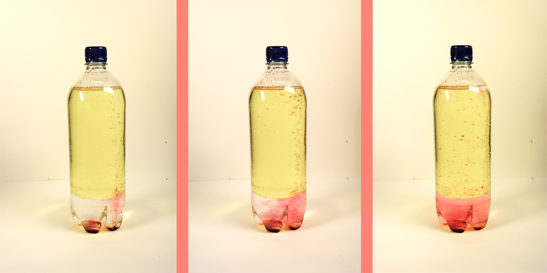
Camera settings
Shutter speed: 1/125
ISO: 100
Shutter speed: 1/125
ISO: 100
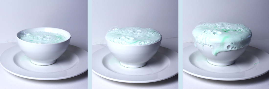
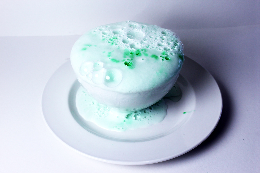
Experiment 2 - 'Magic Potion'
For this experiment, we set up the lights facing a white surface and background of card. Into the bowl we put some vinegar, to fill up about a third. We then added a few drops of green colouring, one tablespoon of washing-up liquid and three table-spoons of baking soda. The mixture commenced to bubble and rise out of the bowl, and below are the images that I captured of this reaction.
Camera settings
Shutter speed: 1/125
ISO: 400
Shutter speed: 1/125
ISO: 400
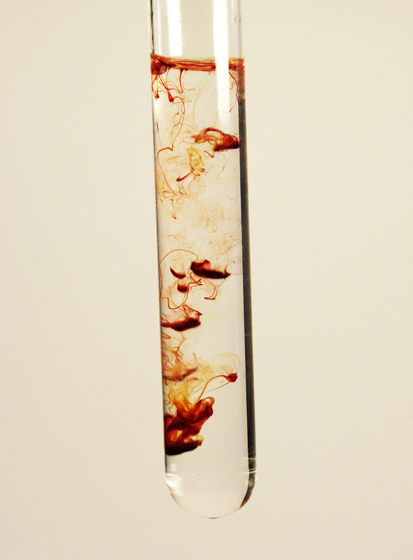
Experiment 3 - 'Food Colouring in Water'
In this experiment, we set up a test-tube in the rostra, and made sure the lights were positioned so that there was no shadow on the clean white background. We filled the test-tube with water, and very slowly, using a plastic syringe, squeezed small drops of food colouring into the water. The camera was set to a fast shutter speed to ensure that as much of the reaction was seen as possible. In the second photo, we combined food colouring of yellow and red to form an orange-y, fire-y combination.
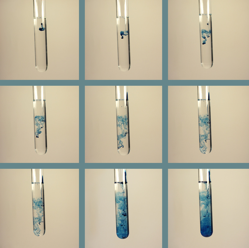
Camera settings
Shutter speed: 1/250
ISO: 400
Shutter speed: 1/250
ISO: 400
Experiment 4 - 'Coloured Milk'
For this experiment, we poured a very small amount onto a plate, just enough to make sure there was a very thin covering on the bottom. We then added a large drop of each food colouring into the milk as quickly as possible, because as soon as the colour was added, it began to merge with the milk. We then covered the end of a cotton bud in washing up liquid and placed this in the middle of one of the colours. After the merging had fully happened, I used the cotton bud to merge all of the colours to form a space-like colourful mess. The photos are shown below...
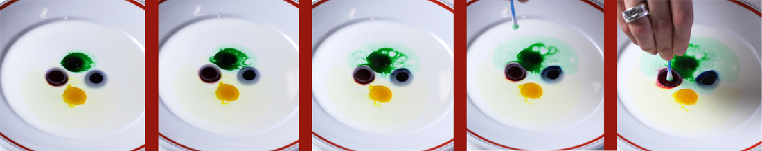
Camera settings
Shutter speed: 1/125
ISO: 200
Shutter speed: 1/125
ISO: 200


exhibition visit
'Lines of Thought' at Parasol Unit Foundation'
I wrote a review for www.artlyst.com about an exhibition I was asked to visit. Luckily enough, I thought the exhibition was highly relevant to 'Combinations and Alliances'. I have posted the review below.
I wrote a review for www.artlyst.com about an exhibition I was asked to visit. Luckily enough, I thought the exhibition was highly relevant to 'Combinations and Alliances'. I have posted the review below.
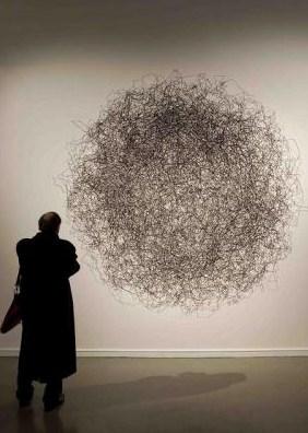
‘Lines of Thought’ is the current exhibition at Parasol Unit (that beautiful space in Angel with brick walls and high ceilings), and presents an ensemble of work from 15 contemporary artists, from the 1960s to the present, each of whom use line in innovative and imaginative ways. From endless parallel lines, to intangible messes of squiggles, it seems as if these artists really have thought of it all, pushing line to its near limit.
Each piece is presented on the flat white walls of the Parasol, so that standing in the centre of every spacious room gives you a panoramic view of the often large and mind-boggling pieces. In the first room a ten-foot intricate painting of a fishing rod on canvas stands aside smaller box frames containing delicate drawings, reminding one of difficult shapes drawn in geometry. The room is further populated with other large-scale, using a variety of different materials, from thread to wire, each presenting a different interpretation of line and its use.
One piece that really stands out is Hemali Bhuta’s ‘Stepping Down’ – an overwhelming cluster of candles, hanging from the ceiling like stalactites. This work is a particularly interesting and extravagant way to present lines, extending them down almost to touch the floor, so that standing underneath the artwork felt as if you were amongst the candles themselves.
On the first floor, an incredible structure of yellow steel protrudes out of the wall and forms (when the viewer is stood in the correct position) an impossible optical illusion, in which a cube is created out of the air itself. It is by the artist Fred Sandback, and remains ‘Untitled’. But so real and enticing was the effect that I was even tempted to try and crawl through it! In direct contract, the opposite wall presents itself with far more abstract pieces: paint smeared across canvas and impossibly delicate lines drawn directly onto the wall; these appeared from afar as cracks, and remained still and flat even when up close.
Although the exhibition is mainly art and sculptural, hand drawings (and a solo photograph) are also scattered about, meaning that there is something for everyone (especially good me, who likes to delve into as many creative medias as possible!). I found the exhibition thoroughly enjoyable, and thought it works well to have such a diverse mixture of work standing aside one another, united only in their investigation of line – that most elemental of artistic vocabulary. The exhibition gives room for much interpretation, and will certainly get you thinking.
stop-motion animation
In class, we used a special camera that connected to the Mac to film our very own stop-frame animation. Each shot had to be taken with the camera, and then the object being pictured had to move very slightly to form the next frame. We chose objects that we thought would work well with the software, and below is the final outcome!
What went well - Me and my partner worked well together to create a relatively streamlined piece! The storyline may be slightly sadistic, but we made good use of the props available and created an interesting film...
Even better if - If we had more time, it would have been beneficial to lengthen the film and perhaps utilise more equipment, as it would have been interesting to see what the effect of using water etc was.
Even better if - If we had more time, it would have been beneficial to lengthen the film and perhaps utilise more equipment, as it would have been interesting to see what the effect of using water etc was.
combinations of movement within water
In this photograph, I combined four images that I had taken of water running into bubbles. I thought that it related through the combination of chemicals and water, and also through the combination of images put together to form one piece.
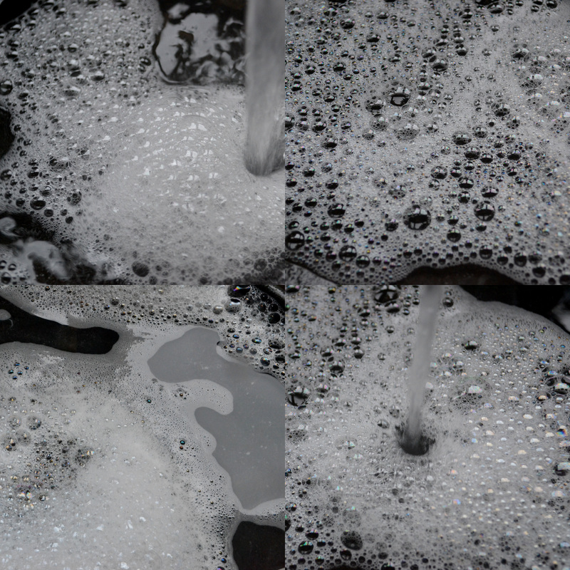
What went well - The quality of the images is high, as I managed to capture enough light with the fast shutter speed I was using. I also think that I edited the images to suit the style, them being slightly desaturated. I then composed the four images to sit together without looking too out of place.
Even better if - Perhaps more images could have been taken, and combined in a different way. For example, I could have utilised some of the techniques that I learnt in the Cubism class task, such as translucent layering and collage.
Even better if - Perhaps more images could have been taken, and combined in a different way. For example, I could have utilised some of the techniques that I learnt in the Cubism class task, such as translucent layering and collage.
alliance between me and the ground
For this set of observations I took images of the ground that I walked on in one day. This links to the theme 'Combinations and Alliances' because not only shows an alliance between the ground and movement, as of course we would not be able to walk without the support of the ground beneath us, but also the combination of images in a set such as this, to suggest a journey or story.


What went well - I like the variety of texture and colour in the images, as this provides good contrast when presented together in a set. I also like the framing of each image. The images hardly needed to be edited at all, which is always beneficial, as means they already contain the right amount of colour and contrast.
Even better if - I would like to extend this set and take more images, perhaps one every time the ground changed, as this would really track a journey, and tell a story. Also, if I took another set of these observations then I would make sure I was directly above the ground that I was capturing.
Even better if - I would like to extend this set and take more images, perhaps one every time the ground changed, as this would really track a journey, and tell a story. Also, if I took another set of these observations then I would make sure I was directly above the ground that I was capturing.
alliance between me and my camera
For this experiment, I took a photograph for each transition that I went through during the day, to form a visual diary of events. The photos below attempt to show my journey through the day...


What went well - I think as a set, the photos work well together as complement each other through colour and composition. There is a good variety of angles, subjects and lighting which renders the set interesting to look at. The quality of the images is also high.
Even better if - Perhaps the images could have been more structured, for example framing each image with a square crop, or had a time scheme to support the images, such as one per hour, or half hour, as this would have made the frame of the day clearer.
Even better if - Perhaps the images could have been more structured, for example framing each image with a square crop, or had a time scheme to support the images, such as one per hour, or half hour, as this would have made the frame of the day clearer.
Alliance of light and time
In this set of observations I took photographs of two interesting trees which appeared on my walk home each day. I wanted to capture how the combination of light and and time can completely change the feel of the picture. I took the images when I felt the sky looked dramatic and interesting.


What went well - I found it difficult to keep the framing of the images exactly similar, as I did not have a specific point on the road in which I took every photo from, and had to judge the positioning from previous photos. I also think that I could have, if more photographs were taken, import them into a stop-motion animation, as then the changing light could be clearly seen.
Even better if - I could have used a tripod to make sure that my images were consistently framed, and mark a point on the road in which my photograph would always be taken from.
Even better if - I could have used a tripod to make sure that my images were consistently framed, and mark a point on the road in which my photograph would always be taken from.
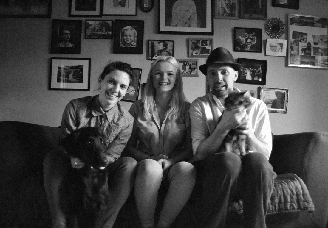
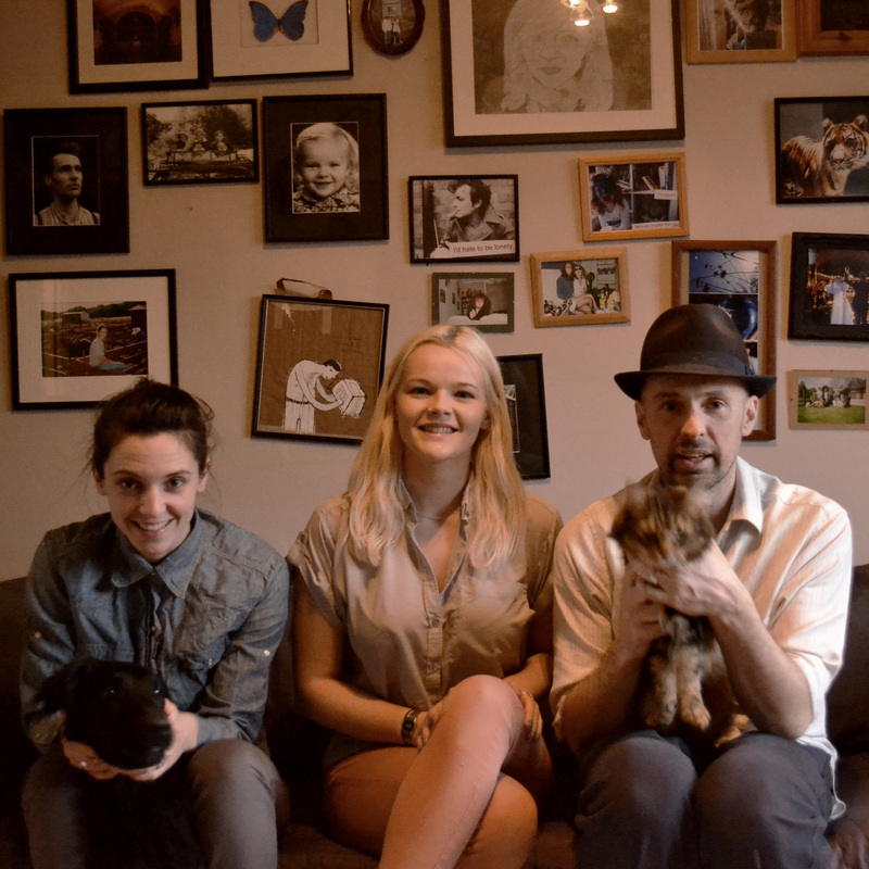
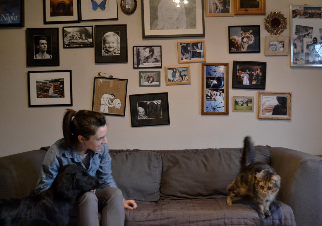
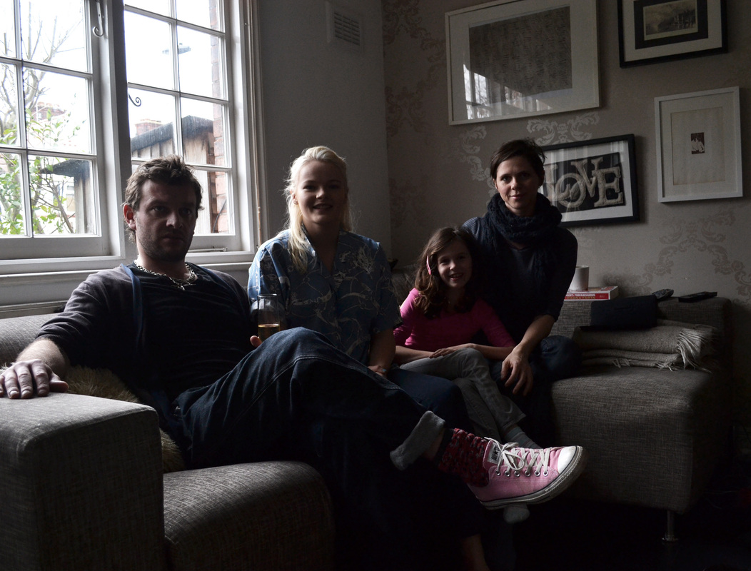
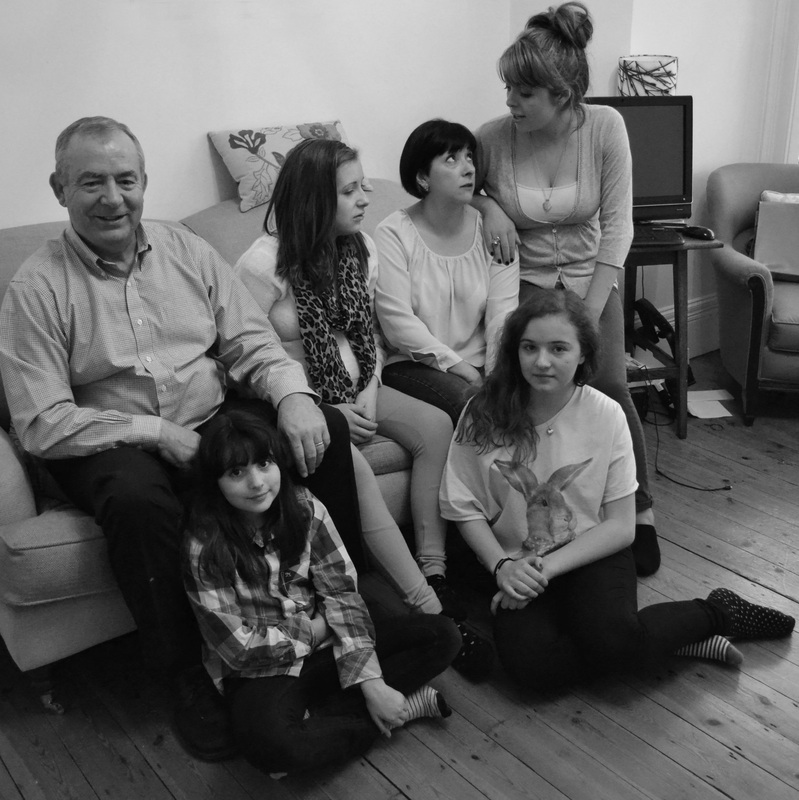
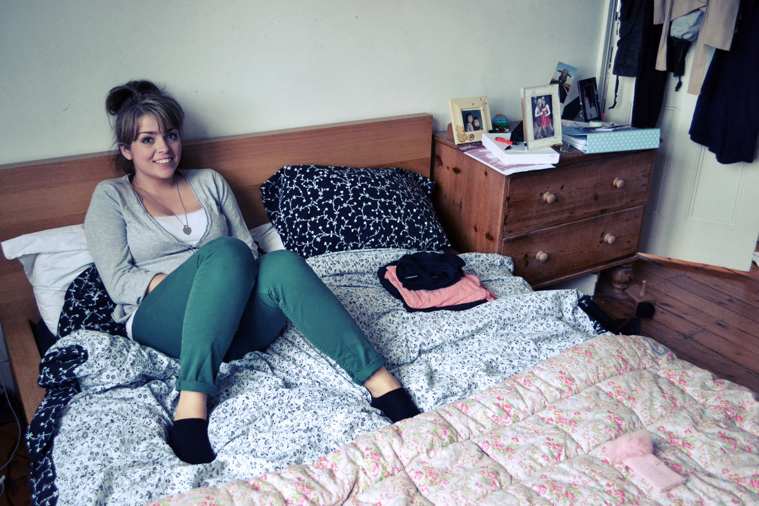
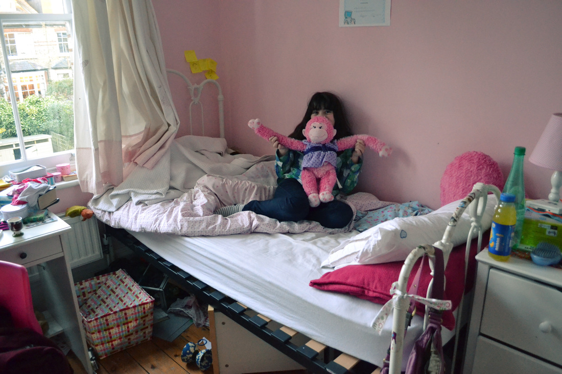
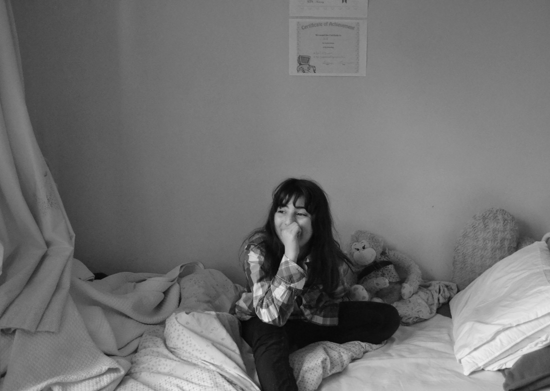
Family - first set of observations
I decided that I would begin to explore the idea of combinations within families, and the alliance that I have with my family. Below are images that I took on the manual camera to show how my family interacts and what the internal relationships are like.


What went well - The manual camera has given a nice effect to the images, rendering them detailed and with contrasting tones. I like the images of my younger sister best; as I believe they convey an appropriate sense of relationship between me and her, the special alliance that siblings have together.
Even better if - Many of the images I took were underexposed, or slightly blurry, and this has shown me that is perhaps too difficult to photograph spontaneous family moments with a manual camera, as it takes far too long to adapt the settings whilst on the move!
Even better if - Many of the images I took were underexposed, or slightly blurry, and this has shown me that is perhaps too difficult to photograph spontaneous family moments with a manual camera, as it takes far too long to adapt the settings whilst on the move!
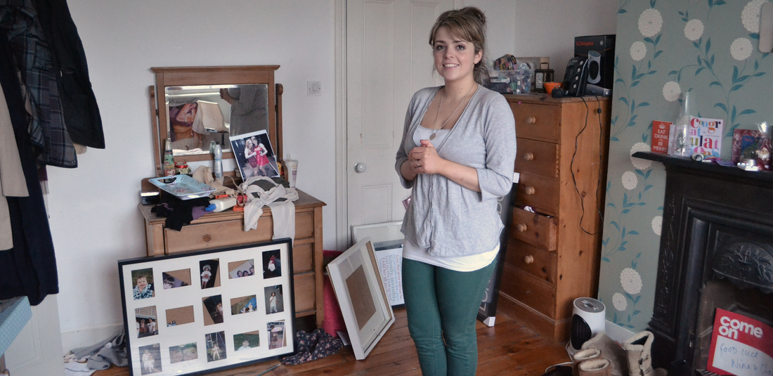
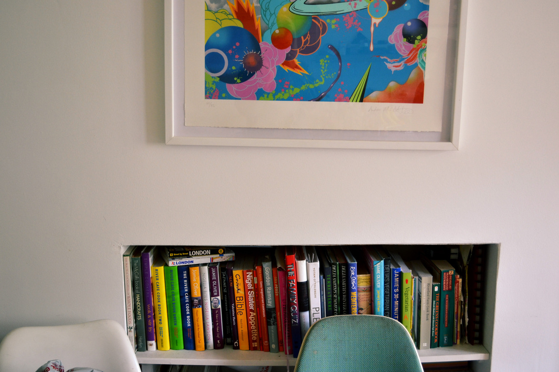
family - Second set of observations
After photographing my family for a portrait in one of my initial strands of work, I decided to take pictures of the house without anyone in it to explore whether a family's identity can be shown through the combination of their material items. In this set of observations I captured the house in its stillest form. My main aim was to determine whether a family's alliance with their home can convey their character's.


What went well - The images capture what needs to be shown, and present an idea of what the family that lives inside the house are like. The combination of colours, textures and shapes presented in the images convey the alliance of a family to their own living environment.
Even better if - To improve, I would focus on particular parts of the home that the family has made their own. For example, collections of family photos and objects that show the alliance between family and their home.
family - third set of observations
In this set of observations I focused on more detailed parts of the family home, ones that the family has attempted to make their own, by adding personalised touches. This could be anything from images to possessions that the family has collected and holds special to themselves. So for this set, I took pictures all around the family home, and tried to discover personal touches that conveyed the identity of the family and portrayed an alliance of family and home.


What went well - I think that the range of photos is good, as I explored the house as much as possible to find moments that the family had left. The colours themselves in the images portray a sense of identity in the family.
Even better if - To improve on this set of observations I would perhaps take quotes from the people living in the house to layer over the top of the images, to give an even clearer sense of the family's identity. I have seen photographs with this idea - those of Martin Parr.
Even better if - To improve on this set of observations I would perhaps take quotes from the people living in the house to layer over the top of the images, to give an even clearer sense of the family's identity. I have seen photographs with this idea - those of Martin Parr.
family - fourth set of observations
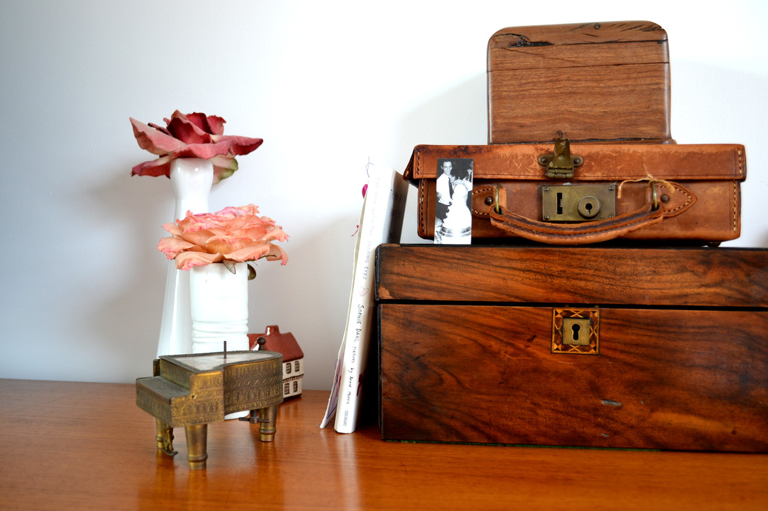
In this set of observations I gathered together objects that represent my family; ones that are special to us, or present a memory that we all share.
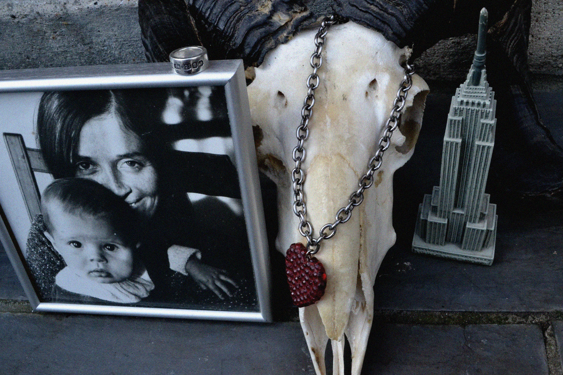


What went well - The clarity and exposure in the images is balanced, as I made use of the natural light outside that day. I chose to photograph each still life against a neutral background of slate and bricks. The objects I chose complemented each other in colour to present another aspect of the family's identity, through subtle and similar colours.
Even better if - This set of observations could have been developed by creating more arranged objects. I could have explored my house further to uncover old family photos. If I was to carry on with these sets of observations I would interview my family and find their favourite objects, or one that tells a story about the family.
Even better if - This set of observations could have been developed by creating more arranged objects. I could have explored my house further to uncover old family photos. If I was to carry on with these sets of observations I would interview my family and find their favourite objects, or one that tells a story about the family.
family - fifth set of observations
This set of observations was to develop on the first images that I took at the beginning of my project. On one day I went round to different houses to photograph the alliance/combination of family members within a portrait. I also photographed particular parts of the family home which I thought presented the alliance of family and home well.
the lawrence family


What went well - In the unedited set of images there were a few unguarded moments that I thought worked well. The lighting was also very dramatic so suited the images and made the contrast interesting.
Even better if - As I had to use self-timer to photograph my family, it meant that the framing was not perfect and some parts were cut off so that many of my photographs were unusable. I also felt that to improve I would tidy the background somewhat, not so much so that the family's identity was hidden, but so that trivial objects were not taking away from the focus of the family members.
Even better if - As I had to use self-timer to photograph my family, it meant that the framing was not perfect and some parts were cut off so that many of my photographs were unusable. I also felt that to improve I would tidy the background somewhat, not so much so that the family's identity was hidden, but so that trivial objects were not taking away from the focus of the family members.
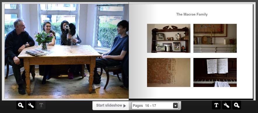
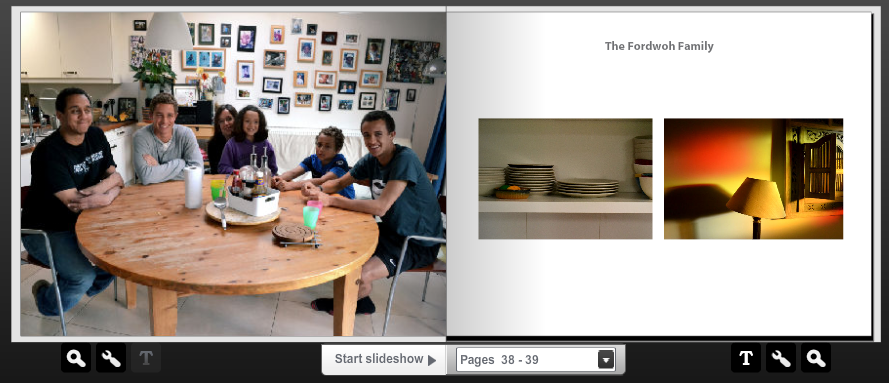
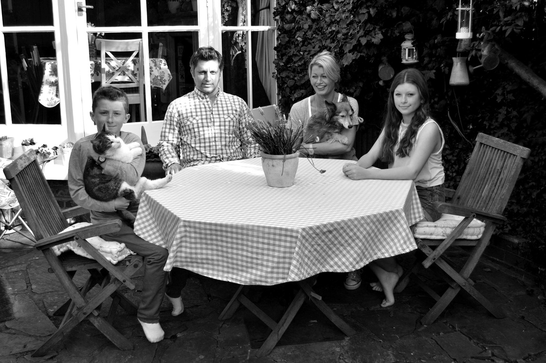
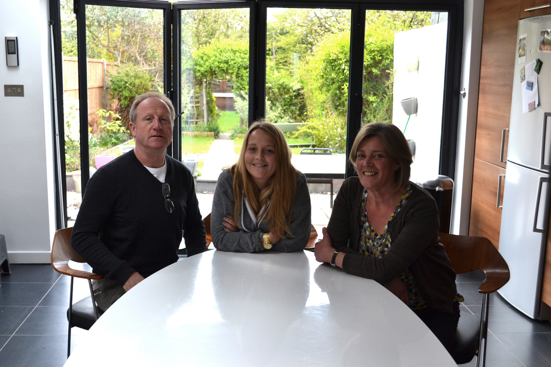
the macrae family
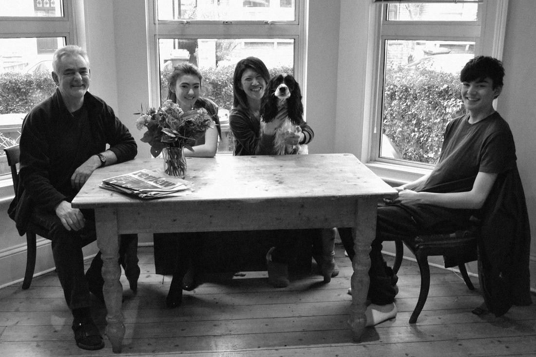
In this set of observations I went and photographed my friend's family, and of course their dog, who is a very important part of the family also! I chose to position them somewhere that they most felt at home, and for them this was in the kitchen, round the table. My favourite images are those that happen spontaneously, between shots, and so when taking more family portraits I will make sure to keep my shutter snapping throughout!


What went well - The light in the images is good, as the three windows let in a lot of light, and although they are backlit, much light reflects off the table to show their faces.
Even better if - I positioned the flowers and the newspapers at what I thought was an appropriate angle, but when looking back through the images, at some points these objects disturb the position of the models, which frustrates me somewhat, and so I think I will take this set of observations again, to improve on the composition and make sure nothing is drawing attention away from the family.
Even better if - I positioned the flowers and the newspapers at what I thought was an appropriate angle, but when looking back through the images, at some points these objects disturb the position of the models, which frustrates me somewhat, and so I think I will take this set of observations again, to improve on the composition and make sure nothing is drawing attention away from the family.
In this set of observations I focused on small parts of the Macrae family home that convey their identity and suggest subtle parts of memory and family history. In these images I focused mainly in the kitchen, as that is where I was told they feel most at home, so wanted to capture parts of that space to see how they had suggested an alliance of family and home.


What went well - I like the composition and framing of the photographs. I also like the pieces captured, particular objects and colours standing out. As the images were taken in the kitchen, it meant that light was used to an advantage and reflects off many of the objects well.
Even better if - In the middle photograph, of the map, there was hardly any light as was taken in the hallway and this rendered the photograph without enough information to make it clear. I would like to take this image again if re-photographing the Macrae family.
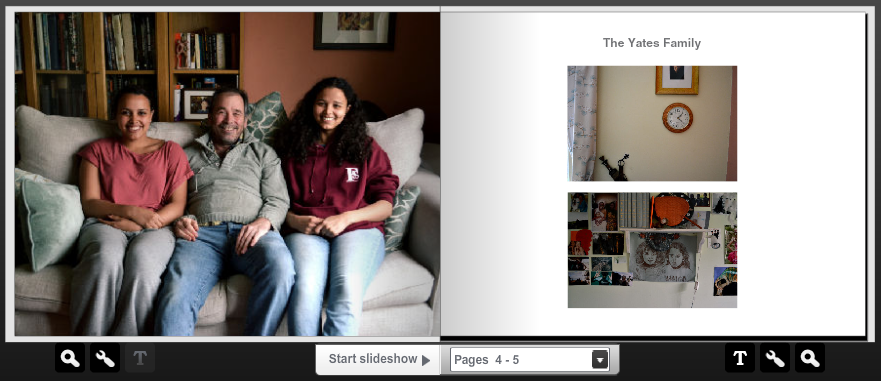
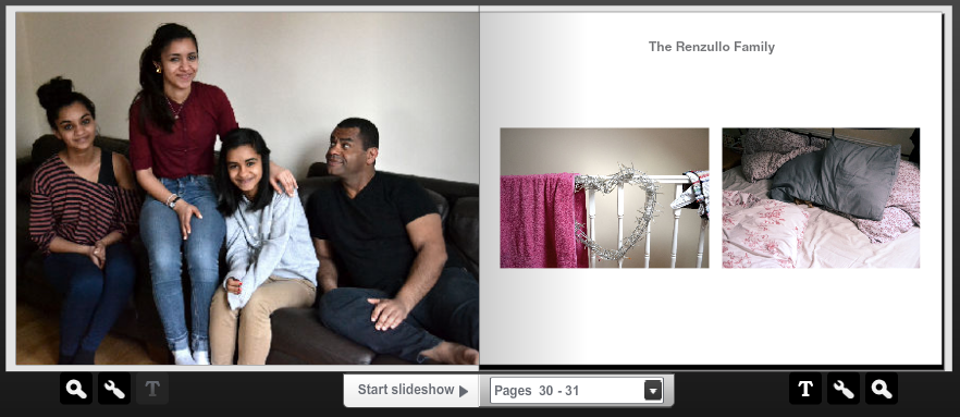
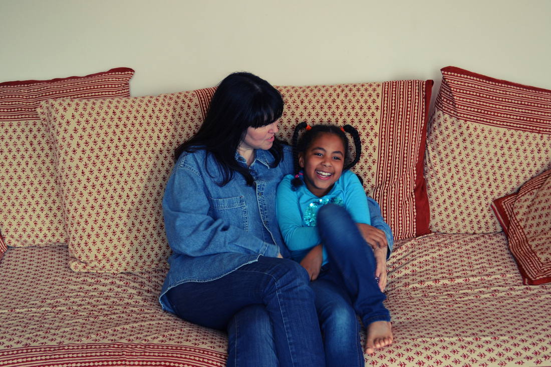
the renzullo family
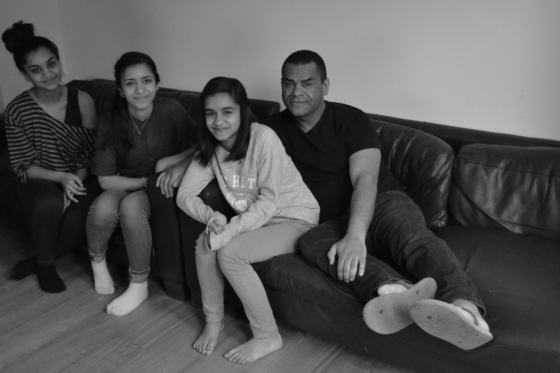
My next stop was photographing the Renzullo family, which made a good contrast to the Macrae's as wasn't the classic 'nuclear family', but instead contained a father and his three girls. Similarly to my first observations photographing family, I found my favourite images were those which captured the unguarded moments, in particular the last image where the father looks upon his eldest girl with a genuine look of love.


What went well - The light streamed through the large windows of this particular living room, which meant that the images were very high in quality and meant that the family were able to move around freely without causing a blur in the image.
Even better if - To improve, I would change around the positioning of the family, as an exploration of different compositions could benefit the image and perhaps create a more natural portrait.
Even better if - To improve, I would change around the positioning of the family, as an exploration of different compositions could benefit the image and perhaps create a more natural portrait.
In these pictures, I explored the Renzullo house all over, as it was a large house I wanted to go into every room to find moments to capture. There were many spaces that were cluttered with photos and family objects, so this worked very well for my intentions.


What went well - In the first image, I edited it to contain a slightly cross-processed feel, and I believe that this complemented the photograph well. The lighting was often quite dramatic which made for interesting photographs also. I really like the top photograph as it appears very still, and the muted colours and interesting composition make it an unusually beautiful image. This, I believe, perhaps shows that family best, as could be seen to be a metaphor of love remaining, despite things that seem to cover it in everyday life.
Even better if - The light is sometimes quite low, which means that the photographs are often not as clear as they could be. If taking these images again, I would make sure that the best light was made use of.
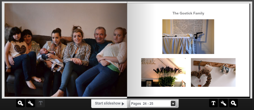
the gostick family
In this set of images, I took inspiration from Magda Segal and decided to crop these images to fit a square format. As the Gostick family is quite large, this worked well, as there was only often small spaces for them to sit on!


What went well - The lighting in the images was soft, and I put on a warming filter to get rid of any unwanted bluish tones. I also desaturated the images slightly, as I though this complemented them well. My favourite images, once again, were those which appeared spontaneous and unposed, such as where the family are looking or talking to each other.
Even better if - The background for this set of images was not as clean as it could have been. For example, there is a television set in the background, and in the un-cropped landscape images the doorway can be seen. I would like to photograph this family again, as I believe they are interesting, but would definitely ask them to seat themselves in a different position, perhaps at the kitchen table, as there is lots of light and a nice background.
In these images I explored the very large house and took a combination of pictures from the kitchen, bathroom and some of the bedrooms. I tried to get a wide range of different places captured as they are such a large family who fill the house so well, and I wanted to convey this through my images!


What went well - I used a cross-processing technique in one of the images, and I like the effect of that. The colours in each image complement each other well, some images remaining warm, and some creating a cooler effect.
Even better if - I could have taken more images, perhaps ones of more subtle moments in the house, as these images are of quite obvious sections of the house. For example I could open a draw in a room and photograph what is inside.
Even better if - I could have taken more images, perhaps ones of more subtle moments in the house, as these images are of quite obvious sections of the house. For example I could open a draw in a room and photograph what is inside.
family - sixth set of observations
The alliance of a person and their bedroom
In this set of observations I decided to take a slightly different track and photograph family members in their rooms, so show an alliance of a person and their room. Often a person's room conveys lots about their personality, through the combination of photos and objects which hold specific memories. Other things can also be interpreted from someone's room, like for example a tidy room suggesting a neat person or a bright room suggesting a bubbly character.
In this set of observations I decided to take a slightly different track and photograph family members in their rooms, so show an alliance of a person and their room. Often a person's room conveys lots about their personality, through the combination of photos and objects which hold specific memories. Other things can also be interpreted from someone's room, like for example a tidy room suggesting a neat person or a bright room suggesting a bubbly character.
What went well - I like the interesting composition of some of the images, such as the square one showing simply the subject's face and a picture frame filled with images above. I enjoy taking photographs including much negative space, as I believe that this makes sure that only the very important aspects are contained within the photograph, and makes sure that the audience of the photograph has to use their effort to determine the meaning of the photograph!
Even better if - If I was to continue with this set of observations I would perhaps develop on the thin landscape images, and perhaps create a panoramic view of each room. This effect could be created on photoshop by layering images.
family - seventh set of observations
Combining image and text, inspired by Martin Parr's 'Sign of the Times'
The next step from this set of observations is to continue taking more family portraits, as perhaps for my final idea I would create a book of portraits and moments of character seen through the family home. I would also like to pursue the idea of aligning text with the images, such as Martin Parr did in his set, 'Sign of the Times'. I would take quote from the families whose home I have photographed and present them under the image itself. An example of a Martin Parr photograph is shown below...
The next step from this set of observations is to continue taking more family portraits, as perhaps for my final idea I would create a book of portraits and moments of character seen through the family home. I would also like to pursue the idea of aligning text with the images, such as Martin Parr did in his set, 'Sign of the Times'. I would take quote from the families whose home I have photographed and present them under the image itself. An example of a Martin Parr photograph is shown below...
Here are my own attempts at a Martin Parr alliance of image and text to do with the family home...

family - eighth set of observations
Windows
After taking a photograph out of a window as part of my Martin Parr experiment, I decided that I would explore this type of photograph more, as I thought it was a suitable digression to my project. The alliance between a family and their home can also be seen through their surroundings, and what they see outside of their windows. Therefore, I took a set of observations based on this prospect of the alliance of a family and their surroundings. The photographs can be seen below...
After taking a photograph out of a window as part of my Martin Parr experiment, I decided that I would explore this type of photograph more, as I thought it was a suitable digression to my project. The alliance between a family and their home can also be seen through their surroundings, and what they see outside of their windows. Therefore, I took a set of observations based on this prospect of the alliance of a family and their surroundings. The photographs can be seen below...
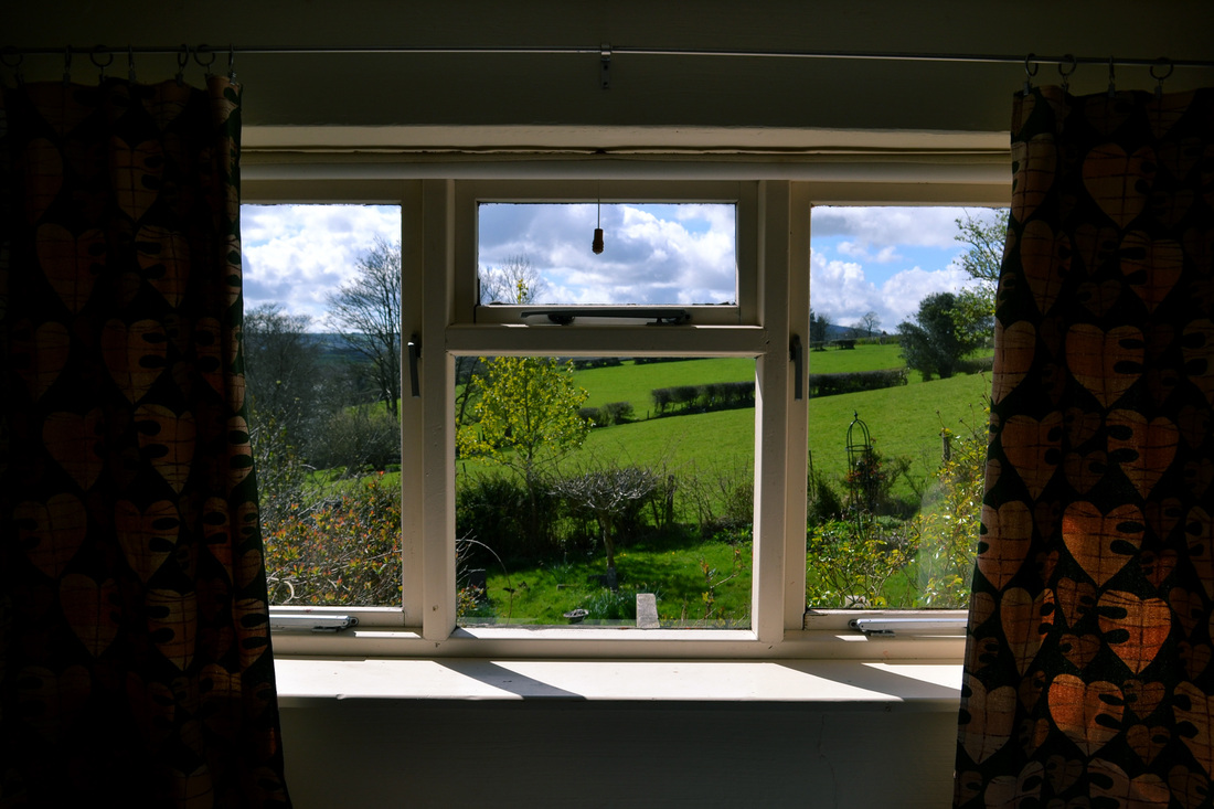


What went well - I like the framing of the images, as each one is very different. The contrast of the frame to the outside world works very well also, and I think they fit as a set suitably.
Even better if - Perhaps I could have drawn out a little more, as in the first window photograph I took as part of my Martin Parr experiment, as this means that there is more negative space for the outside to be framed within.
Even better if - Perhaps I could have drawn out a little more, as in the first window photograph I took as part of my Martin Parr experiment, as this means that there is more negative space for the outside to be framed within.
family - ninth set of observations
In this set of observations I carried on with my idea of photographing the family in their natural habitat. Through this study, I am to take photographs of diverse families, through their members and their cultures. This means that I may have to pursue a wider search of areas in London, to try and gain a differing perspective on family life than just those close to me.
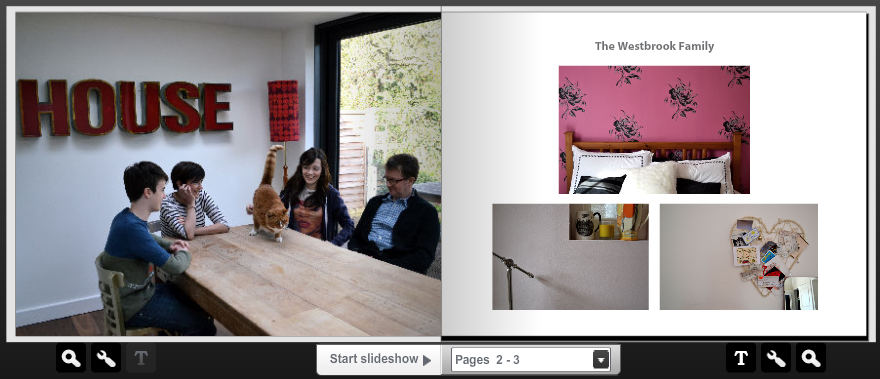
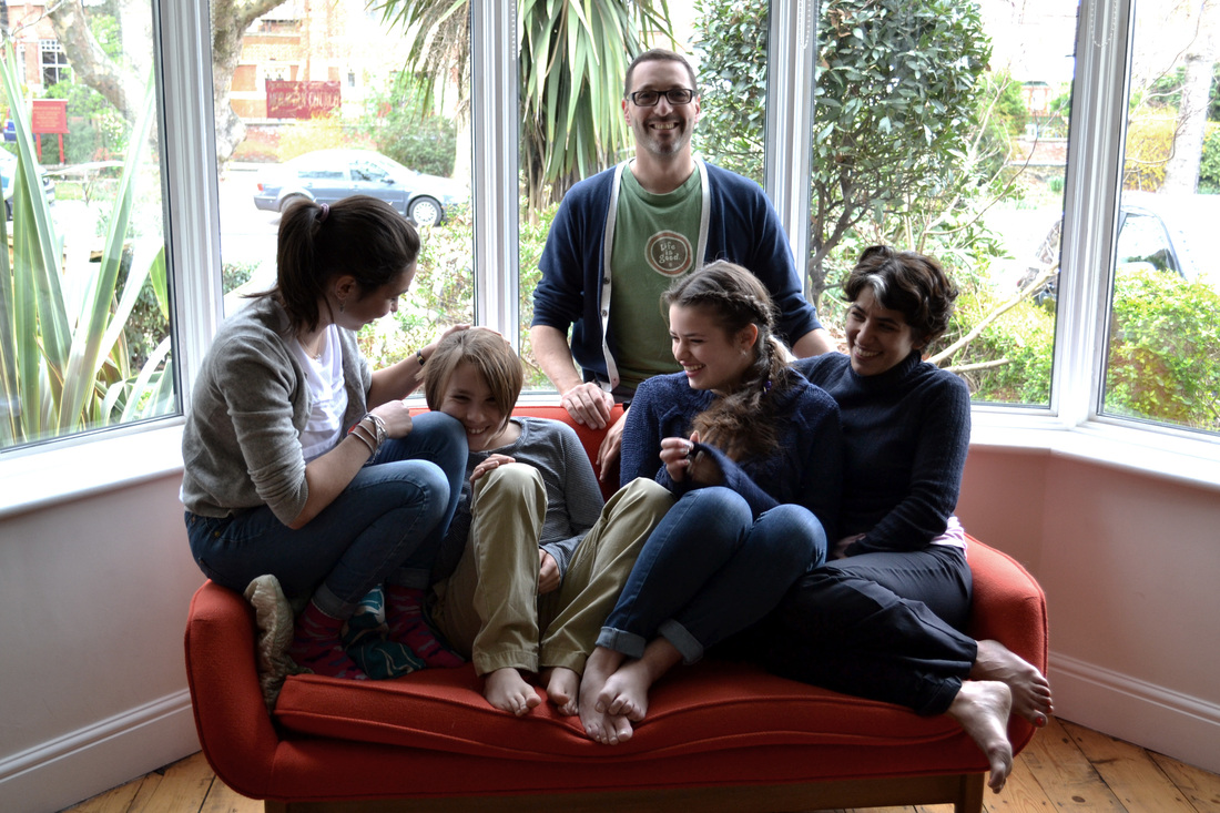
the westbrook-lewis family
In this set of observations I positioned the Westbrook's around the kitchen table, a place where they feel most as a family. The composition here worked well, the window letting in all the light that I needed for a high quality photograph. I wanted their pet, Kenny the three-legged cat, to be in the photograph as he is a major part of their identity.
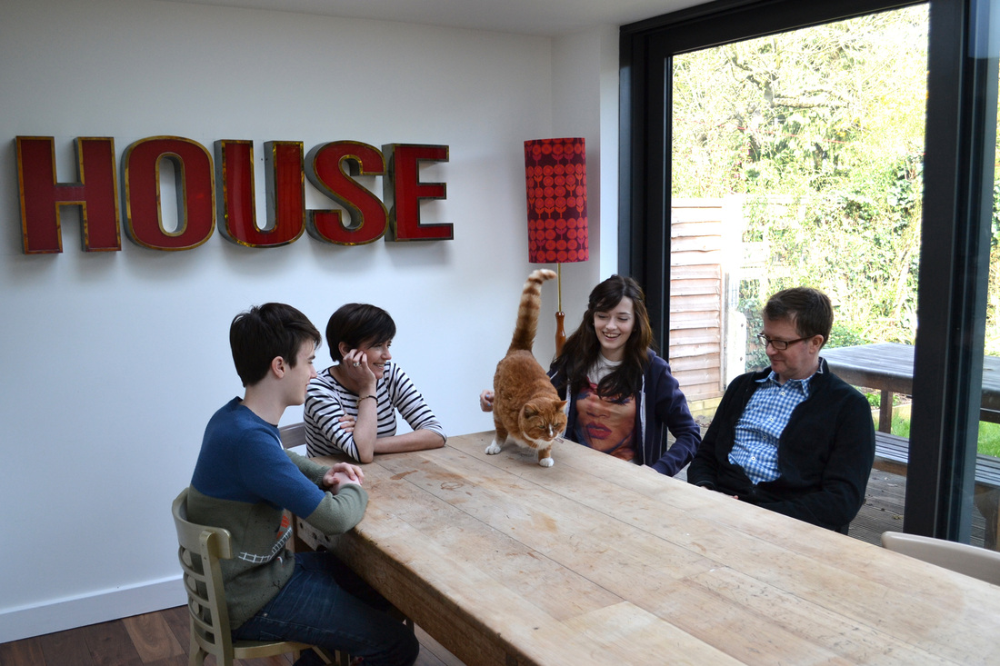


What went well - The composition of the shot was good, as I like how the long table juts out of the corner of the image and pins them all in the centre of the shot. I also like the red theme in the image, as this begins to tell a story about the family's identity. My favourite shots are those which are spontaneous, the best being the first in which each family member is absorbed in the cat.
Even better if - Perhaps I could improve on the images taken on the outside table, as the composition is not so accurate, and I found difficulty with the harsh sunlight causing over-exposure in some areas.
I also used the manual camera to photograph the Westbrook-Lewis family, as the images that I had been originally inspired by, by Magda Segal, had been captured on a manual black and white camera, and so I wanted to try and explore whether this medium of photography would suit the images best. What I found difficult with this method, especially in the Westbrook-Lewis household, was that I could not get far enough away for a wide shot, as the camera automatically zoomed towards the shot by about 5 feet. I think this was due to the lens, and for this reason I determined that photographing family portraits with a manual camera was a far harder prospect than first assumed.
In the next set of images, I focused on particular parts on the family home in which I thought the Westbrook's conveyed their identity. This was anything thing from arrangement of objects to the colours and textures they presented. The images are seen below...


What went well - My favourite thing about these images is the often large negative space that is captured. I think that captures moments which often go unnoticed in a household, but which hold much importance to them. The photograph of the books is cross-processed in photoshop, and I like this effect very much.
Even better if - Perhaps to improve on my images that are taken inside the family home, I could also expand to ones outside, and take photos of particular patches of earth with plants in or front door mats, as this would suggest a sense of a family's identity also.
Even better if - Perhaps to improve on my images that are taken inside the family home, I could also expand to ones outside, and take photos of particular patches of earth with plants in or front door mats, as this would suggest a sense of a family's identity also.
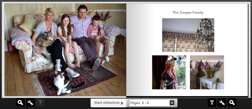
the cooper family
In this set of observations I photographed the Cooper family sitting at two places in their house; all piled on the flowery sofa in the living room, and then sitting round the garden table outside. I asked them where they felt most as a family, and these two places were listed. It is important when taking family portraits to make sure that the setting reflects their reality.


What went well - My favourite thing about these images was the cat. At first, he had been struggling in one of the Cooper's arms, attempting escape. So he was let go, and instead of running away, came and sat by the family's feet and stared into the camera, waiting to be photographed! This completely spontaneous moment made for a great picture, the whole family genuinely laughing.
Even better if - It was slightly more difficult to take the pictures outside, as there was sunlight glaring into faces, which meant that the images were slightly uneven in places. My preferred images are therefore the inside ones, which are higher quality and also have the miraculous positioning of the cat!


Above, I photographed the Cooper family with the manual camera to explore the effect that this would produce. I found difficulties with the focussing of the lens, as can be seen in the images above, as many parts of them are not clear. In the second image it can be seen the the depth of field is too narrow, which means that family members further back on the sofa are out of focus. Light can also be seen to be let into the camera's lens through light-leaks and this overexposes the images in some parts to render them uneven.
I then commenced to take photographs of the inside of the Cooper's family home, which is incredibly beautiful, every single space being filled with something lovely and bright and usually vintage! The images are seen below...


What went well - As there was so much to photograph, the range of photographs is wide, as I got to photograph inside bedrooms as well as hallways and staircases, seen through the immensely crowded wall of framed photographs. I like the colour and softness of the images as they suggest much about the relationship of family members.
Even better if - Again, I could have taken pictures outside of the house, as especially in the front of the house, there is much decoration which means it can be picked out as special from all the houses beside it. I think that I will go back and photograph the outside of the house another time.
Even better if - Again, I could have taken pictures outside of the house, as especially in the front of the house, there is much decoration which means it can be picked out as special from all the houses beside it. I think that I will go back and photograph the outside of the house another time.
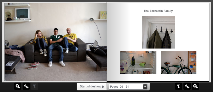
the bernstein family
In these images I took pictures of the Bernstein family, which is comprised of Chilli and her dad, and her brother, who isn't related by blood. I thought this would be an interesting family portrait, as contrasts with the classic idea of the 'nuclear family'. I photographed them on the sofa in the massive front room, where light streamed through the open doors, as this is where they feel most as a family.
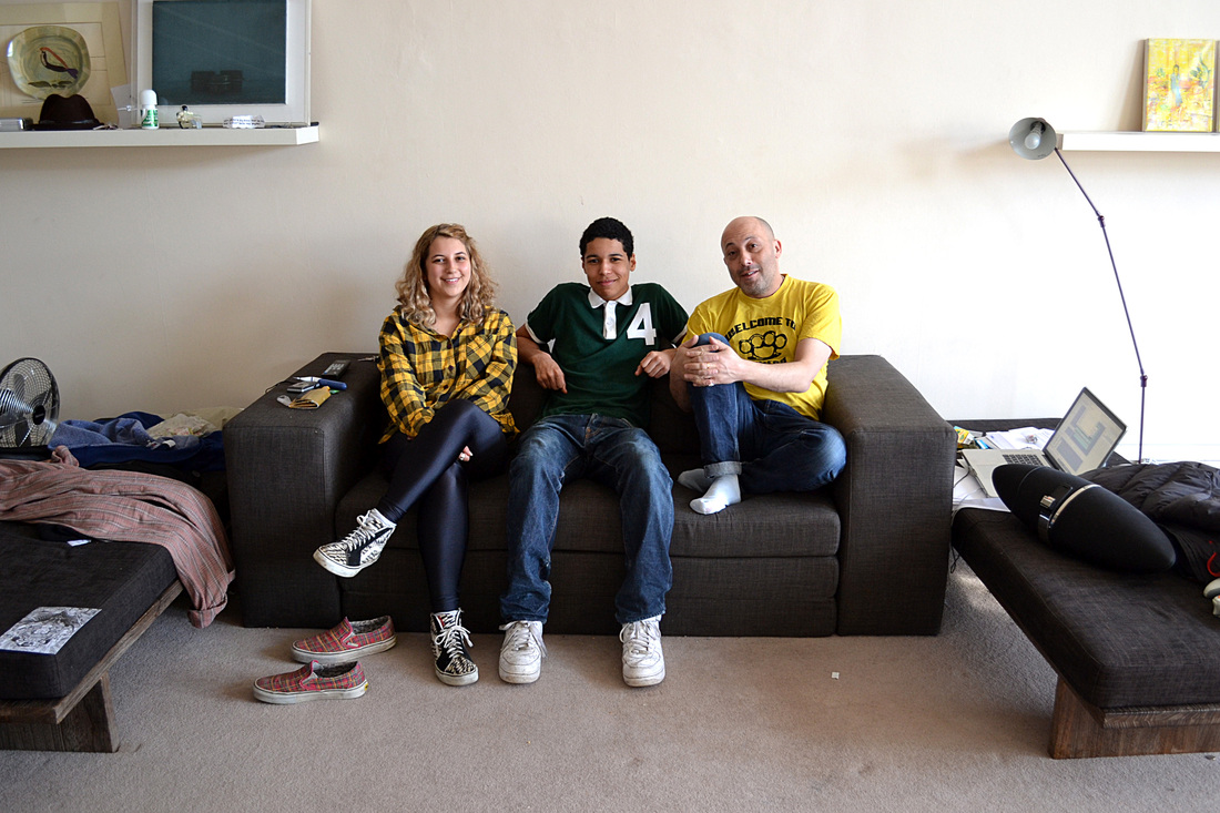


What went well - I left the background for these images relatively untouched, as I wanted the photographs to convey a realistic portrait of the family home. Therefore, there is some mess around the sofa, which I feel adds to the identity of the image, and gives clues into how that mess may have gotten there, and pushes the observer to imagine the family's story. I also liked how Chilli and her dad were both wearing yellow, as this suggested an alliance between them, personally.
Even better if - I could have taken the portraits in another part of the home as well, for example on the large steps leading up to the flat, which shows the beautiful outside of it.
I also took one image of the Bernstein's on the manual camera, which did not turn out as well as I thought, as in some places is very grainy and often unfocussed. After exploring the medium of manual photography related to 'alliance of family and home', I have determined that it is not the most sufficient way of capturing a family portrait, as there are many things to consider when taking photographs manually, such as lighting, aperture and focus that are far easier with a digital camera. Also, the expense of developing a roll of negatives, and the effort put in to developing them in a darkroom means that capturing family portraits is a far slower and laborious process, when actually I am aiming to take as many family portraits as possible.
The flat was incredible, the rooms being about three times the width and height of any usual room! The extremely high ceiling made certain that the walls and large empty expanses of the room were covered with things which suggested the character of the people living inside of it. The images can be seen below...


What went well - The large, white room made sure that there was much light being reflected across the walls. The range of objects captured is high, and I delved deep into the home, even opening the fridge and capturing the sparse variety of food inside! I cross-processed on of the images in photoshop, which I think works well as well.
Even better if - Perhaps I could have taken some photographs from different angles, as the images have relatively the same framing and closeness. I could have also photographed the bedroom, which would have been interesting to suggest Chilli's dad's personality.
family - tenth set of observations
Whilst photographing the Coopers, I thought it would be interesting to take some photographs of the children and capture the alliance that siblings have together. I thought about this idea previously when photographing the Renzullo's and the three sisters, so thought that I would explore it further with some shot.
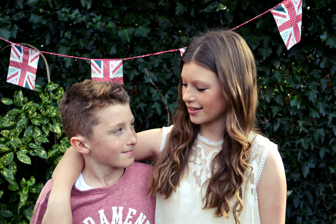


What went well - I like the composition of the images, with the bright leaves and British flag as a background. My favourite images is the first, in which the most spontaneous moment is captured. The two children look beautiful next to each other, and their features are highlighted by the natural lighting in the garden.
Even better if - I would have liked to have taken less-posed images, perhaps of them playing or talking together, as this would better show their relationship in its most natural form.
Even better if - I would have liked to have taken less-posed images, perhaps of them playing or talking together, as this would better show their relationship in its most natural form.
family - eleventh set of observations
For this set of observations, I continued in my pursuit of taking family portraits of different people's families. I aimed in these images to take note of the problem's that I had incurred and to develop my technique of family portrait photography-taking to ensure that I was capturing the best images possible.
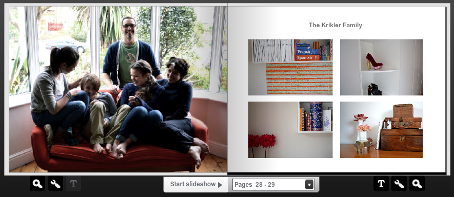
the krikler family


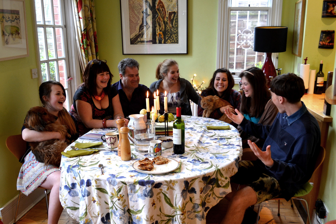
I took pictures of the Krikler's who live in a beautiful big house in Crouch End. That evening, they were celebrating passover, so I was lucky enough to not only take pictures of them in their front room, but also at the incredibly laid extensive dinner table, which they had to rent chairs for!
What went well - The top photograph is my absolute favourite, as it appears unposed and completely spontaneous in the moment, all family members being involved in laughter. I think the range of images captured is wide, as I adapted my position often to ensure that I was exploring different angles and also different combinations of family members communicating with one another. I also edited the images in various ways, one being in black and white and one being cross-processed to see which effect suited the portrait the best.
Even better if - The light streaming through the front window was often quite harsh, which has caused shadows on family members' faces sometimes. I came across this problem previously, when capturing the Macrae family, by the window in their kitchen. I could overcome this by perhaps turning on an interior light or using a studio fill light to make faces glow.
I then commenced to take photographs around the Krikler's house, and I was given a tour by Noa, who told me about all of the stories behind the objects, which was perfect in relation to my pursuit of exploring the alliance of family, home and their personal possessions, which each hold special memories and stories.


What went well - As the house had many large windows to let light in, the images are very clear and crisp, which suits them well. I was also pleased with the range of photographs captured, as I managed to explore many different rooms. The colours in the photographs and the often vintage objects or obsessive collections give away clues about the Krikler family's identity.
Even better if - Perhaps I could explore taking portrait images, as for many objects, this would suit them better. Also, I could have added effects to some of the images to accentuate their key ideas, such as adding a vintage feel to the old objects to present them as antique and interesting.
Even better if - Perhaps I could explore taking portrait images, as for many objects, this would suit them better. Also, I could have added effects to some of the images to accentuate their key ideas, such as adding a vintage feel to the old objects to present them as antique and interesting.
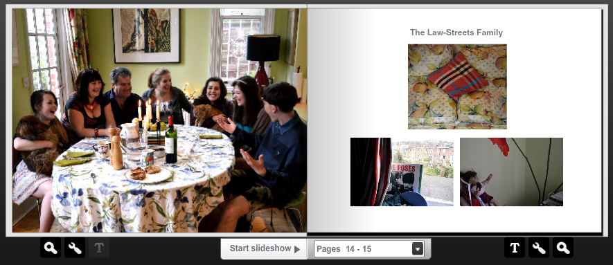
the law-streets family
In these images, I took pictures of Mac and his family filled with girls! I was also lucky enough to arrive on a day in which his extended family were visiting to celebrate Easter. My main priority was to capture the base family, who actually resided in the home, but afterwards, I took photographs of the whole family, which presented the two combinations of the families of Chris, Mac's dad, and Caroline, Mac's step-mum.


Extended family


What went well - The first image is my favourite, as all the family are engaged in a spontaneous incident and it captures a perfectly beautiful innocent moment that would occur in their everyday family life. I also like the integration of the animals within the portrait, as they look so happy in the girls arms! The composition of the shot is also pleasing, and I think that the inclusion of the table with wine, food and candles on it expresses a correct identity of the Law-Streets family and the life that they lead together in their shared home. The extended family portrait also worked well on this prospect.
Even better if - Perhaps I could have experimented with angles more, as the framing of the images are relatively the same. I could have perhaps pulled out and captured more of the kitchen with the table in it, which would have made for a more natural image.
I then explored the family home and took some images, as seen below...


What went well - The house was very large, and so I had an opportunity to capture many parts of the family home. I like the asymmetrical composition in many of the images, as I thought this suited the large family and their eccentric family home. I like the bright colours and contrasting colours that show the thought that has gone into creating a space of their own.
Even better if - I could have attempted some effects on the images that I took, such as perhaps adding noise or cross-processing to further accentuate the identity of the family.
Even better if - I could have attempted some effects on the images that I took, such as perhaps adding noise or cross-processing to further accentuate the identity of the family.
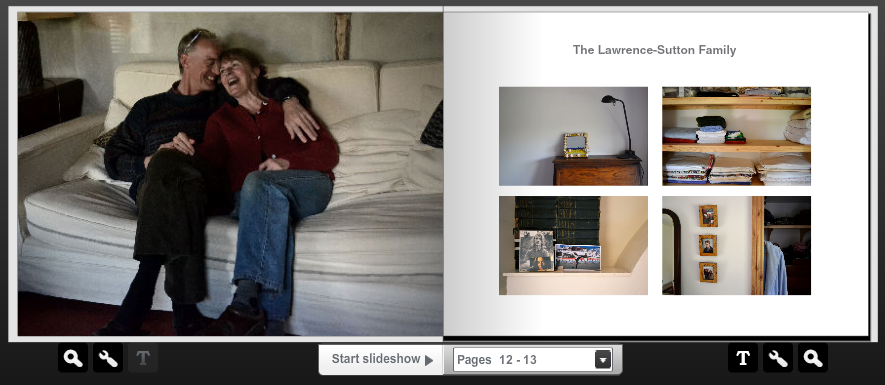
the lawrence-sutton family
In this set of observations I photographed my grandmother and grandfather in their Welsh countryside home. It was great to be able to do this, as it adds another layer of diversity onto my projects as it depicts two adults whose children have grown up and left home. It was also interesting to photograph a country home and contemplate the different choices that a family go through to suggest their identity through their home.
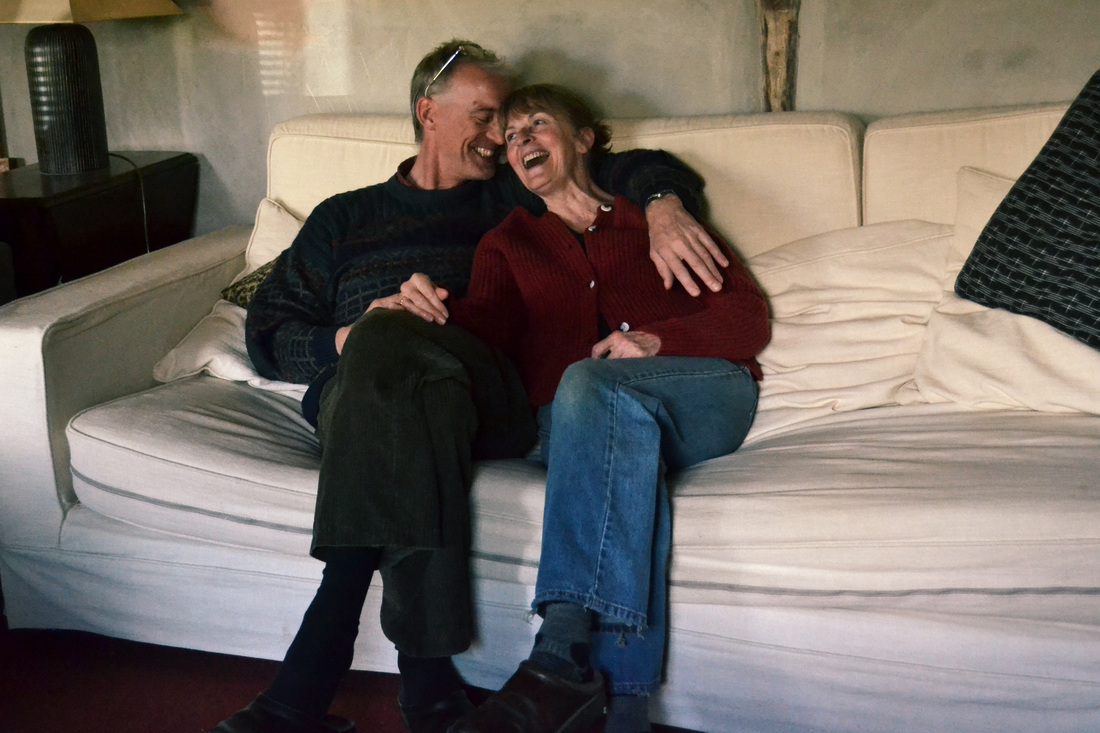


What went well - The top image is my favourite - it makes me smile to even look at it - as it captures such a happy moment between the couple. In this set of observations I made sure to capture as many different positions of the two people as possible, in the attempt to find the most natural and contented pose. This means that I have a wide selection to choose through.
Even better if - The lighting was sometimes limited and this has caused some of the photographs to become slightly blurred in places, as my shutter was being held open for an extended time.
Below are some photographs that I took from around the Lawrence-Sutton family home...


What went well - The framing and composition of the photographs work well, and I think they are a pleasant contrast to some of the other family home photographs I have captured, as they present a more old-fashioned side to the family home, such as with the larder.
Even better if - As the house has recently gone through building work, it was sometimes difficult to find moments of the Lawrence-Sutton family presence, as many items were still packed away, and painting was unfinished.
Even better if - As the house has recently gone through building work, it was sometimes difficult to find moments of the Lawrence-Sutton family presence, as many items were still packed away, and painting was unfinished.
final idea plan
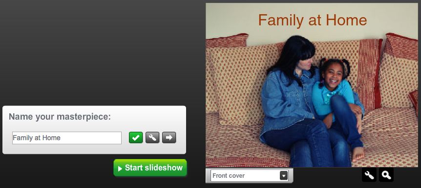
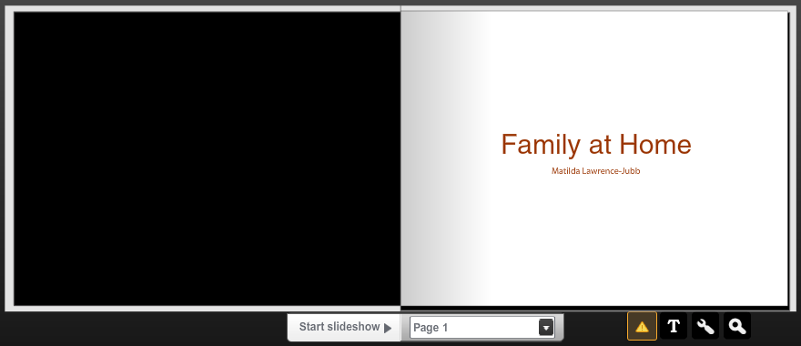
I have thoroughly enjoyed photographing the alliance between a family and their home, through portraits and identity-suggesting images of their home, and so with this, want to put every portrait to use and create a book of my final images. An A3 book would suit the images well, as enough detail would be apparent. The plan is to present the family portrait as a full page on the left, and have a small collection of photographs from the family home on the right page. This would perhaps be 3-4 images.

Below are some mock-ups that I created for the predicted plan of the layout in the book. I am still unsure whether I will have the family portrait in colour or in black and white, so will continue to deliberate that.


family - twelfth set of observations
For these observations, I continued my search to photograph families for my book. I am aiming to photograph as many as possible, to fill up my A3 family photo album!
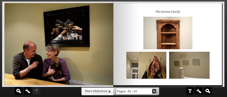
the davies family
I photographed this couple alone, as although they have children and other family members who they regularly see, they are the only two who live in the house full-time, and the only ones who can suggest the alliance between them and their home through their possessions and decoration.


What went well - I was lucky enough to be able to photograph their new puppy, Frank, who has been a new addition to the family, and whose owners love him it is already clear to see. I like the slightly abstract composition of the photograph, as because I was not standing directly in front of the couple the framed picture is slightly slanted and I think this makes it interesting.
Even better if - Unfortunately, I was photographing in early evening so the light wasn't great, which meant that the yellowness of the walls was slightly overpowering, and the focus isn't perfect, which means that I have limited the chance of enlarging one of the images to A2 size.
The images below are of the alliance of the Davies family and their home.


What went well - As the house was minimalistic, I believe that this was conveyed through the photographs that I took. I explored all of the house, and so the photographs display a wide range of objects and possessions.
Even better if - Yet again, the yellowness of the walls has slightly overpowered the images, and so perhaps I need to edit them further to reduce the yellow quality and render the images with a cleaner, more professional feel.
Even better if - Yet again, the yellowness of the walls has slightly overpowered the images, and so perhaps I need to edit them further to reduce the yellow quality and render the images with a cleaner, more professional feel.
family - thirteenth set of observations
I continued in my pursuit of taking family portraits and in the next three observations took photographs of the Robertson family, the Dell family and the Hogan family and their homes.
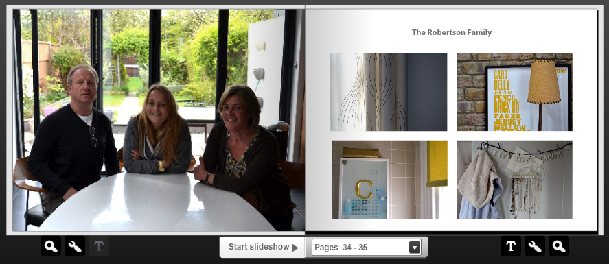
the robertson family


What went well - I set up the kitchen how I wanted, as I was aiming for the background of the garden to be featured as much as possible, as this suggested an aspect of the Robertson family's identity. The colour in the photographs is crisp and works well.
Even better if - I should have set my camera to manual focus for this particular set of observations, as when enlarged it seems as if the garden is in better focus than the family themselves. To improve this issue I could also have widened the aperture to ensure that the focus was on the smaller area of the family.
I then took pictures of the Robertson family home...


What went well - The Robertson family home was great to photograph, as had lots of moments of detail that conveyed family memories and identity. The range of colour was wide, which made each image individual amongst the others. I like the off-centre framing of the images also, as this created a unique image.
Even better if - Perhaps I could have focussed in on smaller parts of the family home, such as the objects inside the cabinet as this would have given a better range of size.
Even better if - Perhaps I could have focussed in on smaller parts of the family home, such as the objects inside the cabinet as this would have given a better range of size.
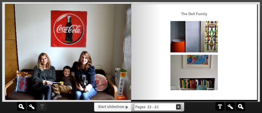
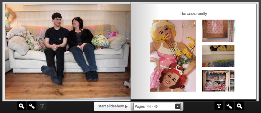
the dell family
I have photographed Chilli and her dad's family, the Berstein's, previously, but wanted to also photograph her mum's side, who she lives with. I think this will give an interesting insight into the contrast between two families who were once as one! I will also do this with my own two families.
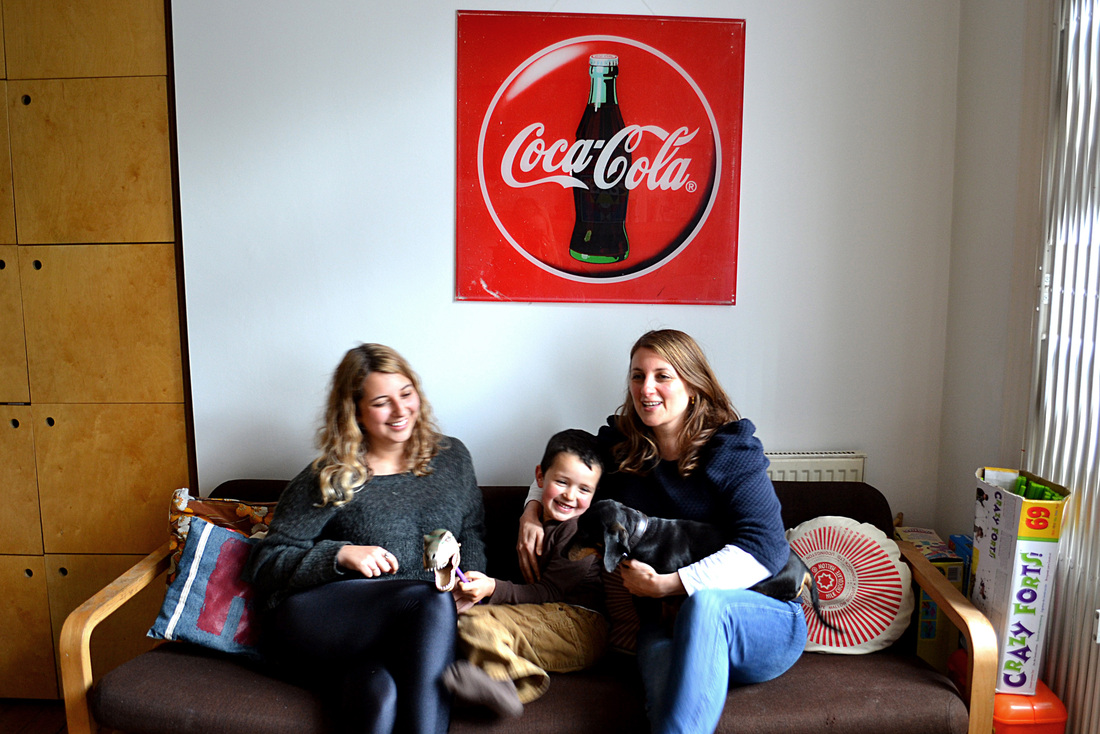


What went well - I like the background of the photographs as the negative space of the cupboards on the left contrast with the bright perspex 'Coca Cola' image. The lighting was also good as the family were positioned just to the left of wide windows.
Even better if - In each of the photos there is always someone who is slightly blurred or moving! This is a problem that spontaneous photography creates and that I will have to deal with. If this affects the photographs to a negative extent then a face could be copied from another photograph, though this slightly defeats the point of a spontaneous image!
I then took photographs of the Dell family home...


What went well - The colour in the images is varied and presents an aspect of the Dell family's personality. The framing of the images is slightly abstract, and I particularly like the image in which a photograph is on its side in a room as presents a slight optical illusion.
Even better if - Some of the images that were taken in the bottom floor of the flat are slightly underexposed, and could have done with some more light in the room.
Even better if - Some of the images that were taken in the bottom floor of the flat are slightly underexposed, and could have done with some more light in the room.
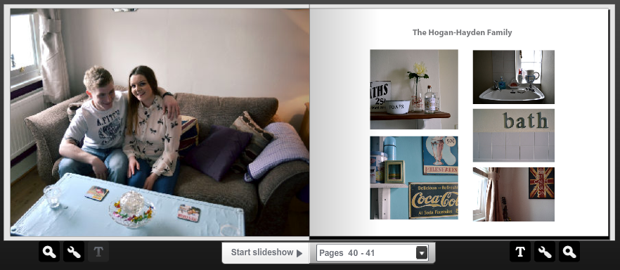
the hogan family
I then travelled to Angel and took photographs of Gemma and her boyfriend Albert in their tiny flat. This was a good contrast to the other family portraits I have captured, as showed a young couple before getting married and having children and the differences between their homes.


What went well - The lighting in the images was good, and I liked the shadows that this caused as made for a more atmospheric photograph. I also like the framing of the images, as including the table and the objects on it suggests a part of the Hogan family's identity.
Even better if - Sometimes the positions of the family members look slightly forced, and more posed than I would have wished for, but there are a few images that work well.
I then commenced to take pictures of their family home...


What went well - I like the framing and composition of the images, and it was great to photograph a home that had such a distinct style. The colour in the images varies and suits each well and also conveys the family's identity.
Even better if - Some aspects of the photographs are not perfect, for example there is a plug featured in one of them, but I will have to work around this by leaving the image out of the final book or cropping it to size.
Even better if - Some aspects of the photographs are not perfect, for example there is a plug featured in one of them, but I will have to work around this by leaving the image out of the final book or cropping it to size.
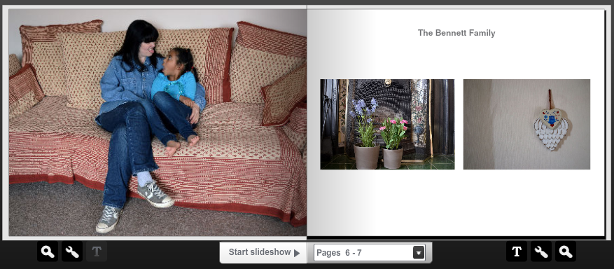
The Bennett family
I took photographs of Carolyn and her daughter Millie in their home. I wanted to photograph the Bennett family as it made an interesting contrast to the typical nuclear families that I have photographed previously.


What went well - The sofa was large and wide which made for a good background for the Bennett family. I like the fact there is only two of them, as this made for many more possible final pictures, as most of the time the family members were working in sync. I desaturated some of the images as I believe this suited them better and the top image is slightly cross-processed.
Even better if - Perhaps I could have asked the family to move to another place in the house, as this would have given more variation.
I then took pictures of the Bennett family home...
Even better if - Perhaps I could have asked the family to move to another place in the house, as this would have given more variation.
I then took pictures of the Bennett family home...


What went well - I like the colour in the images, as is muted and suits the portraits that I took. The minimal style of the house shows through the photographs, and this is what I was aiming for, the personality of the family to shine through the images.
Even better if - Perhaps I could have taken pictures of busier areas of the house, as I avoided piles of clothes and mess etc, so when taking more family portraits I will attempt to convey every part of the family home, and make sure everything is on display.
Even better if - Perhaps I could have taken pictures of busier areas of the house, as I avoided piles of clothes and mess etc, so when taking more family portraits I will attempt to convey every part of the family home, and make sure everything is on display.
fourteenth set of observations
As I am aiming to include 25 families in my final piece, the next observations are the continuation of the study 'Family at Home' each to be presented in my final book and a select few to be enlarged.
the stoker family


What went well - The background was relatively busy, and I thought this worked well, as there were only two members in the family. I like the fact that the cat was in it too, and I know that he is an important part of the Stoker family!
Even better if - The light was coming through the window quite harshly to my right, which often overexposed some parts of the photographs. I attempted to decrease this overexposure as much as possible in Photoshop, but it would have worked better if I had made my shutter speed faster, as then also movement of the cat would have been presented.
I then took pictures of the Stoker family home...


What went well - I like the variation in images, as it suggests that the different family members have different interests. This lighting was good in all of the images, and the first image was lit by an overhead lamp, which made for an interesting spotlight effect, to bring out colours and details.
Even better if - The other photographs I took from around the house could have also been edited to bulk up my experimentation, but as I will only include 2-4 home images in my final book, I thought these were sufficient.
the bigg family
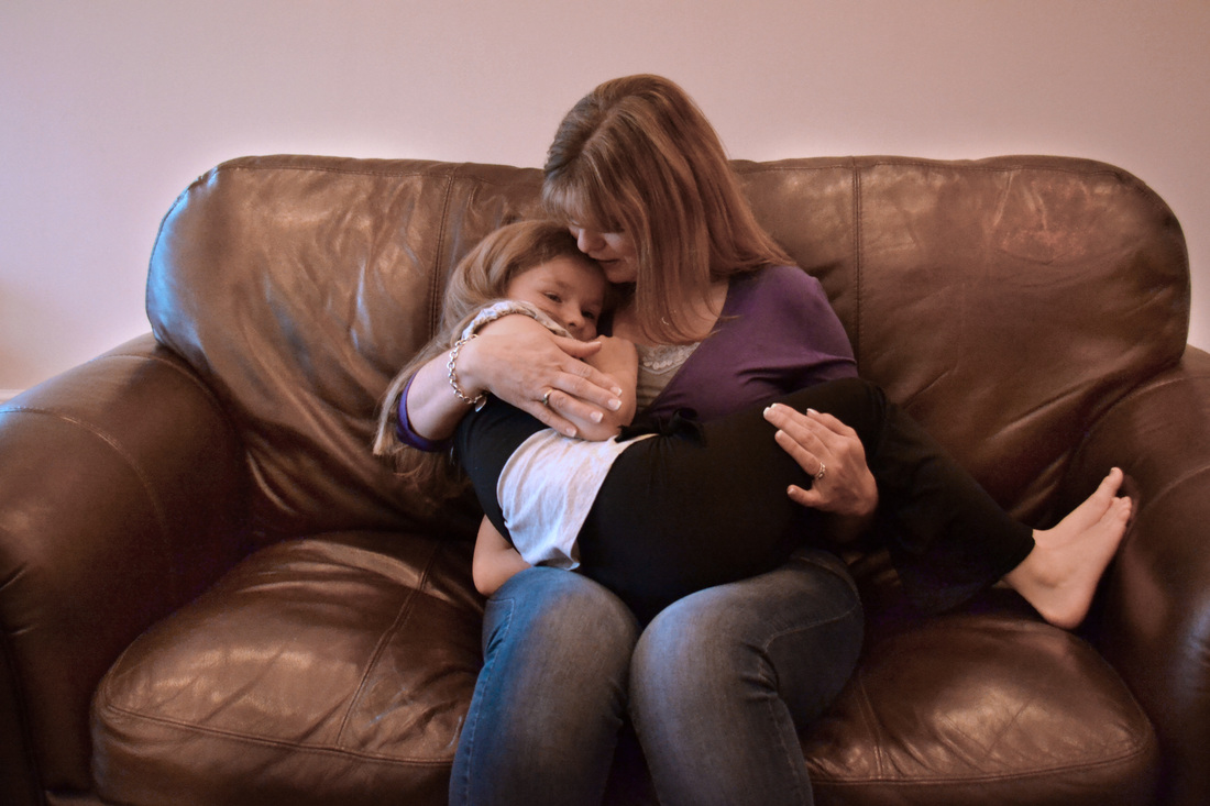
What went well - I like the positioning of this family as it portrays an intimate snapshot of their relationship. It reminds me of a Nan Goldin image as conveys a part of their life which may not be on show at all times of the day.
Even better if - This was the only image that I thought appropriate to be able to place in my book, as all the other images were too yellow. As there was not much light in the house, I left the main light in the sitting room on, which was a mistake! I have learned that even if there is little light, it is always best to use what is naturally there, as this will give the cleanest image and can always be redeemed by editing in Photoshop.
Here are pictures of the Bigg family home...


What went well - I found it difficult to photograph things in their house, as it was quite modern and open-plan, so I think I did quite well for the lack of objects. The colour in the two outer images is muted, and I like that effect.
Even better if - I could have perhaps taken pictures of negative space, or an objects surrounded by clear walls and floors, as this would help to suggest the tidy nature of the house.
Even better if - I could have perhaps taken pictures of negative space, or an objects surrounded by clear walls and floors, as this would help to suggest the tidy nature of the house.
the wells family


What went well - I like the expressions on each of the Wells' family's faces, as they contrasted to each other and gave clues into the personalities of the characters. I also like the colour in the photograph, as the mother's green top draws attention to the centre of the photograph and portrays her as the central family member that holds everyone together!
Even better if - I could have experimented with another place that the family could have positioned themselves, such as the kitchen table, as this would have given more options to choose between, as some of these images are slightly too cropped and miss out important aspects of the photographs.
Here are pictures of the Wells family home...


What went well - I like the colours in the images, as they are muted and soft, especially in the image of the blossom, where the colours work beautifully together. The composition of the images is pleasing also.
Even better if - I could have uploaded more images, as I took lots more. Also, the lighting could have been slightly better, as in the top right image there is some underexposure where the shadows lie.
Even better if - I could have uploaded more images, as I took lots more. Also, the lighting could have been slightly better, as in the top right image there is some underexposure where the shadows lie.
the meatyard family


What went well - I like the fact that these portraits are slightly closer-up than others, as this explores a different angle to family portrait photography, one that is slightly more up-close and personal. The colours work well also, because the images are very colourful yet also muted.
Even better if - Again, I could have taken more portraits of the family in a different position, perhaps maybe spread out over two sofas, as they may naturally sit.
Even better if - Again, I could have taken more portraits of the family in a different position, perhaps maybe spread out over two sofas, as they may naturally sit.


What went well - The variation of images is good, as shows both mature and childish parts of the house entwined. They work well together as a set and contrast in composition and framing.
Even better if - I could have taken slightly closer up images, perhaps of kitchen clutter, as this would present a different side to the family, one that was slightly less organised!
Even better if - I could have taken slightly closer up images, perhaps of kitchen clutter, as this would present a different side to the family, one that was slightly less organised!
the onisto family


What went well - I like the expression on each family member's face, as it suggested genuine relationships between them, and the way that they would naturally act at home. I also like the composition of the images, as cutting off the bottom half of their bodies contrasts with some of the other more traditional portraits that I will include in my book.
Even better if - The lighting in the images could have been better, but I specifically put my camera to a faster shutter speed, as wanted more detail in spite of underexposure. I could have rectified this problem in Photoshop slightly more before I uploaded the images.
Even better if - The lighting in the images could have been better, but I specifically put my camera to a faster shutter speed, as wanted more detail in spite of underexposure. I could have rectified this problem in Photoshop slightly more before I uploaded the images.


What went well - The contrasting colours work well in the images, and I think they would look good together when presented in the final book.
Even better if - I could have captured a slightly wider variation of images, as I will have to eliminate one of the plant images when putting them in my book, as this would seem like repetition. The lighting could have been better sometimes, such as the dartboard, as it was in a basement room. I will redeem this problem when organising the images for my book.
Even better if - I could have captured a slightly wider variation of images, as I will have to eliminate one of the plant images when putting them in my book, as this would seem like repetition. The lighting could have been better sometimes, such as the dartboard, as it was in a basement room. I will redeem this problem when organising the images for my book.
the yates family


What went well - The Yates family were very expressive, and this showed through my photographs. They seemed comfortable and happy to laugh with each other. In this way, I was lucky to capture body language and expression that were highly natural, and worked well aesthetically also.
Even better if - I could have positioned the Yates family somewhere else too, as they told me that they spent lots of time outside in their garden too. Unfortunately, it was a very rainy day, and so it would not have looked great! To improve, I could perhaps revisit and capture more images, if I do not feel completely satisfied with these.
Here are pictures of the Yates family home...


What went well - It was nice to photograph their family home, as it was one that conveyed lots of personality and life experience. I like the images for their off-centre composition and negative space.
Even better if - I could have explored more of the house, and perhaps even captured some garden images, seeing as this is an important part of their family tradition.
Even better if - I could have explored more of the house, and perhaps even captured some garden images, seeing as this is an important part of their family tradition.
the jubb family


What went well - I wanted to take these images to improve on my very first set of observations that I captured of my family. I think this has been achieved, as the images are far more better composed, and the lighted was much higher, which gave more detail in the images. Also, the animals were behaving slightly better, which made things much easier!
Even better if - I could have experimented with different positions, or different family members holding which animals, to explore which felt most comfortable.
Here are pictures of the Jubb family home...
Even better if - I could have experimented with different positions, or different family members holding which animals, to explore which felt most comfortable.
Here are pictures of the Jubb family home...


What went well - I like the photograph on the top left of the origami birds in the bathroom, as I believe this conveys the importance of creativity in my family.
Even better if - Some of the photos are slightly yellow, as there was not enough natural light to photograph with. Again, I have learned that it is always best to use natural lighting, as this can be rescued in Photoshop far better than the synthetic quality of home lighting.
Even better if - Some of the photos are slightly yellow, as there was not enough natural light to photograph with. Again, I have learned that it is always best to use natural lighting, as this can be rescued in Photoshop far better than the synthetic quality of home lighting.
the castagnet-galeski-stoker family


What went well - I thought this family portrait was an interesting contrast to the others, as shows a family that perhaps may not be related by blood, but are a family because of the home that they share. I also like the clean quality of the yellow sofa and wall behind, as this makes for a good finish.
Even better if - There weren't many photographs where the Castagnet-Galeski-Stoker family were looking at the camera and smiling, and although my favourite photographs are the spontaneous ones, it would have given me more choice when choosing the final image.
Here are pictures of the Castagnet-Stoker-Galeski family home...
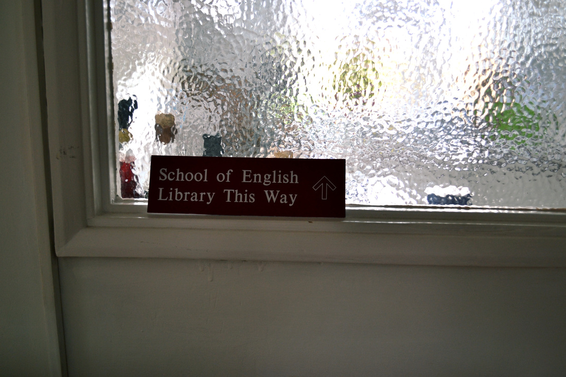


What went well - I like the negative space often pictured in the photographs, as this makes sure that only the important aspects of the photographs are focused on, and provides a frame for them. I also like the colours and variation of images.
Even better if - I didn't explore the bedrooms of the Castagnet-Stoker-Galeski family home, and this meant that I didn't have many intimate photographs of objects, which would have added depth to the collection.
Even better if - I didn't explore the bedrooms of the Castagnet-Stoker-Galeski family home, and this meant that I didn't have many intimate photographs of objects, which would have added depth to the collection.
the gostick family portrait retakes
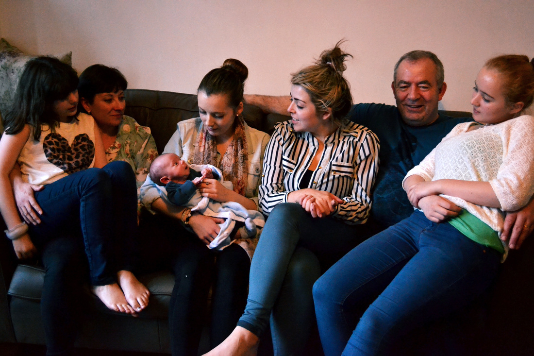


What went well - I wanted to retake these photographs, firstly, because the original images had to be cropped to square to make sure that the busy background wasn't distracting from the family, and secondly, because there was an arrival of a new baby! I think these images are far better than the originals, as the large family are able to spread out slightly more and feel more comfortable in their space.
Even better if - The lighting wasn't perfect in these images as it was early evening, so if I was ever to retake (again!) I would make sure that I photographed them at an earlier time, to make use of the most light possible.
Even better if - The lighting wasn't perfect in these images as it was early evening, so if I was ever to retake (again!) I would make sure that I photographed them at an earlier time, to make use of the most light possible.
the grace family
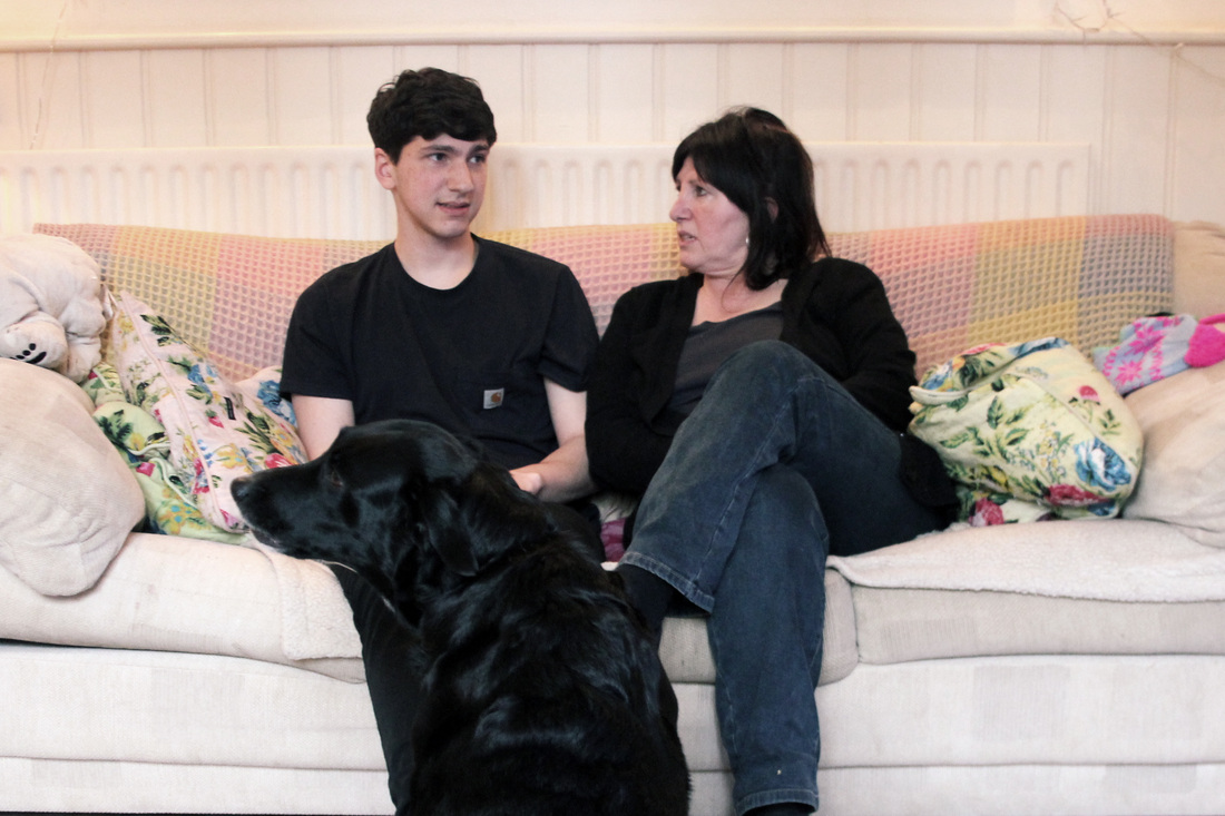


What went well - I like the inclusion of the dog in the images, especially when she is on the sofa, as this presents what an important part of the family she is! I also like the colours in the images, and in some I have slightly cross-processed and I think this works well with the theme of the house.
Even better if - I did not ask the family to pose, and I think I should have for some of the time, as many of the images were in mid-conversation, or one family member would look right, whilst the other was moving!
Here are pictures of the Grace family home...
Even better if - I did not ask the family to pose, and I think I should have for some of the time, as many of the images were in mid-conversation, or one family member would look right, whilst the other was moving!
Here are pictures of the Grace family home...


What went well - I loved the colours in the house, as it made for beautifully pastel images. I also like the portrait image, as I have not captured any portrait images in previous sets, so this will make for an interesting contrast when organising the images for my book.
Even better if - I only took pictures downstairs, and I think to increase variation I could have explored bedrooms and perhaps even outside, as this is (in summer!) where the family spend lots of their time.
Even better if - I only took pictures downstairs, and I think to increase variation I could have explored bedrooms and perhaps even outside, as this is (in summer!) where the family spend lots of their time.
the fordwoh family


What went well - From previous sets, I had learned that it is important to experiment with different settings that the family were to be photographed in. So, for this set, I photographed the Fordwoh family in the two places that they spent most of their time.
Even better if - The lighting in the living-room images is slightly low in some places, and extremely overexposed when focussing on the window. For this reason, I know I will choose one of the images from the kitchen to include in my final book, as these work better.
Here are pictures of the Fordwoh family home...


What went well - From the outside, the house is relatively closed off, and the blinds are almost always closed, but when inside the house, I got to see it from a different perspective and was blown away by the beautiful light that streamed through the coloured glass of the door and narrow slits in the shutters. I like these images as they are simple, yet effective.
Even better if - I could have taken some images from outside the house, to contrast with the differing interior, as this would suggest perhaps a private quality to the family.
Even better if - I could have taken some images from outside the house, to contrast with the differing interior, as this would suggest perhaps a private quality to the family.
the coates family


What went well - The relationship between the two family members can clearly be seen and I like the contrasting body language, as this makes interesting shapes in the images. The colours also work well here, as I have slightly muted them to suit each other.
Even better if - Perhaps I could have drawn out even more, as the room was quite large so I could have made sure that more of it was in the frame, as this would give further clues into the relationship between the family and their home.
Even better if - Perhaps I could have drawn out even more, as the room was quite large so I could have made sure that more of it was in the frame, as this would give further clues into the relationship between the family and their home.


What went well - I like the muted colours, and off-centre composition, as this makes sure that the important parts of the photographs are focused on, for example the text on the binding of the book.
Even better if - I could have captured more places in the house, such as the kitchen or bathroom, to provide a contrast to the images that I already have.
Even better if - I could have captured more places in the house, such as the kitchen or bathroom, to provide a contrast to the images that I already have.
final piece
After taking my 25 family portraits and various images to capture the alliance of the families and their homes, I created an A3 book on Photobox to present them. I screen-grabbed each image in the preview of the book to show the full effect of the presentation.
I also have chosen 6 images to enlarge to A2 size and mount on foam board, those being: 'The Meatyard Family', 'The Cooper Family', 'The Renzullo Family', 'The Jubb-Galvin Family', 'The Hogan-Hayden Family' and 'The Law-Streets Family'. I can't wait to see the outcome!
I also have chosen 6 images to enlarge to A2 size and mount on foam board, those being: 'The Meatyard Family', 'The Cooper Family', 'The Renzullo Family', 'The Jubb-Galvin Family', 'The Hogan-Hayden Family' and 'The Law-Streets Family'. I can't wait to see the outcome!